What a Personal Colour Consultant Actually Does
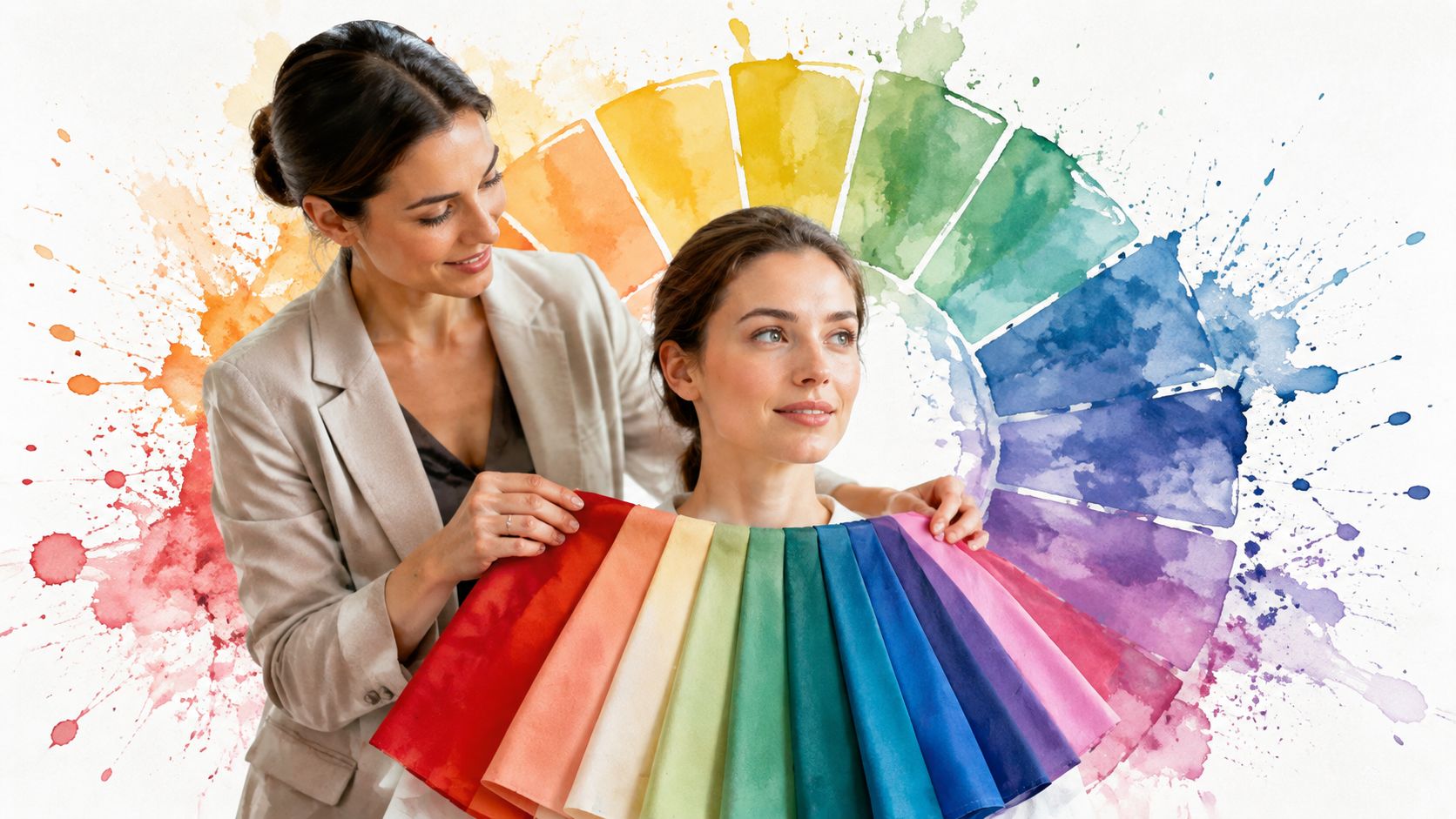
A personal colour consultant is a trained expert who analyses your skin, hair, and eyes to build a personal palette of flattering colours, then uses that palette to guide clothing, makeup, and accessories. In the broader image-consulting sector, that kind of guidance sits inside an estimated $4.5 billion market in 2025, while the colour-cosmetics market is projected at about $92 billion in 2025 and $143 billion by 2034 (Orchidia market note).
You know the moment. A top looks gorgeous on the hanger, then suddenly makes your face look flat in the mirror, or a lipstick you loved online turns strangely harsh in daylight. That's the kind of puzzle a personal colour consultant helps solve, and it's why people keep coming back to colour analysis as a practical decision aid rather than a one-time styling gimmick.
What a Personal Colour Consultant Does
She stands in front of the mirror in a blouse she thought was perfect, then notices something off. The colour is not ugly, it just makes her look tired, while another shade nearby makes her skin look clearer and brighter without any obvious effort.
That is the problem a personal colour consultant helps solve. The work is to study how your colouring responds to different shades, then turn that into a practical palette for everyday choices, not just a pretty board of swatches.
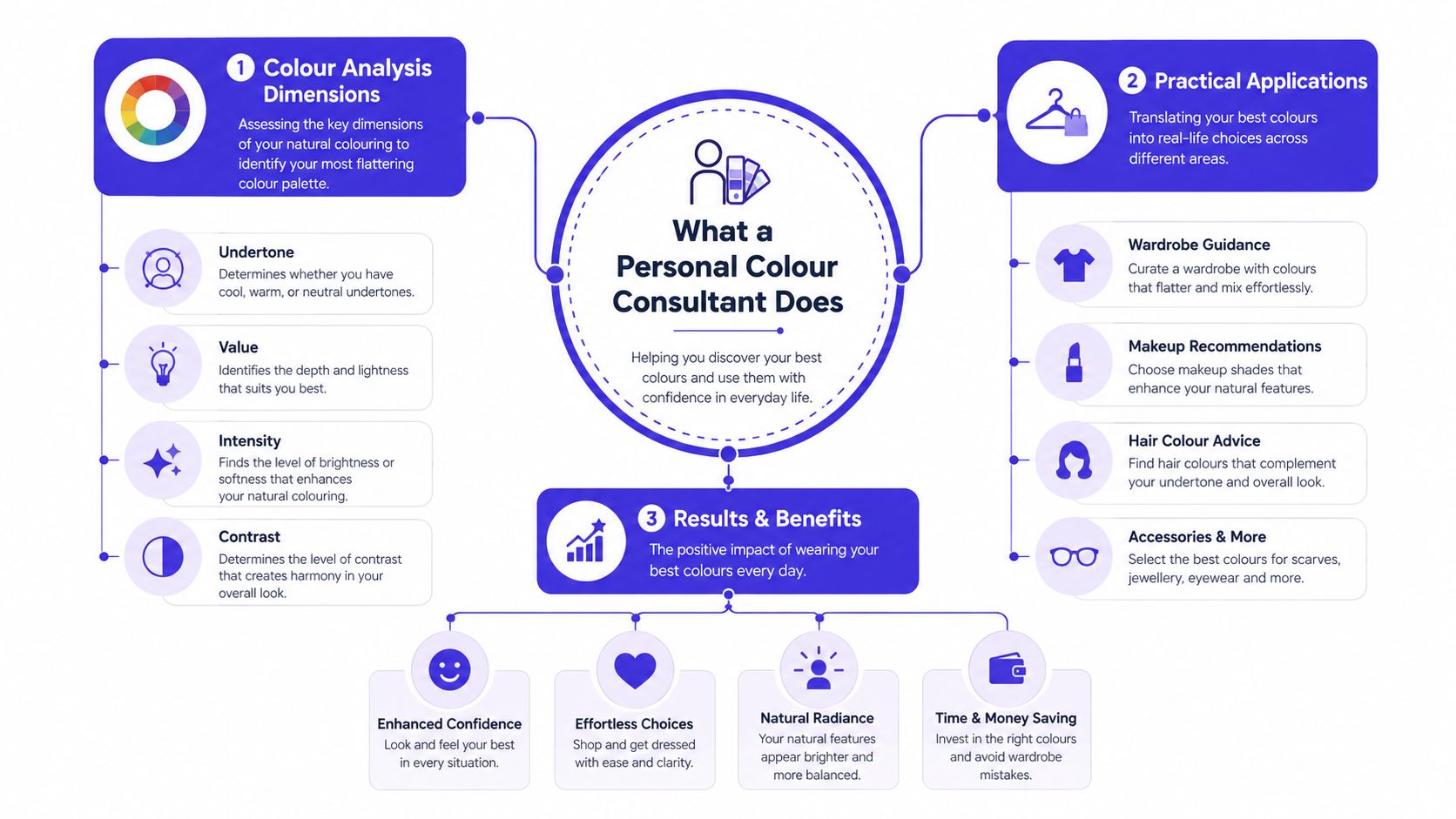
A consultant does not guess from one feature. The analysis usually looks at undertone, depth, and chroma, then uses those results to guide what feels harmonious near your face and what works best in clothing, makeup, or accessories.
Practical rule: if a colour makes your skin look more even, your eyes look clearer, and your face feel more awake, that is the kind of shade a consultant wants to include in your palette.
Personal colour consulting is especially helpful if you shop online a lot, feel stuck in the same neutrals, or keep buying colours that look better on the rack than on you. It also works as a useful reset when your wardrobe, hair colour, or style preferences have shifted and you want your clothes to feel more deliberate. For a simple example of how palettes can be matched to your own colouring before you commit to a purchase, this guide to colours for your skin tone shows how the idea translates into real shopping decisions.
How Consultants Read Your Colours
Colour analysis works a bit like sorting paint samples for a room. The palette only makes sense once you look at how a few different qualities interact, because one shade can flatter one person and flatten another.
Undertone, depth, and chroma
Undertone is the base quality of your skin, often described as cool, warm, or neutral. Depth is how light or deep your overall colouring reads, while chroma, sometimes called clarity, describes whether your best colours tend to be bright and clean or softer and more muted.
That is why two people can both fit the same seasonal label and still suit different shades. One may need a softer, dustier palette, while another can wear cleaner contrast and more saturation without the colour overpowering the face.
Seasonal labels are shorthand, not the whole story
The familiar spring, summer, autumn, winter framework is a useful shortcut, and it shows up in mainstream style writing because it is easy to remember (Vogue UK). The reading is still more detailed than a single season name, because consultants are looking at how your skin, hair, and eyes work together beside colour.
A good consultant should be able to explain the reasoning, not just hand you a season and send you away.
That practical side is what makes colour analysis useful in real shopping, not just in theory. If you want a clearer sense of how specific shades might look on your own colouring before you buy, the guide to best colours for skin tone is a helpful next step.
What a Typical Colour Consultation Looks Like
Before the draping even starts, the prep matters. A clean face, no tinted moisturiser, no fake tan, and hair pulled back give the consultant a clearer read, because those things can distort how your colouring appears in the room (YouTube guidance on inputs and lighting).
Then the consultant begins placing fabric swatches near your face. The point is simple, they're watching how your skin reacts to different colour families, especially under balanced daylight or carefully controlled lighting.
What happens in the room
The session usually feels more like a conversation than an exam. The consultant may ask what colours you already wear, which shades you avoid, and whether you want a wardrobe that feels polished, playful, understated, or bold.
From there, the swatches tell the story. Some colours make redness more noticeable, some soften the face, and some create that clean, calm effect where your features seem to come forward naturally.
What you leave with
Most sessions end with a palette card, digital guide, or written report. That's the part people use later when choosing tops, lip colours, scarves, jewellery, or even hair shades.
The Canadian government's career handbook frames colour consultants as professionals who advise clients on personal appearance to improve personal and business image, which is exactly why the session is so focused on visual presentation (Canadian government career handbook).
Useful expectation: the result is meant to help you make better-looking choices faster, not to turn you into a different person.
In-Person, Virtual, Photo-Based, and DIY Options
You might be standing in front of a closet full of clothes, wondering why some shirts make your face look bright and rested while others seem to pull colour out of it. That is where the different consultation formats start to matter, because each one gives a slightly different kind of read.
An in-person consultation usually gives the clearest result. The consultant can drape fabric in real time, shift between shades, and watch how your skin responds as the lighting and colour families change. If you want quicker help or live too far away for an appointment, virtual sessions and photo-based reports can still be useful, especially when the images are prepared with care and the consultant knows what to look for.
A published service example shows how premium the field can be, with traditional in-person colour analysis typically ranging from $200 to $800, most sessions around $300 to $500, and virtual consultations often between $150 and $400 (Total Image Consultants).
Comparison of Personal Colour Consultant Formats
| Format | Typical Duration | Price Range | Best For |
|---|---|---|---|
| In-person | Longer, full session | Higher end of the market | Shoppers who want the most hands-on reading |
| Virtual | Short to moderate | Mid-range | People who want convenience and live guidance |
| Photo-based report | Very short or async | Lower than full sessions | Fast palette feedback from prepared images |
| DIY apps | Instant or near-instant | Lowest cost or free | Quick experimentation and casual exploration |
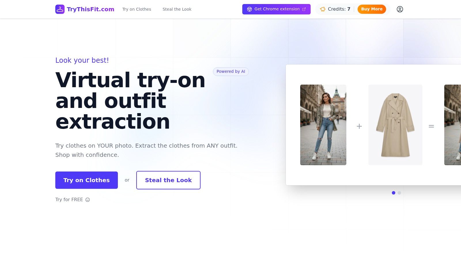
There is also a practical middle ground for shoppers who want to preview colour choices without booking a full appointment. TryThisFit's virtual try-on lets you see how outfits and colours look on a real garment shape before you commit, which helps when you are comparing a few options from home or deciding whether a shade is worth buying.
The trade-off is simple. Controlled lighting and a clear input image usually make the result feel more trustworthy, while a rushed selfie or poor light can blur the read and make the palette feel less reliable.
Typical Pricing and What Credentials Mean
Price is one of the quickest ways to tell whether you are looking at a careful colour consultation or a rushed online quiz. A higher fee does not guarantee a better result, but established pricing usually points to more time, more training, and a more structured process.
A business profile for House of Colour gives a useful sense of what a mature service can look like. The profile shows a long-running brand founded in 1985, with $25.4 million in reported annual revenue in 2024 and 254 employees listed in one profile, which suggests an established consultancy rather than a small side project (House of Colour profile).
What to look for
A trustworthy consultant should be able to explain their method in plain language. They should tell you whether they focus on undertone, depth, chroma, seasonal systems, or a mix of these ideas, and they should be comfortable walking you through how they reach a recommendation.
Vague promises are a warning sign, especially if someone says they can give you a perfect result in a few minutes without describing the steps. Another warning sign is language with no clear framework, because that usually means the advice is closer to personal opinion than colour analysis.
What credentials matter
Formal training through a recognised image-consulting institute can help, but experience and client feedback matter too. Reviews are most useful when they describe the consultation itself, whether the consultant listened carefully, explained the palette in a way that made sense, and helped the client use it in real shopping choices.
If you are comparing a few services, ask what clients leave with at the end. A palette card, a written guide, or a simple plan for next steps tells you more than a polished Instagram feed ever will.
When Your Palette Clashes With Your Taste
This is the part most colour guides glide past. A technically correct palette can still feel wrong if you hate pastels, live in black, or love colours that fall outside the “ideal” family.
That doesn't mean the consultation failed. It usually means you need rules for using the palette flexibly instead of treating it like a strict yes-or-no system.
Make the best colours work harder
Put the strongest shades near your face first, in tops, scarves, knitwear, lipstick, or earrings. Then let less ideal colours move farther away from the face, where they matter less and can still work in trousers, skirts, coats, or bags.
If you love a trend colour that isn't in your palette, wear it with intention. A familiar neutral near the face, or a makeup shade that brings harmony back, can make the whole look feel more like you.
Common mistake: treating a palette like a ban list. It's usually more useful as a hierarchy, with your best shades getting the prime spots.
This is also where shopping habits matter. If you buy online often, rigid rules can create frustration fast, because you can't feel the fabric or test the colour in store. Colour analysis works better when it supports your choices instead of replacing your taste.
Previewing Colours on Yourself Before You Buy
You have your palette in hand, but the next question is practical. If a shirt looks perfect on paper, how does it sit against your skin, hair, and eyes once it is on a real body, under real lighting, and paired with the rest of your outfit? Virtual try-on tools help answer that by letting you preview clothing before you buy, which makes it easier to tell whether a shade reads soft, bright, warm, or a little flat on you.
The clearest results usually come from flat-lay clothing photos and clean, well-lit images of yourself. That matters because colour capture is sensitive to lighting and image quality, and even basic guidance on colour checking says daylight gives a truer read than fluorescent or incandescent light (HueCheck white paper).
TryThisFit is built around that kind of visual shopping. You can upload photos and see how it looks in seconds, without creating an account, then compare outfits side by side before you decide what to keep or skip. It also works on many shopping sites through a free Chrome extension, so you can right-click a product image on Zara, H&M, Amazon, Shein, Vinted, or Depop and preview the style without leaving the page.
That same face-first approach matters for accessories too. The guide to choosing frames for your face shows how visual balance changes the way glasses sit with your features, and the idea carries over to clothes, scarves, and earrings as well. When you match that logic with your colour palette, the whole outfit tends to feel more intentional.
The same check can be useful with TryThisFit's clothes colour matching app, especially when you want to see whether a shade from your palette really works before checkout. If you want a quick visual walkthrough, there is also a short demo video here: <iframe width="100%" style="aspect-ratio: 16 / 9;" src="https://www.youtube.com/embed/XdKi5NGWqHQ" frameborder="0" allow="autoplay; encrypted-media" allowfullscreen></iframe>
Best use case: online shopping where return friction is annoying, especially when you are choosing between a few similar colours and want the quickest visual answer.
Putting It All Together for Smarter Shopping
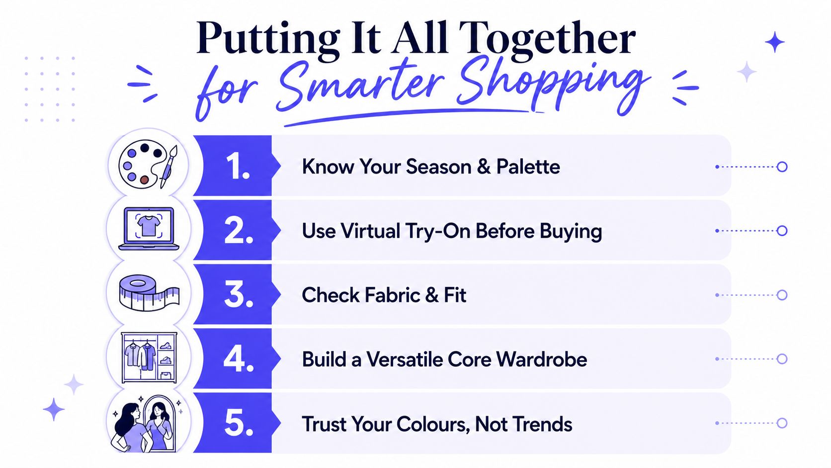
A good colour analysis works like a map at the shop and a mirror at home. It does not tell you who to be, it helps you sort through choices so you can spot the pieces that make your features look clearer, your skin look fresher, and your outfit feel more like you.
Start with the simplest check. Hold the item near your face in natural daylight, then ask whether the colour supports your colouring or starts to pull attention away from it. A soft blue that settles into your features can feel very different from a harsh shade that makes your skin look tired, even if both are “nice” colours on the rail.
Then separate the decision into layers. If the item is a top, scarf, jumper, or jacket, its colour matters more because it sits close to your face. If it is a skirt, trouser, or shoe, the colour has more room to sit in the background. That is why a palette can act as a practical filter, especially when you are choosing between a trend colour and a shade you already know feels easy to wear.
Small details can change the whole effect too. A polished set of facials can sometimes make your skin look a little brighter, which changes how certain colours sit next to your face. Makeup, jewellery, and clothing all work together in that same visual frame, so the final result is rarely about one thing alone.
If you shop online, previewing matters even more. Use the trythisfit.com/go/extension/chrome Chrome extension to check items on retailer pages, or open TryThisFit when you want to compare how different colours and outfits sit on your own image before you buy. That kind of virtual try-on can turn colour analysis into a simple shopping habit, one that helps you choose with more confidence and fewer guesswork purchases.
Try Virtual Try-On Now
See how clothes look on you before you buy - works with any online store
Get Started Free