App Preview Examples: Inspiring Store Videos for 2026
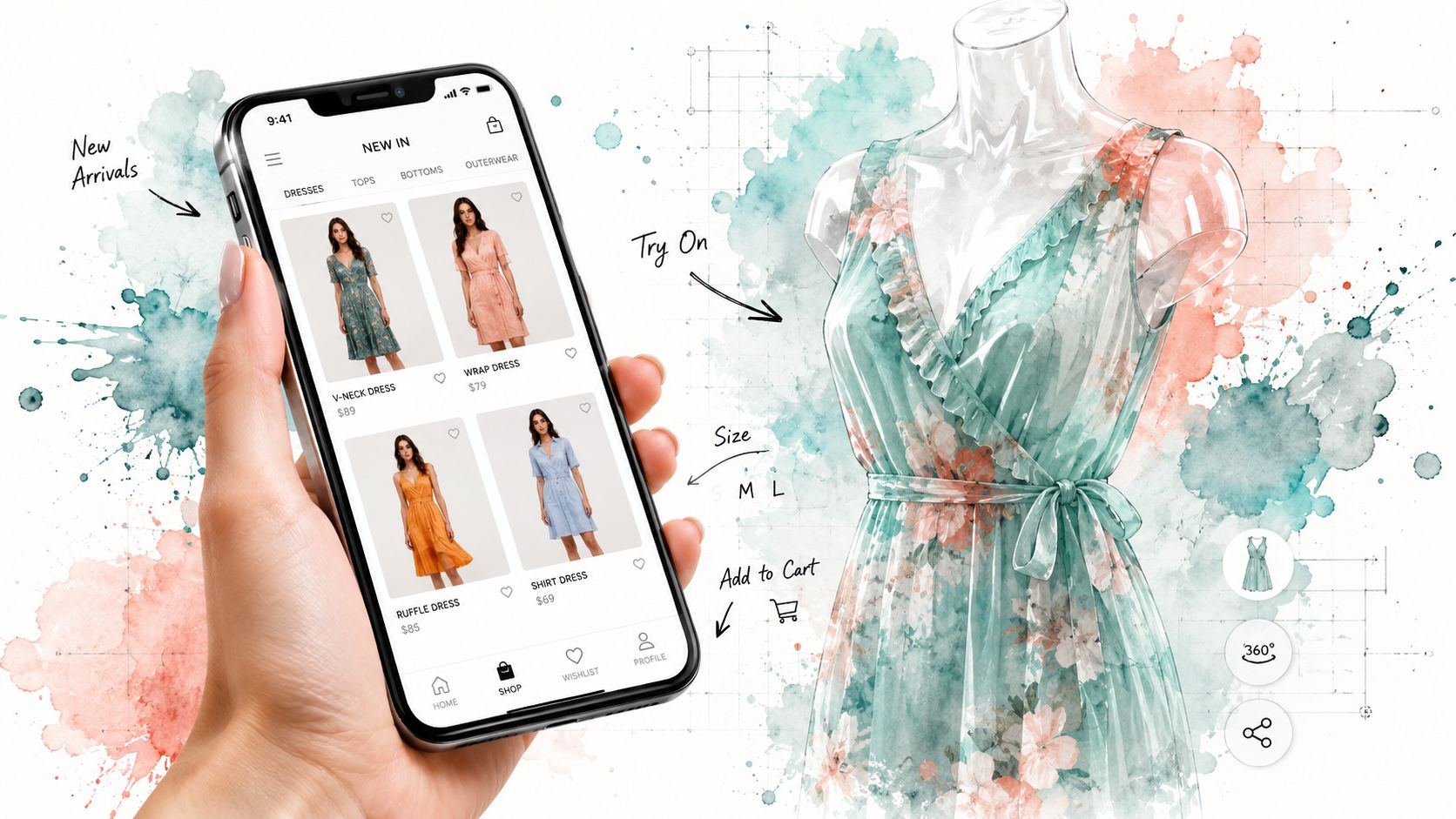
Do your app previews prove the value fast enough, or do they just decorate the page? That's the gap in most app preview examples, because a pretty clip can still fail if viewers don't understand what the app does in the first few seconds. Apple's own guidance makes that point clear, since creators are told to show the virtual object being placed or manipulated immediately so people can separate what's virtual from what's real, and to capture footage from real device interactions inside App Store Connect rather than simulations (Apple App Previews guidance).
The best previews don't just look polished, they answer a shopper's question instantly. For app marketers, that means balancing official rules, strong creative patterns, and conversion-minded tools that help you build visuals people can understand without sound, extra taps, or guesswork. If you're building for fashion, resale, or any product where visual confidence matters, the bar is even higher, because the preview has to sell the experience before the install ever happens.
1. TryThisFit
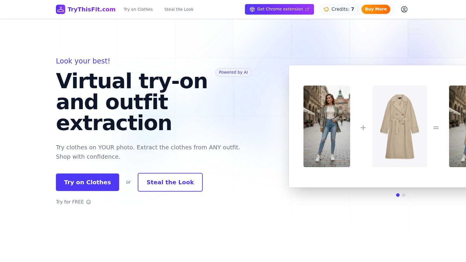
TryThisFit is the clearest example here because the preview acts like the product demo itself. Shoppers can see how clothing looks on their own photos in seconds, without creating an account, and the free Chrome extension installs quickly through the TryThisFit Chrome extension. For shoppers on Zara, H&M, Amazon, Shein, Vinted, Depop, ASOS, and similar clothing sites, the right-click flow does the heavy lifting, because the app and extension work directly on the product image and show an immediate preview without forcing a tab switch.
The visual advantage is strongest when the source image is clean. Flat-lay clothing photos usually produce the most accurate results, which matters if the preview needs to feel believable instead of generic. That lesson carries over to niche apps, too, because the strongest app previews avoid trying to show everything and focus on one unmistakable outcome quickly.
Practical rule: if the app's value is visual confidence, the preview should function as a fast before-and-after that builds trust through the image itself.
TryThisFit also matches real shopping moments that preview videos often overlook. Secondhand browsing, Halloween costume planning, and quick outfit decisions all benefit from a visual shortcut, especially when the user wants to compare style options without leaving the product page. The app's /history page adds another layer of utility, because saved try-ons make the experience feel useful over time instead of only impressive on first use.
For a fashion app, this is the kind of preview that can outperform a generic feature tour. It shows the style, the speed, and the convenience in one pass, which is why I'd start with this approach before polishing the rest of the listing. For a more detailed breakdown of the shopping use case, see TryThisFit's shopping app features, then use the preview to show how fast shoppers can visualize the style, decide what to wear, and move on with confidence.
2. Apple Developer App Previews
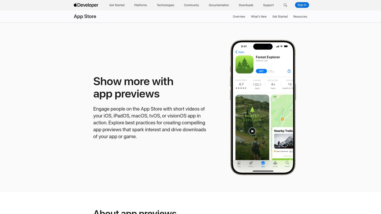
Apple's official App Previews page is the first place to check before judging any example. It lays out the production rules that matter, including planning, capture, editing, poster frames, muted autoplay behavior, and the fact that previews are managed in App Store Connect. Apple also expects previews to come from real device interactions rather than simulations, which makes the format more than branding, it is a storefront asset built for conversion (Apple App Previews guidance).
The strongest part of Apple's guidance is the attention it gives to the first few seconds. That opening window decides whether a preview earns attention or gets skipped, so effective App Store videos show the core value proposition immediately instead of easing into it slowly. Apple also says previews are 15 to 30 seconds long in the standard guidance, while the technical specification sets a minimum length of 15 seconds and a file size under 500 MB (Apple preview specifications).
That makes the page useful for compliance, but limited for creative reference. It does not work as an inspiration gallery, so it will not give you a wide mix of market examples or much creative variety on its own.
Use Apple as the baseline, then layer your own message on top. If you are building a commerce app preview, the listing should reflect the product story clearly, and the internal breakdown at TryThisFit shopping app features is a useful reference for how visual try-on apps can frame the shopping journey.
What to copy from Apple: show the core action immediately, keep the copy legible, and make the poster frame work hard because it often becomes the first visual decision point on the page.
3. Matte App Store Preview Video Examples
Matte is useful because it gives you creative patterns, not just rule summaries. Its preview examples break down formats like Quick Demo, Feature Tour, and Problem-Solution, which is exactly the kind of shorthand app marketers need when they're trying to decide how to structure a short video for conversion. The value here is sequencing, since the page focuses on pacing, the opening beat, and the logic of moving from problem to payoff quickly.
That matters because Apple's format is short and unforgiving. A preview with too many scenes looks busy, while one with too little motion feels flat, so the strongest pattern is usually a tight walk-through of 3 to 5 features with clear touch indicators and fast cuts. Matte's guidance is especially handy when you're translating a real product into a store asset, because it gives you a repeatable structure instead of a vague “make it engaging” instruction.
If I were building a preview for a shopping or fashion app, I'd use Matte-style sequencing to compress the value story. Open with the moment that matters, then show the user action, then end on the payoff without padding the middle. That keeps the viewer oriented, which is the whole game when autoplay and sound-off viewing are both part of the experience.
The limitation is that Matte is a curated teaching set, not an endless archive. You still need to benchmark your own version against your category's top apps and against the Apple rules above, because a clean idea on paper can still lose to a stronger screenshot stack.
For fast iteration, the best move is to sketch the preview flow first, then test whether each clip earns its place. If the answer is no, cut it.
4. Apptamin App Preview Poster Frames
Poster frames are one of the most underused parts of app preview examples, and Apptamin handles them like a conversion asset, not a leftover design detail. Their breakdown shows both effective and ineffective poster frames, which helps because the still image functions as a conversion asset even when autoplay is muted or delayed. On iOS 11 and later, previews autoplay in the store, but the poster frame still shapes the first impression and can carry a lot of weight before motion starts (AppDemoVideos data cited in Apple preview guidance).
Apptamin's value is in the specifics. The page doesn't stop at “pick a good thumbnail,” it shows why some poster frames create curiosity while others feel flat or confusing. That matters for commerce apps, because the frame has to signal the visual payoff immediately, especially when the preview features clothing, makeup, or another style-led choice.
I'd use this lens for TryThisFit-style assets too. The poster frame should make the try-on obvious, so the viewer knows right away they're looking at a visual preview and not a generic app promo. The internal page at TryThisFit product presentation is a useful reminder that the best listing assets make the product idea easy to read in a split second, going beyond aesthetics.
A great poster frame should work even if the video never starts.
That is the standard. If the still image cannot communicate the action, the preview is carrying too much weight in motion and not enough weight at the first glance.
5. AppScreens.store App Store Screenshot Gallery and Generator
AppScreens.store is useful when you need inspiration and production support in one place. Its main strength is scale, because it gives you a searchable archive of 5,300+ screenshot sets from 750+ apps, organized by layout patterns and ASO strategy. For app marketers, that matters because it makes repetition visible. You can see which structures top apps keep returning to, which is often more useful than scrolling through attractive screens with no pattern behind them.
The Time Machine history adds another layer for teams that want to study how screenshot galleries change over time. You can trace how apps shift positioning, and that kind of pattern review helps when you are deciding whether your own preview should tell a feature-led story, a social-proof story, or a more visual-first product demo.
The generator side pulls its weight too. It gives you templates, 3D mockups, and multi-size exports, which helps when a team needs to move from research to output without rebuilding everything from scratch. The trade-off is that the preview video tools are more basic than a full editing suite, so I'd treat the platform as a research-plus-speed tool rather than the final word in motion design. The deeper features also sit behind paid tiers, which makes sense given how much material the library covers.
For a visual commerce app, the archive is especially helpful for screenshot logic around styling and discovery. If the goal is to show clothing in context, the asset strategy should stay tied to the actual try-on experience, and photos for clothes in a virtual try-on flow is a good reference point for keeping that connection clear.
6. AppScreenshots.net App Screenshot Examples
AppScreenshots.net is the fast-start option when you want examples without friction. It gives you a curated set of screenshot examples across categories, plus a free editor with size presets and device frames for both App Store and Google Play. For teams moving quickly, the no-signup flow is the biggest practical win, because you can inspect examples and start building without setting up a full workflow first.
The site is also useful because the examples come with basic tips and templates, so the inspiration is paired with just enough guidance to be actionable. That matters for smaller teams, especially when the goal is to ship a clean store asset rather than spend days debating layout theory.
The trade-off is depth. The examples catalog is smaller than dedicated research platforms, and the more advanced functions like batch translation or broader export options sit behind paid plans. Still, for a quick first pass, that's often enough to get a listing moving.
This kind of tool is best when the app preview needs to be practical, not theatrical. If you're building a visual shopping product, the strongest next step is to get the product shots and try-on imagery aligned with the motion concept, then use the preview to show the experience in action. The main TryThisFit page at TryThisFit is a solid model for keeping the value proposition direct and visual.
7. Asoinspo Latest iOS App Store Screenshot Examples
Asoinspo is the best pick when you want to see what leading iOS apps are shipping right now. Its gallery focuses on real screenshots from top apps, so the inspiration is current rather than theoretical, and that matters in ASO because screenshot language changes as categories mature. The page is especially useful for value-prop sequencing and for spotting where successful apps place social proof or onboarding cues.
Its ASO angle also makes the gallery more tactical than a pure mood board. Instead of just showing polished screens, it points you toward the patterns that help users understand the app quickly, which is what preview assets should do in the first place. The practical FAQ on device resolutions and screenshot counts is a nice bonus because it helps you keep the asset set aligned with platform realities.
The limitation is that it's mostly iOS-centric, so Android parity isn't the main benefit. It's also inspiration only, not a creation tool, which means you'll still need a separate workflow to build the listing assets.
For fashion, resale, or costume apps, Asoinspo is useful as a pattern check. You can compare how leading apps sequence their visuals, then decide whether your own preview should lead with a transformation shot, a direct product demo, or a more lifestyle-driven frame. The key question is whether the viewer can tell, in a second or two, what the app helps them do.
7 App Preview Examples Compared
| Item | Implementation complexity 🔄 | Resources & tools ⚡ | Expected outcomes ⭐📊 | Ideal use cases 💡 | Key advantages |
|---|---|---|---|---|---|
| TryThisFit | Low, install extension, right‑click to try | Chrome/Chromium, user photos (works best with flat‑lay images) | ⭐⭐⭐, instant on‑model previews; accuracy varies with photo quality 📊 reduces checkout indecision/returns | Online & secondhand shopping, quick outfit planning, reduce returns | Instant, account‑free, privacy‑first; free Chrome extension |
| Apple Developer – App Previews | Low, read and follow official rules | Standard dev tools (QuickTime/iMovie/FCP), device assets | ⭐⭐⭐⭐, compliance and rejection risk minimization 📊 ensures App Store compatibility | Preparing App Store previews that must meet Apple's technical/creative requirements | Canonical, authoritative specs and do's/don'ts |
| Matte – App Store Preview Video Examples | Low–Medium, apply creative patterns and pacing | Video editor, assets for 15–30s clips | ⭐⭐⭐, conversion‑focused preview scripts and better first‑seconds impact 📊 improves viewer engagement | Crafting 15–30s preview videos with strong pacing for installs | Actionable, example‑driven creative frameworks |
| Apptamin – App Preview Poster Frames | Medium, design/testing of poster frames | Designer/studio resources; possible paid production | ⭐⭐⭐⭐, high‑impact thumbnails that increase conversions 📊 directly affects click/view behavior | Optimizing poster frames/thumbnails for autoplay‑off contexts | Deep, specialist analysis and tactical recommendations from a video studio |
| AppScreens.store | Medium, research + template customization | Platform subscription for full features, templates, generator | ⭐⭐⭐, faster ideation and asset production 📊 combines research and creation | Competitive research and rapid production of screenshots/previews | Large searchable gallery + built‑in generator and exports |
| AppScreenshots.net | Low, browse examples and use free editor | Free editor, size presets, device frames; no signup for basics | ⭐⭐, quick compliant screenshot sets for store listings 📊 fast turnaround for basic needs | Rapidly generating compliant screenshots without signups | Fast to start, free exports and basic editor |
| Asoinspo | Low, browse curated, up‑to‑date examples | None beyond a browser | ⭐⭐, current iOS screenshot trends and ASO patterns 📊 useful for inspiration and sequencing | Identifying what top iOS apps are shipping now; ASO pattern research | Regularly updated, ASO‑focused curation of real app screenshots |
Your Blueprint for High-Converting App Previews
The line between a browse and a download is thin, and app previews draw it. Apple's guidance gives you the rules, the preview analytics guidance tells you which moments to measure, and the best example libraries show you how real apps structure their stories so the value lands fast (Apple App Previews, advanced video analytics for app previews).
The most important lesson from these app preview examples is that polish alone doesn't convert. You need a preview that leads with the core action, keeps the message simple in sound-off viewing, and uses the right visual asset for the job, whether that's a poster frame, a screenshot sequence, or a short product demo that proves usefulness in the opening seconds.
For niche apps, especially fashion and e-commerce, the bar is even clearer. The app has to help people see how it looks, narrow choices quickly, and feel confident about style before they ever buy, which is exactly where a tool like TryThisFit stands out. It's built for instant visual try-ons, it works on major shopping sites through a free Chrome extension, and it gives marketers a realistic way to show what the app does instead of merely describing it.
If you're building or refreshing a store listing, don't start with motion graphics. Start with the answer your user wants, then build the preview around that answer. Use the official Apple specs, compare against category leaders, and test whether your preview improves installs instead of assuming video will always win. Ready to make that shift? Generate your first style preview at TryThisFit and install the free Chrome extension in seconds so you can turn product images into persuasive visuals fast.
TryThisFit helps me turn clothing images into instant visual try-ons, which makes app previews for fashion and shopping feel concrete instead of abstract. If you're building a store listing that needs to show style fast, visit TryThisFit and use the app or free Chrome extension to create a preview that helps shoppers decide what to wear.
Try Virtual Try-On Now
See how clothes look on you before you buy - works with any online store
Get Started Free