Apparel Product Presentation: Boost Sales in 2026
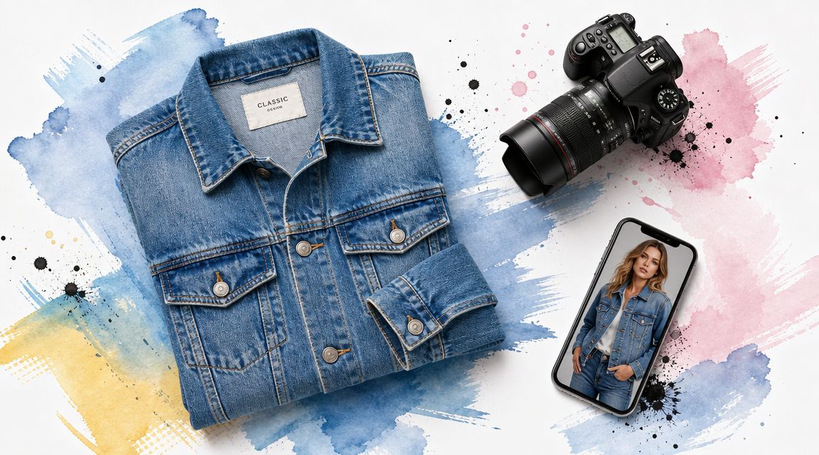
A shopper lands on your product page, likes the dress, zooms in twice, flips through six photos, then leaves. Another buys the same blouse in multiple sizes because she still can't picture the style clearly enough to commit to one choice. That pattern isn't just frustrating. It drains margin, clutters fulfillment, and turns good traffic into weak results.
In apparel, product presentation isn't a gallery problem. It's a confidence problem. Shoppers don't just need to see the garment. They need enough visual clarity to imagine the shape, texture, styling, and overall appearance in real life.
The stores that handle this well don't always have huge budgets. They usually have a sharper system. They show the product in a way that reduces guesswork, and they make the path from browsing to decision feel easy.
Why Your Product Presentation Is Costing You Sales
Most apparel listings fail in a very ordinary way. They show the item, but they don't help the shopper visualize the style.
That gap shows up at the worst moments. A shopper adds to cart, pauses, and wonders if the neckline will feel too wide, if the skirt will look too stiff, or if the color will flatter her usual wardrobe. If the page doesn't answer that visually, hesitation wins.
The real issue is memory and clarity
A product page competes with distraction. Shoppers are comparing tabs, checking prices, and bouncing between marketplaces. If your presentation is text-heavy or visually muddy, the item becomes forgettable fast.
Research summarized by Visme found that visual content can increase information retention by 15% compared with verbal-only presentations, and that after three hours people remember 85% of content when paired with visuals versus 70% for verbal-only content, according to Visme's presentation statistics roundup. That matters in e-commerce because apparel decisions are often made after a shopper leaves, thinks, compares, and comes back.
Practical rule: If the shopper can't grasp the appeal of the item at a glance, the listing is asking her to do too much work.
What weak apparel pages usually get wrong
Some stores overload the page with repetitive angles that don't add new information. Others post one clean image and assume the product will sell itself. Neither approach helps much.
Useful presentation answers different questions at once:
- What is it really like in color, shape, and construction
- How does it look when worn in a styled context
- Why should I trust this listing enough to buy without touching the garment
If you're rebuilding your image process, a solid foundation is learning strong product photography tips that focus on clarity, consistency, and realistic presentation.
The upside is simple. Better product presentation doesn't require more noise. It requires better visual decisions, in the right order.
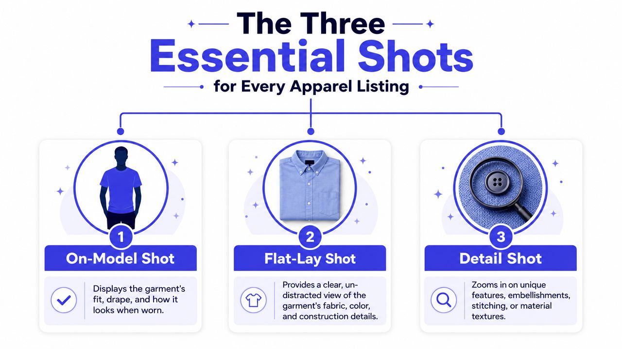
The Three Essential Shots for Every Apparel Listing
A strong listing doesn't need endless photos. It needs the right three.
Each image should do a separate job. When all three are present, the shopper gets a fuller read on the garment without feeling buried in clutter.
Start with the flat-lay shot
The flat-lay is the most underrated image in apparel.
It strips away styling noise and shows the garment itself. You see the outline, sleeves, length, print placement, collar shape, and overall construction in one clean frame. For online shopping, that's often the clearest truth-telling shot in the whole set.
Flat-lays are also especially useful when you want shoppers to preview appearance with virtual try-on tools later, because the garment is isolated and easy to read visually. In practice, that means fewer distractions from pose, background, or dramatic lighting.
Keep this shot simple:
- Use a neutral surface so the garment color stays believable
- Smooth the fabric fully so the silhouette reads clearly
- Center the item cleanly with enough breathing room around it
Add the on-model shot
Shoppers still need a human reference. That's where the on-model image earns its place.
This shot gives context that a flat-lay can't. It shows drape, proportion, styling mood, and how the item behaves on a body in motion or in a natural stance. A blazer can look boxy in a flat-lay and polished on a person. A slip dress can look plain folded and elegant once worn.
The on-model shot sells the outfit idea. The flat-lay sells the garment itself.
Use this image to answer visual questions quickly. Is the top cropped-looking or full-length in styling? Does the skirt hang straight or move softly? Does the jacket read casual, fitted, or oversized?
Finish with the detail shot
The detail image is where you prove quality.
This is the close-up of stitching, ribbing, pleats, lining, hardware, buttons, zipper finish, embroidery, or fabric texture. It's the shot that reassures a shopper the item isn't just attractive from a distance. It has material character.
A useful detail shot usually focuses on one thing, not five things at once. Pick the feature that carries the strongest buying signal.
| Shot type | What it answers | Common mistake |
|---|---|---|
| Flat-lay | Shape, color, structure | Wrinkles or messy framing |
| On-model | Drape, styling, silhouette | Over-styled scene hides garment |
| Detail | Texture, finish, craftsmanship | Close-up is too dark or too tight |
Tim Wackel's summary of sales presentation research reports that if a presentation includes video, consumers are 85% more likely to buy the product or service, as noted in this sales presentation research summary. For apparel, that reinforces a practical lesson. Static images are your base, but richer visual media often helps buyers commit because they can read the product faster and with more confidence.
If you already have these three shots, your listing is no longer just showing inventory. It's guiding a decision.
Mastering Lighting and Composition Without a Pro Studio
You don't need a rented loft, a giant softbox, or a production crew to make apparel look polished. You need light that's forgiving and composition that stays out of the product's way.
Natural daylight is usually enough. A large window does more for clothing than a harsh overhead bulb ever will.
Use light that keeps color believable
The easiest setup is a window with indirect light. Shoot near it, not in a beam of direct sun. Direct sun creates hard shadows, blown highlights, and color shifts that make fabric look cheaper or wrong.
Cloudy days are great for this. So are times when the sun isn't hitting the garment directly.
A few practical fixes make a small setup work better:
- Face the garment toward the window so the light spreads evenly
- Turn off mixed indoor lighting to avoid strange yellow or blue casts
- Use white foam board on the darker side if you need a softer fill
Research summarized by Visme notes that visual content can improve retention and make content more memorable, which is why image quality matters so much when a customer is deciding what to buy from a screen. If you're refining your setup, this guide to clothes product photography is a useful companion for apparel-specific image choices.
Compose for quick understanding
Good composition feels invisible. The shopper notices the item, not your camera technique.
That usually means a clean background, straight framing, and enough negative space to keep the garment from feeling cramped. White board, light wood, plain concrete, or a neutral wall all work if they don't compete for attention.
Duarte's guidance, summarized in the Visme research above, includes the idea that a slide should pass a 3-second glance test. The same instinct works on a product page. A shopper should understand the item almost instantly.
Clean composition doesn't make a photo boring. It makes the product easier to trust.
Keep a few framing habits consistent
Small consistency choices create a more premium store feel than most owners expect.
- Match camera height across similar products so categories feel organized
- Leave similar margins around garments in every frame
- Crop intentionally so hems, sleeves, and collars aren't awkwardly clipped
- Reserve dramatic angles for editorials, not core product shots
If your photos feel "almost good" but not convincing, lighting is usually too harsh or framing is doing too much. Pull it back. Simpler almost always wins in apparel product presentation.
A Fast and Repeatable Workflow for Product Assets
The stores that publish sharp-looking listings every week rarely rely on inspiration. They rely on a system.
Ad hoc shooting creates visual drift. One blouse gets morning light, another gets warm kitchen light, the third gets photographed three days later on a different background. The result is a storefront that feels patched together even when the products are strong.
Build around a weekly batch
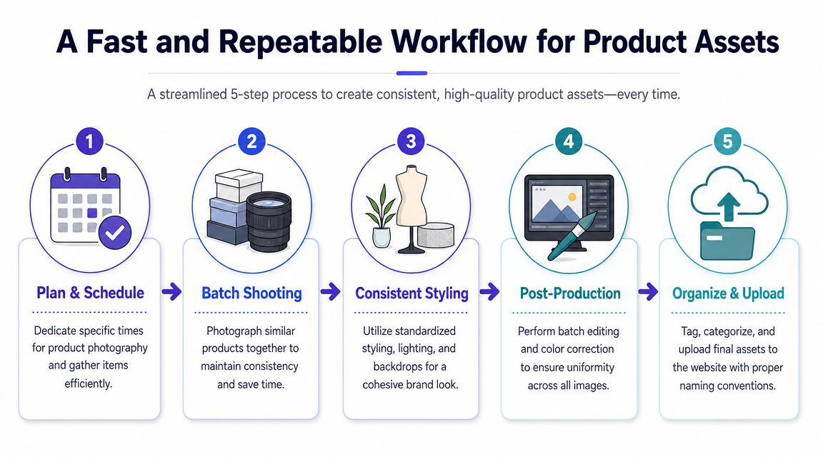
A repeatable workflow starts with batching. Photograph similar items together, in the same light, with the same setup.
That does two things. It cuts decision fatigue, and it gives the whole catalog a consistent visual rhythm. Dresses look like they belong together. Knitwear looks deliberate. New arrivals don't feel visually disconnected from older bestsellers.
A simple batch routine works well:
- Prep everything first. Steam, lint-roll, shape collars, fasten buttons, and sort by category.
- Shoot by image type. Do all flat-lays first, then on-models, then detail shots.
- Edit in groups. Apply the same corrections to similar fabrics and tones.
- Name files clearly. Product name, color, angle, and final version help later.
- Upload with consistency. Keep image order standard across every listing.
Let business goals drive the asset list
Good workflows start before the camera comes out. Guidance on product-oriented data products recommends starting from business goals, translating them into requirements, then building iteratively with feedback and testing, as explained in this workflow guide from Product Leadership.
That same logic applies here. If customers often ask about texture, your process needs stronger detail shots. If they struggle to understand silhouette, the on-model image needs to move earlier in the gallery. Asset creation works better when it reflects real buyer friction.
For stores that run on Shopify, it also helps to check practical specs for perfect Shopify product photos so your polished images don't lose impact once uploaded and resized.
A short visual walkthrough can help if you're building this into a team routine:
<iframe width="100%" style="aspect-ratio: 16 / 9;" src="https://www.youtube.com/embed/Q1b365iSh2o" frameborder="0" allow="autoplay; encrypted-media" allowfullscreen></iframe>Standardize the parts that shouldn't change
Don't reinvent your setup for every product.
Use the same backdrop family, similar crop rules, a fixed editing preset, and one shared checklist before upload. That leaves more creative energy for styling decisions that matter.
| Workflow stage | What to standardize | What can vary |
|---|---|---|
| Prep | Steaming, lint removal, naming | Styling pairings |
| Shooting | Background, light direction, framing | Garment-specific posing |
| Editing | Exposure baseline, white balance, crop ratio | Fabric-specific fine tuning |
| Upload | Image order, alt text pattern, file naming | Collection merchandising |
A repeatable workflow doesn't make your store look repetitive. It makes your catalog feel intentional.
Go Beyond Static Images with Virtual Try-On
A shopper lands on a dress page, scrolls through clean photos, likes the color, and still hesitates. The product is clear. The personal outcome is not.
That gap shows up constantly in apparel. Customers can judge fabric, length, and styling cues from strong images, but they still need help answering a more personal question. Will this look like me, or like the model, the mannequin, or the flat lay? That uncertainty is one of the biggest reasons a good product page still fails to convert.
Virtual try-on closes part of that gap by shifting the job of the image gallery. Static photography explains the garment. An AI clothing try-on tool helps the shopper visualize the style on their own photo, which is especially useful for apparel categories where mood, silhouette, and personal taste drive the decision as much as product specs.
Where virtual try-on adds the most value
This works best in categories where customers buy with their eyes first and verify details second.
Dresses, outerwear, occasionwear, costumes, and trend-led pieces all benefit because the shopper is making a fast style judgment. The same goes for secondhand and marketplace listings, where the original photography is often inconsistent. A wrinkled resale image can still generate a sale if the shopper can preview the style on themselves instead of trying to mentally reconstruct it from a weak listing photo.

I also see strong use cases when customers are comparing near-identical options. A beige trench, a black mini dress, a cropped blazer. On a standard product page, those choices blur together quickly. A personal preview gives each option context, which makes the decision easier and often reduces speculative ordering.
Set expectations clearly
Virtual try-on helps with style visualization. It does not confirm exact fit, fabric weight, or how a garment moves in real life.
That distinction matters. If a brand presents try-on as a styling tool, customers understand what they are getting and trust it more. If a brand implies sizing precision the tool cannot verify, disappointment follows. For apparel teams, the smart position is simple. Use virtual try-on to answer "how might this look on me?" while your core photos, size chart, and copy answer the rest.
Image quality still affects the result. Flat-lay photos with clear edges usually produce the strongest preview. Busy backgrounds, heavy folds, or awkwardly shot garments make interpretation harder. Good source images and virtual try-on work together. One does not replace the other.
That balance mirrors the broader direction of assisted commerce. Zinc's piece on the modern AI shopping agent explains how shopping tools are becoming part discovery layer and part decision support. Virtual try-on fits that pattern well because it reduces hesitation at the exact moment a shopper is trying to picture the outcome.
For apparel brands, the practical takeaway is straightforward. Product photos show the item. Virtual try-on helps the customer picture the style on themselves, which is often the missing step between browsing and buying.
Optimizing Placement to Boost Conversions and Cut Returns
A shopper lands on a dress page from Instagram, likes the color, scrolls once, and still cannot answer two basic questions. What does the garment look like without the pose, and what should they click next to picture the style on themselves? That hesitation costs the sale, or worse, it creates a weak purchase decision that comes back as a return.
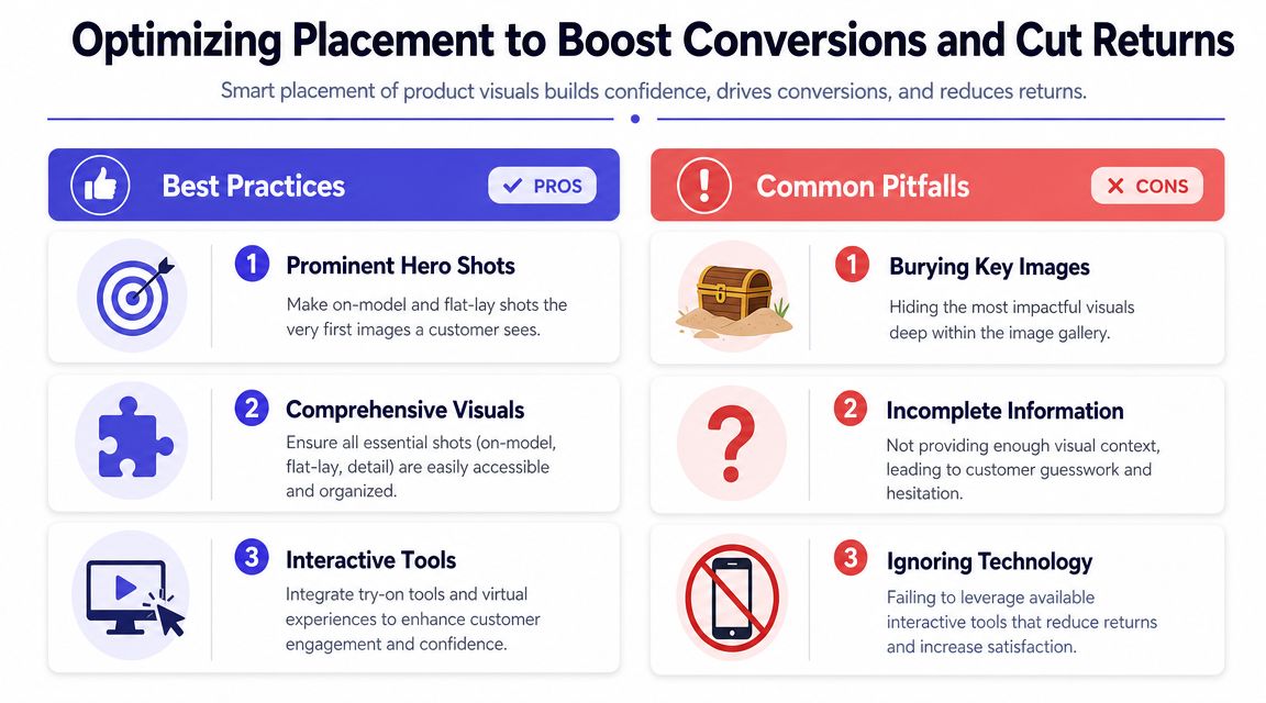
Placement shapes how fast uncertainty drops. On apparel pages, that matters as much as the photos themselves. A strong asset in slot eight does very little. A flat-lay, fabric close-up, or try-on prompt placed early can shorten the path to purchase because the customer gets answers before doubt builds.
Put the most decision-helpful visuals first
The first screen has one job. Reduce guesswork.
Laurie Brown's guidance on technical presentations points to the five-second rule in this article on communicating data clearly. The same principle applies on a product page. If a shopper cannot identify the item, read its silhouette, and spot the next useful action right away, the page is asking them to work too hard.
For apparel, a practical image order usually looks like this:
- Hero image with instant clarity. Use the clearest on-model shot or flat-lay, depending on which explains the product faster.
- Second image that answers the obvious missing question. If the hero is styled on-model, follow with the flat-lay or front view.
- Detail shot that proves quality. Show texture, stitching, closure, or fabric finish.
- Style-assist asset. Place the virtual try-on prompt or preview option where it is visible before the shopper loses momentum.
- Motion or extra lifestyle content. Useful, but only after the core buying questions are covered.
That order is not about aesthetics alone. It is merchandising. Apparel teams that place information in the order customers need it make buying easier and reduce speculative orders.
Test one placement change at a time
Teams often redesign the gallery, move the CTA, update thumbnails, and add a new styling feature in the same sprint. Then nobody knows which change improved performance.
Run cleaner tests. Move the flat-lay from slot four to slot two. Put the try-on CTA beside Add to Cart instead of under the image stack. Replace a vague label with one that explains the value. Measure the result against one clear signal, such as click-through to cart or lower return reasons tied to unmet expectations.
A simple test plan usually beats a complicated dashboard.
If you want a broader framework for page merchandising, CTA placement, and conversion friction, this guide on improving ecommerce conversion rates with stronger product-page decisions is a useful next read.
Placement mistakes that hurt performance
Small layout choices create large buying gaps on apparel pages, especially when customers are trying to judge style, silhouette, and material from a screen.
- Key images are buried deep in the carousel instead of appearing in the first few positions
- The virtual try-on prompt is hard to find or treated like a secondary feature when it should support the buying decision near the main CTA
- CTA copy is vague and fails to explain why the click is useful
- Too many nearby buttons compete for attention around the buy area
- Visual proof is incomplete so shoppers still have to guess about drape, texture, or structure
I have seen this repeatedly with apparel catalogs. Brands invest in better imagery, then hide the most persuasive asset behind decorative shots or interface clutter. The result is predictable. Shoppers either leave or buy with an incomplete picture of the product.
A style-preview action works best when its purpose is obvious at a glance. "See this style on you" or "Preview this look on your photo" gives the shopper a reason to click. A generic icon or clever label adds friction instead of confidence.
TryThisFit fits best in that high-intent zone near the gallery and Add to Cart area, where customers are actively deciding whether the item matches their personal style. Used that way, it does more than add novelty. It helps close the imagination gap that static apparel images often leave behind, which is exactly where many abandoned sessions and preventable returns begin.
Try Virtual Try-On Now
See how clothes look on you before you buy - works with any online store
Get Started Free