What Colors Complement Each Other for Standout Outfits
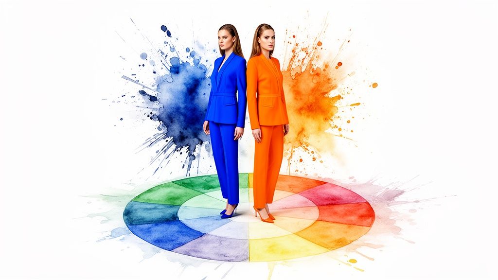
Ever stood in front of your closet and wondered why some color combinations just click? It’s not magic—it's complementary colors. These are the power couples of the fashion world, sitting directly opposite each other on the color wheel.
Think about the electric sizzle of blue and orange together, or the rich, regal vibe you get from purple and yellow. These pairings create an incredible, eye-catching contrast that makes any outfit feel alive and intentional.
Your Instant Guide to Complementary Colors
Let's dive right into the fun part. This is your cheat sheet for crafting those show-stopping looks without any of the guesswork. I've put together a simple table with some of the most classic and powerful color pairings to get your creative juices flowing.
Classic Complementary Color Pairings for Fashion
So, what's the big deal with complementary colors? They're your secret weapon for making a statement. Since they're total opposites on the color wheel, they create the most intense contrast possible, which has the awesome effect of making each color look even brighter and more vibrant when paired together.
For instance, imagine pairing a deep purple blouse with a striking golden-yellow skirt for a look that is instantly luxurious and bold. Or, think about how a simple navy blue sweater pops when you wear it with a pair of burnt orange pants. It’s classic, but with a jolt of energy.
But what if you're not sure how these combos will look on you? I get it. It's one thing to see colors on a wheel, but another to picture them as an actual outfit.
That’s exactly why I built an app called TryThisFit. It lets you see how any outfit looks on your own body using just a picture of the clothes. It works best with flat-lay photos of your clothing items.
Think about it: you could be browsing Zara, right-click a blue dress with the Chrome extension, and instantly see it paired with that orange bag you’ve been eyeing. You can visualize the style without the "what ifs."
The free Chrome extension is a game-changer for online shopping. Whether you're on H&M, Vinted, or Amazon, you just right-click an item you like to see how it looks. It takes just a couple of seconds to install the Chrome extension.
Here’s a quick-reference table to get you started on your color-blocking journey.
| Color 1 | Complementary Color 2 | Outfit Idea |
|---|---|---|
| Red | Green | A chic forest green blazer layered over a simple red dress. |
| Blue | Orange | Your favorite navy blue jeans with a punchy tangerine top. |
| Yellow | Purple | A cozy lavender sweater perfectly balanced with mustard yellow trousers. |
| Teal | Coral | Breezy coral shorts paired with a flowy teal blouse for a perfect summer vibe. |
| Lime | Magenta | A bold magenta skirt that gets a fun, modern twist from a lime green t-shirt. |
These pairings are just the beginning. The real fun starts when you make them your own.
Unlocking the Secrets of the Color Wheel
To really nail which colors look amazing together, you have to start with the foundation: the color wheel. Forget thinking of it as some stuffy artist's tool. It's the ultimate style cheat sheet—a visual map that shows you exactly why some color combos feel so right.
Believe it or not, this all goes back to 1666, when Sir Isaac Newton was playing around with prisms and light. He was the first to organize colors into a circle, and that discovery laid the groundwork for all the color theory used in fashion today. If you're a history buff, you can dive deeper into the origins of color theory.
The Building Blocks of Style
At its heart, the color wheel is surprisingly simple. It all starts with just three primary colors: red, yellow, and blue. Think of them as the parent colors—you can't mix anything to get them.
- Secondary Colors: This is what you get when you mix two primaries. Red + yellow gives you orange, yellow + blue creates green, and blue + red makes a rich purple.
- Tertiary Colors: Now we're getting fancy. Mix a primary color with one of its secondary neighbors, and you get those beautiful in-between shades like a fiery red-orange or a cool blue-green.
These twelve hues make up the full color wheel. Getting this down is the key to unlocking some seriously stunning outfit combinations.
This diagram shows off the most dramatic relationship of all—complementary colors.
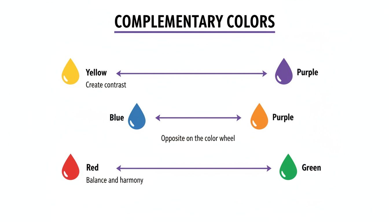
As you can see, colors sitting directly across from each other create a high-impact, vibrant contrast that just works. They're a match made in fashion heaven!
So, Why Does This Matter for Your Closet?
Learning the wheel isn't just trivia; it's a superpower. It frees you from the guessing game and gives you a solid framework for putting together balanced, intentional outfits that turn heads.
Now, here’s where the real fun begins. What if you could take all this theory and see it in action—on yourself—without ever leaving your couch? I actually built a tool for this! It’s called TryThisFit, and it lets you instantly visualize any color combination on your own photo.
Instead of just wondering if that green Zara top will work with those red pants, you can actually see it. This takes the theory and makes it totally practical and personal to you.
The best part? There’s a free Chrome extension. When you’re shopping on sites like Amazon or H&M, you can just right-click an item and see how it looks on you in seconds. Go ahead and install the Chrome extension in 5 seconds to start bringing your best color combos to life.
Ready to Go Beyond the Basics? Let's Talk Advanced Color Combos
Okay, so you’ve mastered the art of complementary colors—that high-impact, head-turning magic. But what's next? It's time to explore the more sophisticated color schemes that professional stylists use to build outfits that are truly unforgettable.
Think of these as the "secret recipes" of the fashion world. They create a sense of harmony, balance, and visual interest that looks incredibly polished and intentional.
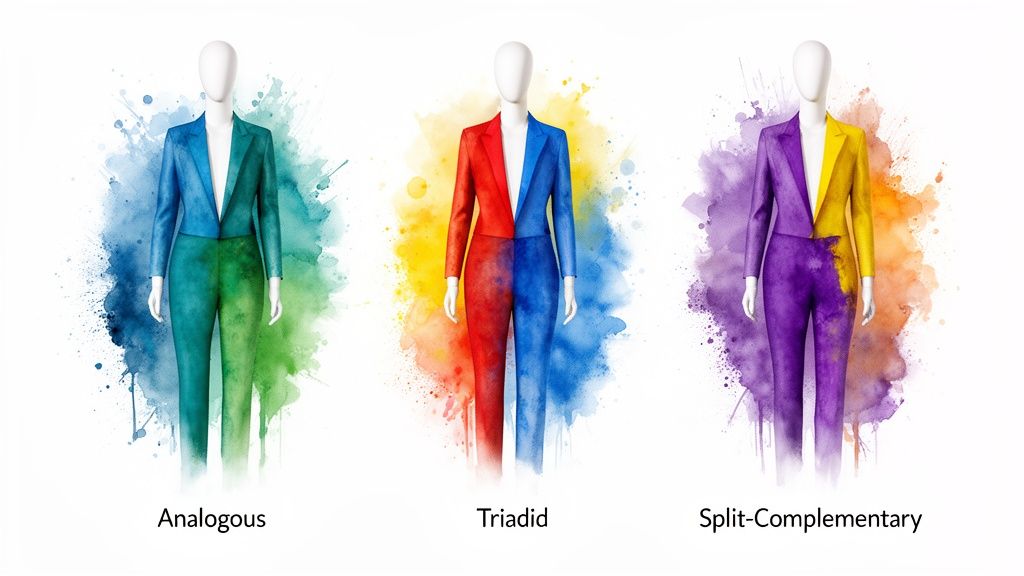
Don't let the fancy names scare you off! These concepts are actually super intuitive once you start playing with them. Let's break them down.
Analogous Colors: The Art of Subtle Harmony
First up, we have analogous colors. These are basically color wheel besties—any three colors that sit right next to each other. Picture a beautiful blue, and then grab its neighbors: a cool teal and a deep indigo.
Because these shades are so closely related, they blend together effortlessly to create a serene and cohesive look. It’s the perfect strategy for crafting an elegant, low-contrast outfit that still feels rich with color.
Triadic Colors: A Bold and Balanced Trio
Feeling a bit more adventurous? A triadic scheme is your ticket to a vibrant, dynamic look. This is where you pick three colors that are evenly spaced on the color wheel, forming a perfect triangle. The most famous trio? The primary colors: red, yellow, and blue.
This combination is all about high-energy fun and visual balance. It’s playful and guaranteed to get you noticed, but it never feels chaotic.
Split-Complementary Colors: The Softer Side of Contrast
Finally, let's talk about the split-complementary scheme. This is a genius little twist on the standard complementary pairing. Instead of picking the color directly opposite your base hue, you pick the two colors right next to its opposite.
This gives you all the eye-catching punch of a complementary look but with a softer, more nuanced feel. It’s a fantastic way to experiment with contrast without it feeling overwhelming. To learn more, check out my complete guide on how to match clothes colors.
To help visualize how these work in practice, here's a quick cheat sheet:
Exploring Different Color Harmonies
| Color Scheme | How It Works | Fashion Example |
|---|---|---|
| Analogous | Picks 3 colors that are side-by-side on the color wheel. | A sky-blue top, teal scarf, and navy blue pants. |
| Triadic | Uses 3 colors that are evenly spaced apart, forming a triangle. | A purple blazer, green trousers, and an orange handbag. |
| Split-Complementary | A base color plus the 2 colors adjacent to its direct complement. | A red dress paired with blue-green earrings and yellow-green shoes. |
Seeing these concepts laid out is one thing, but the real fun begins when you apply them to your own wardrobe.
The real magic happens when you stop theorizing and start trying things on. It’s one thing to read about a triadic combo, but it's another to actually see how it looks on you.
This is exactly why I built the TryThisFit app. It's designed to take all these cool color theory ideas and put them directly onto your photo. You can take a flat-lay picture of a red top and instantly see how it looks with a pair of blue-green pants, creating that perfect split-complementary outfit in seconds.
The free Chrome extension works on any site, from Zara to Vinted. Just right-click an item you love and start building your next look. Install the Chrome extension and turn color theory into your personal style superpower.
Using Color Contrast to Make Outfits Pop
Ever wonder what makes a truly jaw-dropping outfit work? It’s not just about picking nice colors; it's about the magic of how they play together. Color contrast is the secret ingredient that injects life and energy into your style, making it feel deliberate and dynamic.
Think about a bright yellow top paired with deep navy jeans. That's a high-contrast look, and it's full of energy. On the flip side, a creamy sweater paired with soft beige trousers gives off a totally different vibe—subtle, sophisticated, and seamless.
The Secret Law of Color Contrast
This isn't some new fashion trend; it's an idea with deep roots in the art world. Back in the 1830s, a chemist named Michel Eugène Chevreul stumbled upon what he called the "law of simultaneous contrast." He figured out that colors actually change how we see the colors next to them. For a deeper dive, you can explore the historical development of color theory.
His discovery means you can make colors seem brighter and richer just by pairing them smartly. It's an incredible tool for your closet!
High vs. Low Contrast Outfits
So, how do you put this into practice? Let's break it down into two simple approaches you can start using right away.
-
High-Contrast Power Moves: This is all about pairing colors that are wildly different in brightness or hue. This technique is the heart of color blocking, where you use solid chunks of color to make a powerful statement. If that sounds like your kind of fun, you should check out my guide with more color blocking outfit ideas.
-
Low-Contrast Sophistication: This is the opposite approach. Here, you're using colors that are close relatives, like soft pastels together or different shades of the same color for a chic monochromatic look. Imagine a light gray blazer over a charcoal top—it’s sleek, unified, and effortlessly cool.

But how do you know if a high-contrast combo will look amazing or just... loud? The only way to know for sure is to see it. Guessing is risky, especially when you're shopping online from places like Zara or Shein.
This is where a virtual preview becomes your secret weapon. Instead of just wondering if that electric blue skirt will clash with your favorite orange top, you can actually see the combo on your own photo in seconds.
I built the TryThisFit app for this exact dilemma. You can upload a flat-lay photo of any item and immediately see how the contrast plays out on you. Install the Chrome extension in 5 seconds and start making color contrast your superpower.
Visualize Your Perfect Color Pairings Instantly
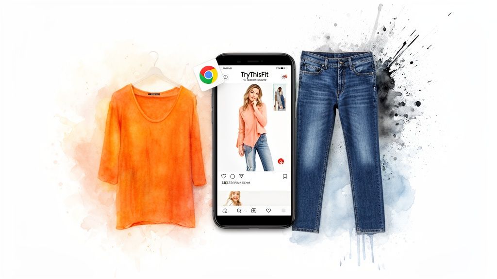
Reading about color theory is one thing, but seeing it on yourself? That's a total game-changer! Instead of just wondering if that vibrant orange top will actually work with your favorite blue jeans, you can see exactly how the style looks in seconds.
I'm going to walk you through using the TryThisFit app to preview any color combination right on your own photo. All you need is a quick picture of a clothing item laid flat. It's the ultimate way to experiment with confidence and figure out what colors complement each other on you.
See Your Style Ideas Come to Life
This visual magic isn't just a cool trick; it's actually rooted in science. Ewald Hering’s Opponent-Colors Theory identified innate color pairs like red-green and blue-yellow that are hardwired into how we see the world. That's why these combinations are so powerful in fashion.
The AI behind the TryThisFit app taps into these very principles, letting you test these powerful combinations on any shopping site. This helps you avoid the dreaded "looks different in person" return, saving you time and money.
This is how you take theory and make it deeply personal. You're not just matching colors from a wheel; you're seeing how they vibe with your hair, your skin tone, and your unique style. It’s the fastest way to build an outfit you'll absolutely love wearing.
The free Chrome extension is a must-have if you shop online—it installs in seconds and no account is needed! You can just right-click any piece of clothing on sites like Zara, H&M, or Vinted and instantly see the appearance.
For even more great tips, check out my guide on using a clothes color matching app. Ready to stop guessing and start seeing? Try it now at trythisfit.com and discover your perfect color pairings today.
Putting It All Together for a Colorful Wardrobe
<iframe width="100%" style="aspect-ratio: 16 / 9;" src="https://www.youtube.com/embed/XDThBOFWdzw" frameborder="0" allow="autoplay; encrypted-media" allowfullscreen></iframe>Okay, you've got the color theory fundamentals and the tools on your side—now for the fun part! Let’s bring it all together to build a wardrobe that’s bursting with color and confidence. Think of this as your roadmap to seeing all the incredible outfit possibilities you've been missing.
The whole point is to swap confusion for creativity. Your style journey is all about experimenting, having a blast, and finding what makes you feel absolutely amazing.
Your Colorful Wardrobe Checklist
Consider these your fail-safe starting points for pulling together incredible looks. No matter the occasion, there’s a color harmony perfect for you.
-
Complementary Colors: Want to turn heads? This is your go-to. Pairing opposites on the color wheel, like a brilliant blue with a zesty orange, creates an electric, high-contrast look.
-
Analogous Colors: For an effortlessly chic vibe, stick with colors that are neighbors on the wheel. Think lush green, deep teal, and cool blue. The result is a beautifully cohesive look that feels totally put-together.
-
Triadic Colors: When you're in a playful mood, try a triadic scheme! Pick three colors that are evenly spaced, like a rich purple, an earthy green, and a splash of orange. Let one color be the star and use the other two as fun accents.
But the real game-changer? Seeing these ideas come to life before you get dressed. Instead of just guessing how that new color combo will look, you can see it instantly with TryThisFit. Just upload a flat-lay photo of an item you already own and start styling.
The best confidence boost comes from seeing your style ideas work in real-time. A tool that shows you what an outfit actually looks like is your secret weapon for skipping buyer's remorse and discovering combinations you never would have thought to try.
The free Chrome extension is a lifesaver for online shopping and installs in seconds. See something you love on Zara, H&M, or Vinted? Just right-click the item to instantly see how it looks on your own photo.
If you want to play with color on a smaller scale, trying out different nail polish discovery sets can be a fantastic way to experiment. You've got everything you need—go build a wardrobe that’s 100% you.
Let's Answer Your Burning Color Questions
Alright, let's dive into some of the questions I hear all the time about mixing and matching colors. Think of this as your friendly cheat sheet to start building killer color combos right now.
What Are the Top 3 Can't-Miss Color Combinations?
Look, style is all about personal taste, but some pairings just work. If you want a foolproof place to start, these three are absolute winners.
- Blue & Orange: This is a classic complementary pair for a reason. It's bold, it's energetic, and it’s perfectly balanced. Think a deep navy sweater with a burnt orange skirt—stunning!
- Green & Pink: Don't be afraid of this one! It gives off such a fresh, playful vibe that feels incredibly chic and modern. From soft pastel mint and blush to a vibrant emerald and hot pink, it’s a surprisingly versatile duo.
- Tan & White: You can never, ever go wrong here. This is the epitome of effortless sophistication. It’s clean, it’s timeless, and it always looks expensive.
Can I Actually Wear More Than Two Colors at Once?
Heck yes, you can! The secret isn't avoiding color, it's all about creating balance. This is where a triadic color scheme becomes your best friend.
Remember those three colors evenly spaced on the wheel, like red, yellow, and blue? The trick is to pick one to be the star of the show—your main piece—and use the other two as supporting actors in your accessories. This gives you a vibrant look without ever feeling chaotic.
How Do I Figure Out Which Colors Look Good on Me?
This is the big one, isn't it? While learning about warm and cool undertones is a great starting point, nothing beats seeing the color right up against your skin. A shirt can look amazing on the hanger but totally wash you out once you put it on.
Beyond just the basic color wheel, you can get really specific by finding your ideal color palette based on your unique features.
Ultimately, though, seeing is believing. That's why a virtual try-on tool like TryThisFit is such a game-changer. You can upload your picture and instantly see how that bright yellow top from H&M or that emerald green dress from Amazon actually looks against your skin tone. No more guessing games, just finding the colors that make you absolutely shine.
Ready to stop guessing and start seeing what colors truly complement your style? Visualize your next great outfit in seconds with TryThisFit. Install the free Chrome extension to begin your color adventure.
Try Virtual Try-On Now
See how clothes look on you before you buy - works with any online store
Get Started Free