Comparing Products on Amazon: A Smarter Shopper's Guide
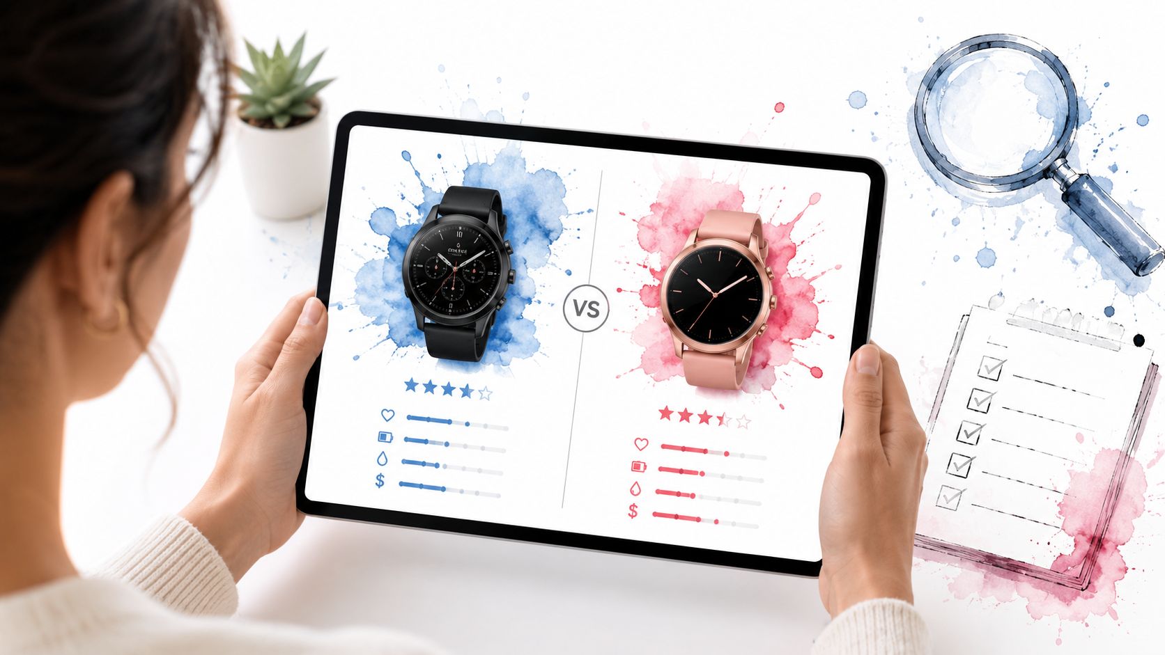
You've probably done this already today. Three Amazon tabs become eight, then twelve, and suddenly you're comparing two nearly identical dresses, one sweater with better photos but worse reviews, and a “similar item” that wasn't even on your shortlist five minutes ago.
That spiral happens because Amazon makes choice easy and judgment hard. The good news is that comparing products on Amazon gets much faster once you stop browsing randomly and start checking the same signals in the same order.
The Amazon Abyss Why Smart Comparison Is Essential
Amazon is where most shoppers already want to buy, so your comparison process has to work there first. In a consumer preference study, 89% of surveyed consumers said they were more likely to purchase from Amazon than from any other e-commerce site (Feedvisor's 2019 Amazon consumer behavior report).
That matters because a weak comparison habit on Amazon doesn't just waste a few minutes. It pushes you toward rushed decisions in the marketplace you're most likely to use anyway.
I treat Amazon like a crowded department store with excellent filters and noisy merchandising. The platform gives you a lot of useful data, but it also buries the most important clues under polished titles, recycled product bullets, and images that can make two very different items look almost identical.
| What shoppers usually do | What works better |
|---|---|
| Open endless tabs | Narrow to 3 finalists fast |
| Trust star rating first | Read recent patterns before averages |
| Compare only price | Compare total risk, quality, and return hassle |
| Rely on polished images | Inspect what the photos omit |
| Buy the first “good enough” option | Use a repeatable checklist |
Why Amazon rewards disciplined shoppers
The biggest mistake isn't buying a bad product. It's comparing inconsistently.
One listing gets judged on reviews, another on photos, another on shipping speed. That's how mediocre options slip through. If I'm shopping fashion, I also check whether the listing visuals are doing real work or just hiding weak details. If you want a better sense of what strong product imagery should include, this 2026 Amazon image size guide is useful because it shows what well-prepared listings tend to get right visually.
Practical rule: If two products seem tied, the one with clearer information usually stays on my list longer than the one with prettier marketing.
The fix is simple. Use the same comparison framework every time, then make your decision from that structure instead of from impulse.
Your 7-Point Amazon Comparison Framework
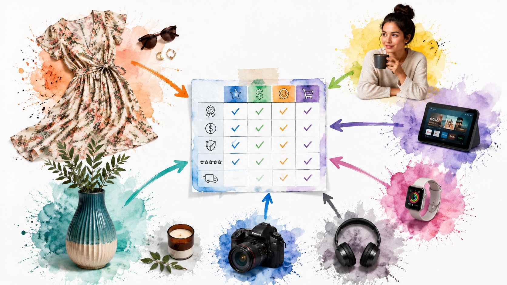
I use a short checklist before I buy anything on Amazon. It works for an air purifier, a carry-on backpack, or a summer dress. The categories don't change, only the details inside them.
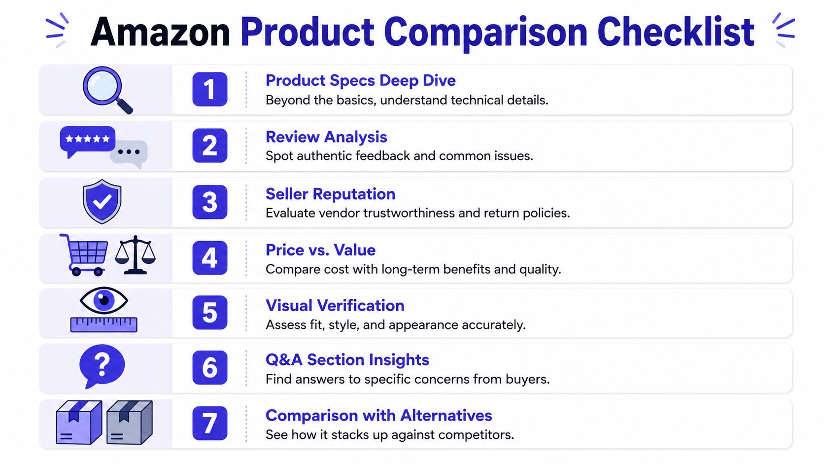
The fast version of the checklist
-
Technical specifications Start with the hard facts. Size, material callouts, care instructions, included components, and product variant details tell you whether two listings are comparable.
-
Materials and build quality
Titles often oversell quality. The product description, bullets, and close-up photos usually reveal whether something is sturdy, soft, lined, lightweight, or cheaply finished. -
Seller and shipping information
A strong product from a messy seller can still become a bad buying experience. I always check who's selling it, how it ships, and whether the delivery window fits the urgency of the purchase. -
Product images and what they hide
Photos aren't just decoration. They reveal seam quality, scale, texture, hardware, drape, and whether the seller is avoiding key angles. -
Customer reviews
Reviews help most when you read them for patterns, not applause. Repeated complaints about fabric, durability, color mismatch, or misleading dimensions matter more than a high-level star average. -
Questions and answers
The Q&A section often surfaces the exact issue the listing glosses over. That's where shoppers ask about transparency, shrinkage, sleeve length, charger compatibility, or whether a bag holds a laptop. -
Return policy
The policy reveals real risk. A product can look great until you realize the return process is annoying, slow, or unclear.
How I keep the checklist practical
I don't score every product with a giant spreadsheet unless I'm comparing expensive items. For most purchases, I just jot one line under each of the seven points and look for the product with the fewest compromises.
If you're curious how developers and shopping tools pull structured marketplace data into cleaner workflows, this explainer on Zinc for Amazon API access gives helpful context on why external comparison tools can feel so much more usable than Amazon's own interface.
The best product usually isn't the one with the most hype. It's the one with the fewest unanswered questions.
Decoding Specs and Reading Between the Reviews
Specs look objective, but they often create false confidence. Reviews look messy, but that's usually where the true story lives.
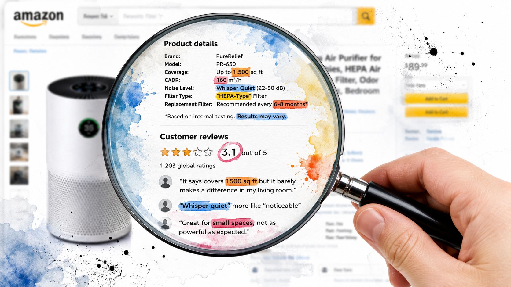
Read specs like a filter, not a verdict
When shoppers build side-by-side comparisons, they often prioritize concrete details such as model number, capacity, volume, and brand in their comparison matrix, based on a manual comparison dataset with 15,000 human-annotated sentences referenced in this Amazon marketplace comparison overview.
That matches how I shop. I don't read every bullet with equal weight. I isolate the few details that change the buying decision.
For electronics, that might be ports, wattage, battery capacity, or model generation. For luggage, it's weight, expansion, wheel design, and handle construction. For fashion, I care more about fabric composition, lining, closure type, care instructions, and whether the photos show movement or only a front-facing pose.
Here's the trap. Sellers know shoppers skim. So they load titles and bullets with feature language that sounds impressive but doesn't help you compare the item against another listing.
A simple way to separate signal from fluff
Use this test on every bullet point:
- Decision-changing detail. Would this alter your choice between Product A and Product B?
- Marketing filler. Does it sound nice without telling you anything measurable or visible?
- Missing context. Does the listing mention a feature but avoid showing it clearly in photos?
If a detail can't help you choose, it doesn't belong at the top of your mental list.
Review volume isn't the same as review quality
Many Amazon shoppers frequently get burned. A huge review count can make an item feel safer than it is.
One under-discussed idea is the statistical weight vs. volume paradox. A Reddit discussion on comparing Amazon products argues that a 4.5-star product with 10,000 reviews can be worse than a 4.2-star product with 800 reviews because review velocity, recency, and sentiment distribution matter, and it further claims that 68% of “top-rated” Amazon fashion items show review aging, with positive sentiment dropping 25% in the last quarter (discussion reference).
I wouldn't shop from the star average alone anyway. I want to know whether the listing is getting worse, not whether it was great a year ago.
Watch for drift: Recent reviews tell you what the product is now, not what it used to be.
How I read Amazon reviews quickly
I look for three things:
- Recent complaints that repeat. If multiple recent buyers mention thinning fabric, broken zippers, poor stitching, or color mismatch, I believe the pattern.
- Specific praise. “Looks expensive,” “held shape after washing,” or “material feels substantial” carries more weight than generic praise.
- Mismatch between photos and owner feedback. If the listing looks polished but buyers keep uploading disappointing real-life images, that's a warning.
For fashion especially, text reviews still leave one major gap. You can learn plenty about quality and consistency, but you still may not know how the style will look once it leaves the listing page.
Mastering Your Side-by-Side Evaluation Workflow
Amazon's built-in comparison tools are fine for a first glance. They're not enough for a serious decision.
The native “compare with similar items” area can help you spot obvious differences, but it usually favors convenience over clarity. It doesn't capture your own priorities, and it rarely reflects how people evaluate alternatives across brands.
Behavioral research found that online behavior involving co-visited products from different brands has a considerably greater effect on focal product purchases than behavior related to products from the same brand, which supports the way shoppers naturally compare across categories and competitors (ScienceDirect abstract).
My manual workflow for comparing products on Amazon
I use a notes app for smaller purchases and a spreadsheet for bigger ones. The point isn't to build a masterpiece. The point is to get the noise out of your head.
-
Start with three finalists
More than that usually creates clutter. If I have seven options, I cut four immediately based on obvious misses like poor photos, weak recent reviews, or unclear materials. -
Create simple columns
I use product name, price, top pro, top concern, seller, shipping, return note, and final gut check. -
Add one line per product
This forces clarity. If you can't summarize the product in one useful sentence, the listing probably isn't giving you enough confidence. -
Compare across brands on purpose
Don't stay inside one brand family if the alternatives aren't better. Cross-brand comparison is often where the strongest option appears.
What goes in my notes
- Best visible strength. “Heavier knit,” “clearer dimensions,” “better zipper photos.”
- Biggest uncertainty. “Recent complaints about shrinkage,” “seller seems inconsistent.”
- Decision trigger. “Buy if style wins,” “only buy if fast delivery matters.”
For clothing, I also leave a space for visual notes. That's where I track whether the neckline, sleeve shape, length, or silhouette is the style I want.
If you want a stronger general shopping process, these smart online shopping tips are a good companion to this workflow because they reinforce the habit of comparing with intention instead of reacting to listing polish.
A comparison system works best when it's boring. Boring means repeatable, and repeatable means fewer mistakes.
The Missing Piece Visually Comparing Styles Instantly
You've narrowed five listings to two. The fabric looks right. Reviews seem solid. Returns are easy. Then a crucial question shows up. Which one will look like you once it arrives?
That is the gap standard Amazon comparison misses, especially for fashion.
Specs answer practical questions. Visual checking answers style questions. Both matter, but they do different jobs. A dress can have the better material blend and cleaner review history, yet still lose because the neckline feels wrong, the skirt shape looks flat, or the whole silhouette misses the look you wanted.
I run into this constantly with Amazon fashion because listing photos are built to sell, not to compare. The model pose changes. Lighting changes. One brand uses close-ups, another uses wide shots, and a third barely shows the back. That makes side-by-side judgment harder than it should be.
Cross-site shopping makes it worse. You may start on Amazon, then check Zara, H&M, Shein, Vinted, or Depop for a better version of the same idea. At that point, text notes are still useful, but they stop short of answering the biggest return-risk question. Does this style work for me?
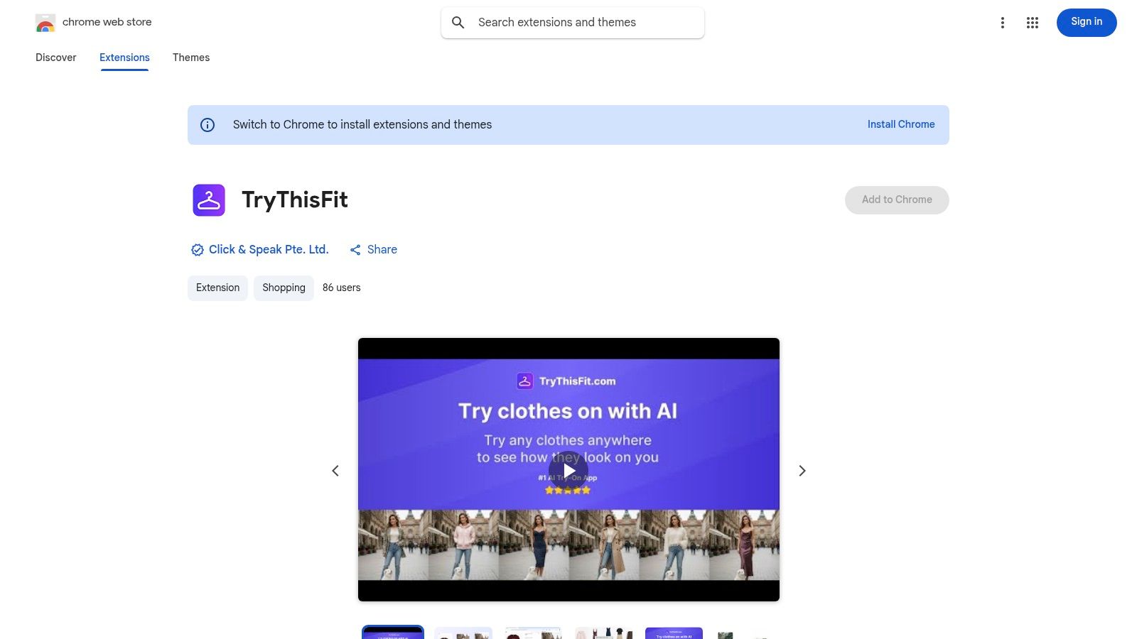
I use TryThisFit for that last check. It fills the visual style verification gap that ordinary comparison frameworks leave open. Instead of guessing from polished product photos, I can preview how a piece looks before I buy, which is often the difference between a confident order and a return waiting to happen.
The browser workflow is what makes it practical. I can right-click a product image while I shop and preview the style without rebuilding my process or opening a separate research rabbit hole. Stack Overflow has a clear technical explanation of Chrome right-click menus, which is the interaction behind that kind of quick image-based action.
Flat-lay photos usually give the cleanest result. Clean front-facing product images also work well. Busy lifestyle shots can still be useful, but they are less consistent, so I treat them as a secondary check rather than my final call.
If you want to test that workflow on your next order, this Amazon virtual try-on guide shows the fastest way to compare styles during a normal browsing session.
Here's a quick look at how the visual workflow feels in practice:
<iframe width="100%" style="aspect-ratio: 16 / 9;" src="https://www.youtube.com/embed/6SSp06xPhP8" frameborder="0" allow="autoplay; encrypted-media" allowfullscreen></iframe>The payoff is simple. I stop treating two listings as equal just because the specs look close. I can see that one reads polished and sharp while the other feels softer or less flattering, even before I get to checkout.
That kind of visual check is the missing piece in Amazon product comparison for clothing. Reviews help. Seller checks help. Price tracking helps. Style verification closes the loop.
Putting It All Together From Dresses to Decor
The system gets much easier once you use it on a real purchase. A summer dress is a perfect example because Amazon gives you plenty of data, but style is still the deciding factor.
Example one choosing between three Amazon dresses
Say you're comparing three casual dresses. One has the prettiest listing photos, one has more believable recent reviews, and one ships fastest.
I'd start with the seven-point check. First, I'd compare fabric notes, lining, sleeve shape, closure, and care details. Then I'd scan recent reviews for repeat complaints, check seller reliability, and make sure the return process looks painless. After that, I'd compare the style visually and drop the option that doesn't match the look I want.
Here's the kind of visual example that helps when you're deciding between silhouettes:
When two listings look equally “good” on paper, appearance is often the real tiebreaker.
Example two secondhand shopping without guesswork
This matters even more on Vinted and Depop. Secondhand listings often have limited descriptions, mixed photo quality, and little room for error.
In that situation, a visual preview is useful because you can see how the style looks before you commit. That's a major advantage when returns aren't realistic and you're trying to judge whether a piece feels classic, dramatic, oversized, minimal, or just not you.
Example three planning a Halloween look
Halloween shopping is another fun use case. You can compare individual pieces from Amazon, Shein, and other sites, then preview the appearance of each item before placing an order.
A costume idea often sounds better than it looks. Seeing the style first helps you cut weak options quickly and keep the combinations that feel right.
Here's a relevant visual example for that kind of shopping:
Your New Confident Amazon Shopping Strategy
You do not need a new decision process every time you open Amazon. A repeatable system beats impulse, especially once listings start to blur together and every option claims to be the best.
The seven-point framework gives you that system. Check the specs. Verify materials. Look at seller quality, product photos, review patterns, Q and A, and the return policy. Then add one more step for fashion and other appearance-driven buys. Confirm how the style looks on you before you check out.
That visual check is the gap that causes a lot of bad clothing purchases. Two dresses can have similar ratings, similar fabric notes, and similar review language, yet one fits your style and the other goes straight into a return bag. Standard comparison advice rarely solves that problem well. A visual style check does.
I use the same approach across categories because the logic holds up. Compare the hard facts first. Then compare the actual fit, scale, or appearance that determines whether you will enjoy owning it. That is why strong niche resources such as these fit-aware bike guides are useful. They respect the reality that good buying decisions depend on context, not just product specs.
If you want a practical follow-up, this guide to buying with more confidence online complements the workflow well and helps turn scattered browsing into clear decisions.
The result is simple. Fewer guess-based purchases. Fewer returns. More items that feel right the first time, whether you are buying a dress, a backpack, or a lamp for the living room.
Try Virtual Try-On Now
See how clothes look on you before you buy - works with any online store
Get Started Free