Ecommerce Conversion Rate: Boost Your Sales in 2026
Most stores don't have a traffic problem. They have a conversion problem.
The benchmark that changes the conversation is this: the global average ecommerce conversion rate is 2.66%, according to Dynamic Yield's benchmark data. That means most visitors leave without buying. Even strong stores feel this gap every day.
For fashion, the challenge gets more specific. People rarely hesitate because they can't click a button. They hesitate because they can't fully picture the item on themselves, in their style, in real life. That confidence gap is where a lot of revenue slips away.
Your Store Is Getting Clicks But Not Sales
A store owner opens analytics after a busy week. Traffic is up. Product pages got attention. Carts filled up. Sales barely moved.
That moment is common because visits don't pay the bills. Purchases do. The metric that tells you whether your store is turning attention into revenue is your ecommerce conversion rate.
Top stores separate themselves here. They don't just attract visitors. They help shoppers feel ready to buy. That's why the gap between average stores and standout stores can feel so dramatic in practice, even when both are getting traffic.
Why this hurts more than it looks
If your store gets a lot of interest but weak sales, it's tempting to blame ad targeting, seasonality, or price. Sometimes those factors matter. But often the core issue is friction or uncertainty inside the buying journey.
A shopper may like the product and still leave because:
- The page feels slow: hesitation starts fast when pages drag.
- The decision feels risky: especially in apparel, where appearance matters.
- The checkout asks for too much: extra steps create second thoughts.
- The store doesn't feel reassuring: trust has to be visible.
For a useful outside perspective on practical ways to improve conversion rates, I like resources that focus on buyer behavior instead of vague growth talk.
One of the biggest leaks sits near the end of the funnel. If you're seeing strong product interest but weak completion, this guide on online shopping cart abandonment is a helpful companion because it breaks down why shoppers stop short right before purchase.
Stores don't usually lose sales in one dramatic moment. They lose them in a chain of tiny doubts.
That's why conversion rate matters so much. It isn't just a number in a dashboard. It's a readout of how confident, comfortable, and motivated your shoppers feel while buying.
What Is Ecommerce Conversion Rate and How Do You Calculate It
At its simplest, ecommerce conversion rate is the percentage of visits that turn into orders.
Imagine a physical store. A hundred people walk in. Some browse, some pick things up, some ask questions. The conversion rate tells you how many walk out having bought something.
The formula in plain English
The standard formula for ecommerce conversion rate is (total orders / total sessions) × 100, and benchmarks from Triple Whale note that the global average hovers around 1.9–2%, Shopify stores often average 2.5–3%, and the top 10% of stores achieve 4.7% or higher.

A simple example
If your store had 5,000 sessions and 100 orders, the math would look like this:
| Store metric | Value |
|---|---|
| Total sessions | 5,000 |
| Total orders | 100 |
| Conversion formula | 100 / 5,000 × 100 |
| Conversion rate | 2% |
It's as simple as that. No advanced analytics degree required.
Where people get confused
The biggest confusion is usually the denominator. Some tools talk about visitors, others talk about sessions. The benchmark above uses sessions, so if you're comparing your store to published ecommerce benchmarks, make sure you're using the same base.
Another common mistake is treating conversion rate like a grade. It isn't. It's more like a health signal. A lower rate tells you shoppers are getting stuck somewhere. A higher rate usually means your pages, offer, trust signals, and buying flow are working together.
If you want another practical perspective on ways to improve ecommerce conversion rates, it helps to compare your own funnel against stores with similar buying journeys rather than chasing a random universal target.
Practical rule: Calculate conversion rate the same way every time. Consistency matters more than fancy reporting.
Once you know your number, the next question is the one every store owner asks. Is it good?
Conversion Rate Benchmarks You Should Know
A benchmark works like a sizing chart. It does not tell you exactly what will fit your store, but it gives you a reliable starting point.
That context matters because conversion rates change with the kind of decision a shopper is making. Buying a snack is fast. Buying a dress is different. The shopper is asking more questions, feeling more uncertainty, and needing more confidence before clicking "Buy."
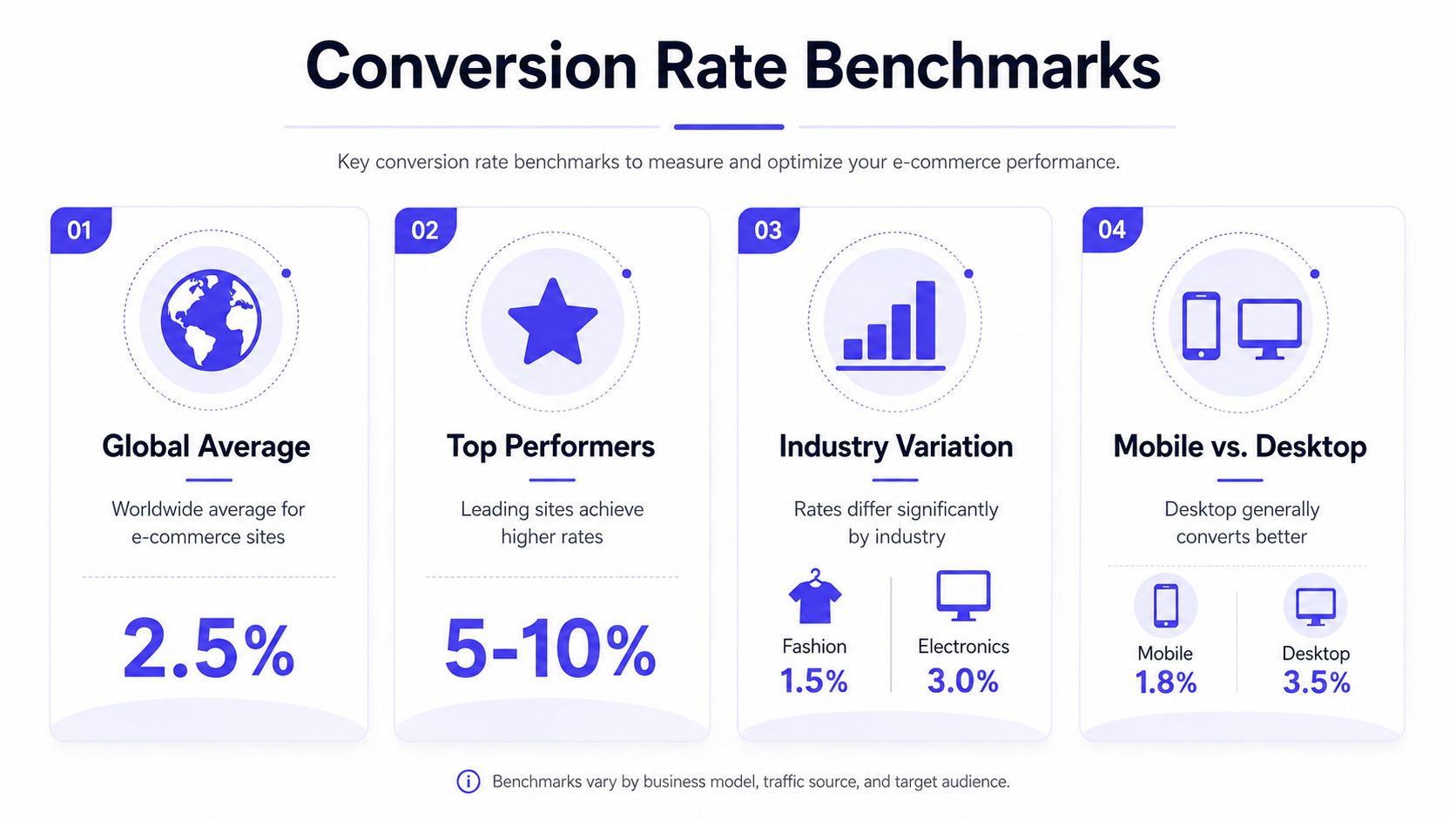
As mentioned earlier, Dynamic Yield's benchmarks show a global average ecommerce conversion rate of 2.66%. The same data puts fashion and apparel at 4.07% and food and beverage at 6.04%. Device also changes the picture. Desktop averages 2.6%, while mobile falls between 1.8% and 2.3%.
How to use benchmarks without misreading them
Benchmarks are diagnostic tools. They help you ask better questions.
Start broad, then get more specific. The global average gives you orientation. Your industry benchmark gives you a fairer comparison. Your device benchmark helps you spot where confidence or usability may be breaking down.
That last point matters a lot for apparel.
If a clothing store converts reasonably well on desktop but struggles on mobile, the issue may not be price or product appeal. Shoppers may be having trouble judging fit, fabric, or silhouette on a smaller screen. In other words, the store is not just losing clicks. It is losing confidence.
A quick benchmark table
| Benchmark area | Typical reference point |
|---|---|
| Global average | 2.66% |
| Fashion and apparel | 4.07% |
| Food and beverage | 6.04% |
| Desktop | 2.6% |
| Mobile | 1.8% to 2.3% |
A useful way to read this table is to compare like with like:
- Global benchmark: a starting point for general context
- Industry benchmark: a better check on whether your category is underperforming
- Device benchmark: a clue to friction, clarity, or confidence problems in the shopping experience
For apparel brands, benchmarks become more useful when you pair them with shopper behavior. Broader online retail trends shaping how people browse and buy can help explain why a store looks healthy in one channel and weak in another.
The main takeaway is simple. A "good" conversion rate depends on what you sell, how people shop for it, and how confident they feel making the decision. For fashion stores especially, the benchmark is not just about traffic quality or checkout flow. It often reflects whether shoppers can clearly picture the product on themselves before they buy.
Key Factors That Influence Your Conversion Rate
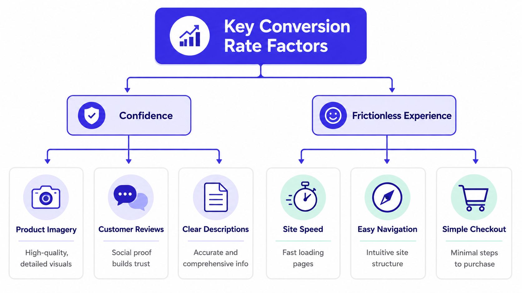
Shoppers buy when two things happen at the same time. They trust the store, and the path to purchase feels easy.
When either piece breaks, conversion drops. That's why the best way to think about optimization isn't as a list of hacks. It's as a confidence-building system.
Friction kills momentum
Slow pages are one of the clearest examples. Wiro notes that slow site performance is a primary cause of conversion loss, and that a 1-second delay in page load time can reduce conversions by 7%. The same source says meeting Google's Core Web Vitals is foundational for a smooth shopping experience.
That matters because shoppers don't experience "page performance" as a technical metric. They experience it as annoyance.
A delay creates tiny doubts:
- Is this site reliable?
- Did my click work?
- Do I want to keep waiting?
- Will checkout feel just as clunky?
Confidence shapes the decision
Trust doesn't come from one badge or one polished banner. It comes from the total experience on the page.
A strong product page usually includes:
- Clear visuals: shoppers need to inspect the item without guessing.
- Useful descriptions: material, details, and style cues reduce hesitation.
- Visible reassurance: payment options, return info, and shipping clarity calm nerves.
- Easy navigation: people shouldn't have to hunt for basic answers.
In apparel, one confidence problem stands out above the rest. Shoppers often can't tell how a piece will look on them. Not size. Not measurements. The appearance. The vibe. The silhouette. That visual uncertainty can stop a purchase even when the product itself is appealing.
Why apparel behaves differently
Fashion shopping is emotional and visual. People aren't only buying fabric. They're buying a look they hope matches their taste, mood, or occasion.
A product page succeeds when it replaces guessing with clarity.
That's why the same store can have decent traffic, good prices, and an orderly checkout, yet still struggle. The product page may not be giving shoppers enough confidence to imagine the item in their own life.
When you frame conversion this way, the work becomes much clearer. Remove friction. Increase confidence. The best tactics do both.
Evidence-Backed Strategies to Boost Conversions
Once you know where conversion friction comes from, the next step is choosing fixes that influence buyer behavior.
Not every tactic has the same weight. Some improve polish. Others directly change whether a shopper feels safe enough, informed enough, or excited enough to buy. Those are the ones worth prioritizing.
Start with trust and relevance
A product with visible social proof usually feels less risky than a product page that looks empty. That's one reason reviews matter so much.
Red Stag Fulfillment reports that products with 50+ reviews convert 4.6x better than those without reviews, and that AI-powered product recommendations can increase conversion rates by 10–15% when the suggestions are relevant to the shopper.
That gives you two practical levers right away:
- Grow review depth: ask for reviews consistently and show them near the buying decision.
- Recommend the right next item: related styling pieces or complementary products work better than random bestsellers.
- Reduce buyer anxiety: make shipping, returns, and payment details easy to spot.
- Improve product imagery: zoom, multiple angles, and visual clarity reduce guesswork.
Clean up the buying path
A lot of stores lose sales because they make the buying process feel heavier than it needs to be.
Review your flow with fresh eyes. Look for places where the shopper has to stop, think, or hunt for information. In many cases, small simplifications outperform flashy redesigns.
Good examples include:
- Shorter checkout paths that don't force unnecessary steps
- Better product page hierarchy so the most important information appears first
- Clearer mobile interactions because small-screen friction adds up fast
If you want a broader set of strategies for boosting conversions, look for advice grounded in shopping psychology, not just button-color folklore.
Focus on the product page decision
For apparel stores, the product page usually carries the heaviest load. That's where the shopper decides whether the item feels right for their style.
A great product page doesn't just describe the garment. It helps the shopper mentally try it on. The more vividly they can picture the appearance, the less abstract the purchase feels.
Buyers convert faster when the page answers their silent questions before they ask them.
That means your strongest opportunities often aren't buried deep in analytics. They're sitting in plain sight on the product page: visuals, reviews, clarity, reassurance, and the shopper's ability to imagine the end result.
If you improve those first, conversion work starts feeling less mysterious and much more practical.
A Modern Solution to Visual Uncertainty
A lot of apparel purchases stall for one simple reason. The shopper likes the item, but they do not feel confident about how it will look on their own body.
That hesitation comes from visual uncertainty. In plain terms, the customer cannot complete the mental picture. And when the picture is fuzzy, the purchase feels risky.
Why visual confidence matters so much
Gorgias highlights fit confidence on the product page as a major driver for apparel performance, including return behavior. For fashion stores, that idea goes beyond measurements. Shoppers also want confidence in the look, the shape, and the overall feel of the item on them.
That helps explain why many stores improve speed, simplify checkout, and still see hesitation on product pages. The operational pieces may be cleaner, but the shopper is still stuck on a basic question: "Will this actually suit me?"
Imagine buying paint from a tiny color swatch. The information is there, but the final result still feels uncertain until you can see it in context.
How visual preview tools reduce hesitation
A good virtual try-on app for online shopping helps close that confidence gap. It gives shoppers a faster way to move from guesswork to a real visual impression.
That matters most in moments like these:
- Big retail sites: browsing Zara, H&M, Shein, and similar stores
- Marketplace shopping: comparing multiple fashion options on Amazon fashion finds
- Secondhand purchases: checking resale listings on Vinted or Depop before taking the risk
- Seasonal looks: testing costumes or event outfits before buying
- Style experiments: trying a color or silhouette that feels outside your usual choices
The value is practical. Instead of asking the shopper to imagine the outcome from a flat product image, the tool gives them a clearer visual reference. That can increase confidence at the exact point where many apparel purchases slow down.
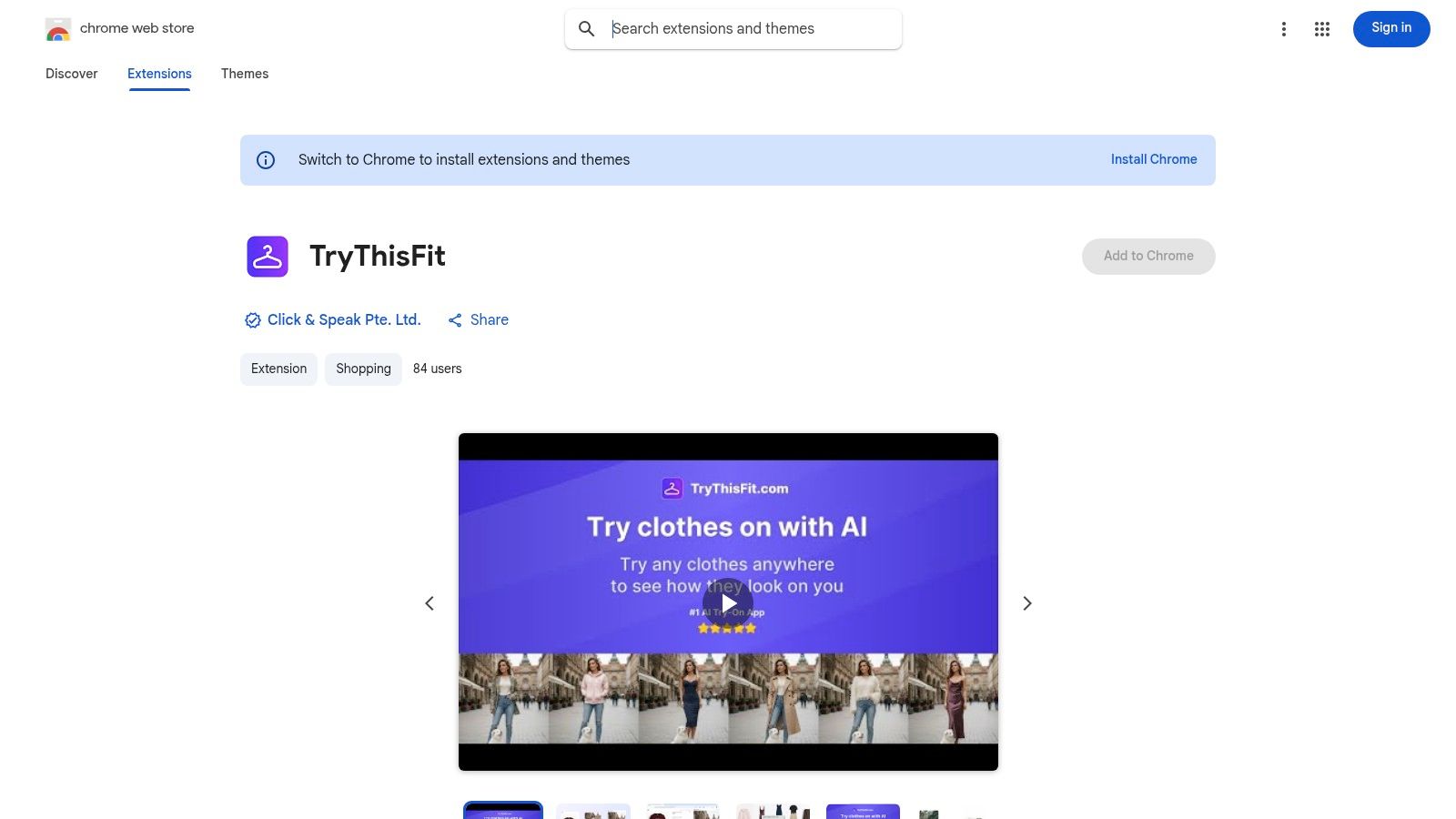
TryThisFit focuses on that problem. It lets shoppers preview how a clothing item may look on them while they browse, which makes it easier to judge style, shape, and overall vibe before buying.
Flat-lay clothing photos usually produce the clearest previews. That makes the experience especially useful on standard product pages and secondhand listings where the item is shown cleanly on its own.
A quick walkthrough helps make that real:
<iframe width="100%" style="aspect-ratio: 16 / 9;" src="https://www.youtube.com/embed/EUJ-ytRdnk0" frameborder="0" allow="autoplay; encrypted-media" allowfullscreen></iframe>What that changes for the shopper
The biggest shift is confidence. The shopper no longer has to do all the visual work in their head.
Now they can answer practical questions faster:
- Does this fit my style
- Do I like how this shape looks on me
- Is this worth adding to cart
- Does this secondhand or costume purchase feel safe enough to try
For apparel brands, that matters because conversion rate is often a confidence problem before it is a traffic problem. The clearer the customer can see the outcome, the easier it becomes to say yes.
Measuring Success and Creating Your Action Plan
Conversion work improves when you treat it like tuning a store, not redecorating a room. You make one change, watch how shoppers respond, keep what helps, and remove what gets in the way. That steady rhythm beats random redesigns because it shows you what changed buyer behavior.
Start small.
A lot of teams lose clarity by changing the homepage, product pages, and checkout at the same time. Then the conversion rate moves and no one knows why. A better approach is to pick the part of the journey where confidence is breaking down first.
Pick one focus area first
Use the point of hesitation as your guide:
- Slow pages: fix load and responsiveness first
- Weak trust signals: add reviews, delivery details, returns info, and reassurance
- Unclear product pages: improve photos, copy, sizing guidance, and visual context
- Checkout friction: remove extra steps and unnecessary fields
This makes testing cleaner. It also matches how shoppers buy. If a customer feels unsure on the product page, a prettier cart will not solve that earlier doubt.
Track before and after
Set a baseline before you change anything. Record your current ecommerce conversion rate, then compare results after the update goes live.
A simple action table keeps the process grounded:
| Step | What to do | Why it matters |
|---|---|---|
| Baseline | Record current conversion rate | Gives you a clear starting point |
| Choose one fix | Speed, product page, trust, or checkout | Keeps testing clean |
| Measure result | Compare before and after | Shows whether the change helped |
| Keep iterating | Move to the next priority | Builds improvement over time |
Watch a few supporting signals too. Product page engagement, add-to-cart rate, and checkout completion can show where confidence improves and where it still drops off. Those smaller signals work like trail markers. They help you spot the exact stretch of the journey that needs attention.
Build around customer confidence
The bigger lesson is simple. Conversion rate rises when shoppers feel more certain.
For apparel stores, that certainty often depends on what the customer can picture. They are not only asking, "Is this a good product?" They are asking, "Will this look right on me?" If that question stays fuzzy, hesitation stays high.
A practical action plan looks like this:
- Make the store fast and easy to use.
- Make product pages trustworthy.
- Make the decision feel clear.
- Reduce visual uncertainty where style and fit are hard to judge.
That last point matters more than many brands expect. In apparel, confidence often breaks at the moment the shopper tries to mentally translate a flat product image into a real outcome on their own body. As noted earlier, tools that reduce that visual guesswork can help remove one of the biggest blockers between a click and a sale.
You're not only trying to raise a metric. You're helping a real person feel ready to buy.
Try Virtual Try-On Now
See how clothes look on you before you buy - works with any online store
Get Started Free