Reduce Online Shopping Cart Abandonment: Top Strategies 2026

You add a jacket, a dress, or a pair of boots to your cart, then stop. That tiny pause is one of the biggest habits in ecommerce.
It also happens far more often than most shoppers realize. Globally, online shopping cart abandonment averaged about 70.19% in 2024, which means roughly 7 out of 10 carts never turn into completed orders, according to Contentsquare's roundup of current cart abandonment data.
The Billion-Dollar Problem Hiding in Your Cart
That number changes how this whole topic feels.
Cart abandonment isn't just a merchant metric buried in a dashboard. It's the everyday moment when someone likes an item enough to click “add to cart,” but not enough to finish paying for it. That gap between interest and action is where online shopping gets messy.
Why this keeps happening
Most shoppers have done some version of the same thing. You find something promising, compare colors, open another tab, notice shipping at the end, get distracted, or start wondering whether the piece will look the way you imagined.
Practical rule: A cart doesn't mean a decision. It often means, “I like this, but I'm not ready to commit.”
That's why the problem has stayed stubborn. The cart is where excitement meets friction.
For store owners, this is a conversion problem. For shoppers, it's a confidence problem mixed with a convenience problem. If you're curious how merchants think about saving those lost purchases, Carti for Shopify store owners gives a useful retailer-side view of abandoned cart workflows and recovery.
Why the cart is such a fragile moment
The cart feels close to checkout, but it's still a testing ground. Shoppers use it to bookmark, compare, delay, and sanity-check the purchase.
Fashion makes that even more obvious. You're not only asking “Can I afford this?” You're also asking “Do I want this?” and “Will this style look right on me?” Those are different questions, and they often go unanswered on a product page.
What Is Cart Abandonment and Why It Matters
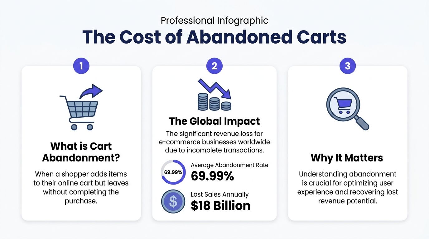
Online shopping cart abandonment happens when a shopper adds one or more items to a cart, begins moving toward purchase, and leaves before completing the order.
That sounds simple, but the impact is huge. Baymard Institute estimates the average documented cart abandonment rate is 70.22%, with mobile abandonment at 85.65%, and it estimates about $260 billion in retrievable orders in the US and EU alone through checkout optimization, as summarized on Baymard's cart abandonment benchmark page.
What the term means in plain English
A cart gets abandoned when interest is real, but completion doesn't happen.
That doesn't always mean the shopper hated the product. Sometimes they got interrupted. Sometimes the price changed once fees appeared. Sometimes the checkout asked for too much. Sometimes they couldn't get comfortable enough with the purchase to click the final button.
Why it matters to stores and shoppers
For stores, abandonment means lost revenue that was very close to conversion.
For shoppers, it means time wasted. You browse, compare, think, and narrow options down, only to leave empty-handed because something in the process feels off.
Here's the part people often miss. Abandonment is also a quality signal. A cart that gets left behind usually tells you something important about the experience.
| What happened | What it often means |
|---|---|
| Shopper leaves after seeing final cost | Price transparency came too late |
| Shopper exits on account screen | Checkout asked for too much effort |
| Shopper leaves on mobile | The flow felt clunky on a small screen |
| Shopper keeps reopening the cart | The decision still feels uncertain |
The cart is where buying intent gets tested against trust, effort, and clarity.
That's why this topic matters even if you're not running a store. Once you understand cart abandonment, you start spotting the exact moments when a shopping experience supports you, and when it nudges you away.
The Top Reasons Shoppers Abandon Carts
Online cart abandonment rarely comes from one dramatic problem. It usually builds from small moments of hesitation that pile up until buying feels harder than leaving.
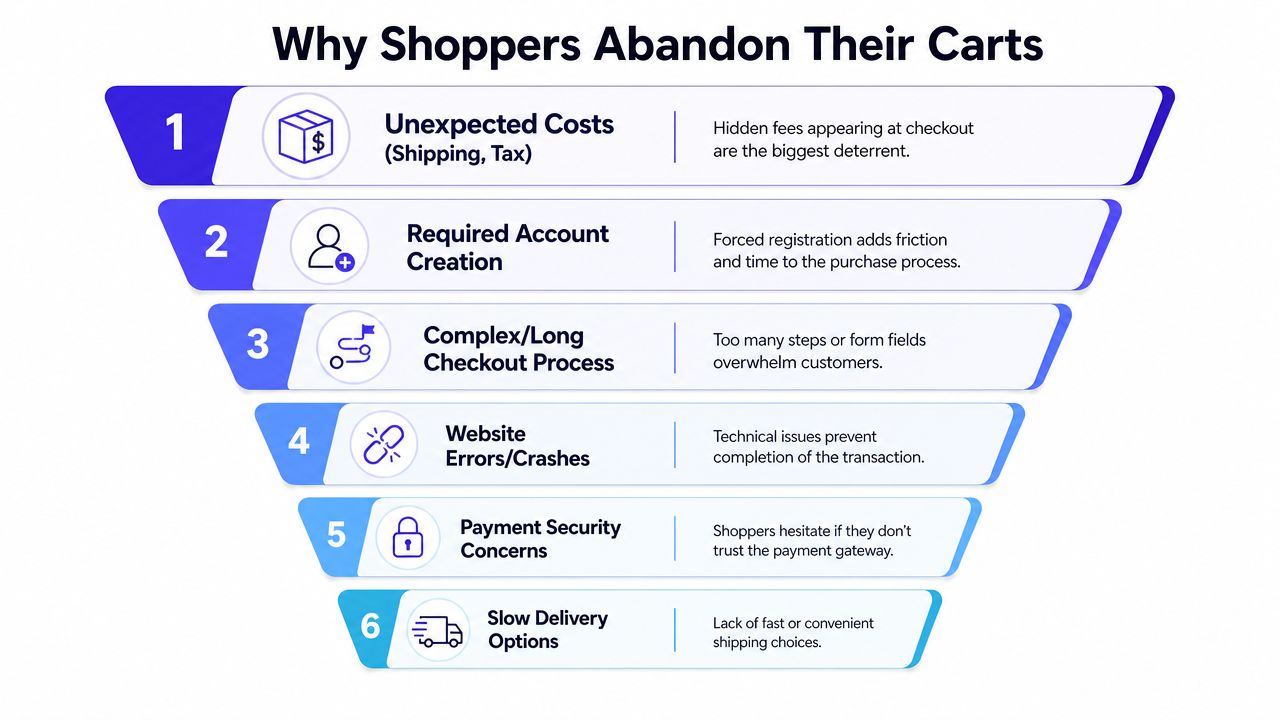
The most familiar trigger is cost shock. A product can feel reasonable on the listing page, then suddenly look less appealing once shipping, taxes, or extra fees appear near the end. That shift breaks momentum fast because the shopper is no longer evaluating just the item. They are reevaluating the whole deal.
The friction shoppers feel right away
Several patterns show up across online stores:
- Unexpected charges: The total at checkout feels different from the price that first earned your click.
- Forced account creation: A store turns a simple purchase into a registration task.
- Long checkout flows: Too many fields, too many screens, or too many chances to second-guess the purchase.
- Slow or unclear delivery: The item may be right, but the timing feels wrong.
- Trust concerns: If payment security, returns, or data handling look vague, caution takes over.
Price plays a bigger role than many stores admit. Shoppers are not only asking, “Can I afford this?” They are asking, “Does this still feel worth it?” That broader hesitation shows up in many markets. This article on the importance of pricing for B2B covers a different type of buyer, but the lesson travels well. Clarity around value affects confidence before any purchase.
Why mobile carts get abandoned so easily
Phones make friction feel heavier.
Industry reporting collected by Ringly notes that mobile cart abandonment climbs to roughly 80%, compared with about 70 to 73% on desktop, and that 21% of users cite a checkout process that feels too long or complicated. On a laptop, a long form feels mildly annoying. On a phone, it can feel like trying to fill out paperwork in a hallway while your coffee spills.
A lot of mobile abandonment has nothing to do with product interest. The shopper may still want the item. The problem is that every extra tap, password, loading delay, and dropdown steals energy.
A quick visual breakdown helps:
<iframe width="100%" style="aspect-ratio: 16 / 9;" src="https://www.youtube.com/embed/d4fielXc1Rw" frameborder="0" allow="autoplay; encrypted-media" allowfullscreen></iframe>A less-discussed reason: style uncertainty
A big share of hesitation comes from something checkout fixes cannot solve. The shopper is unsure how the item will look on them.
That question is different from size uncertainty. Size asks, “Will it fit?” Style uncertainty asks, “Will this suit me?” Those are separate decisions, and the second one often gets ignored in articles written mainly for merchants.
You can like the product photos and still pause. Maybe the color looks great on the model but might wash you out. Maybe the jacket shape feels sharp in one angle and bulky in another. Maybe the dress matches the trend, but you cannot tell whether it matches you.
If a shopper can't visualize the style, the cart becomes a holding area instead of a checkout step.
This happens all the time with clothing, secondhand pieces, occasion wear, and trend-led buys. A dress from Zara, a coat from H&M, a costume from Amazon, or a one-off vintage find on Vinted can create the same stall point. You are interested, but the final picture in your head is still blurry.
That is why visual discovery matters so much from the shopper side. Tools like TryThisFit help close that gap by letting you preview style and appearance before you commit. For shoppers, that changes the cart from a maybe pile into a decision that feels clear and convenient.
How Retailers Measure and Analyze Abandonment
Retailers usually track abandonment with a funnel, which can be visualized as a shopping path with leaks.
A lot of people land on a product page. Fewer add to cart. Fewer start checkout. Fewer finish payment. Each step tells the store where shoppers lose momentum.

What stores look for
Stores usually ask questions like these:
- Where do people leave most often
- Does mobile drop off faster than desktop
- Do shoppers exit after shipping appears
- Do more people abandon when login is required
- Which product categories create the most hesitation
That analysis helps teams improve checkout, but it also helps explain why some stores feel smooth and others feel oddly tiring.
If you're interested in the customer-side impact of these design choices, TryThisFit has a useful piece on customer experience improvement in online shopping that connects friction points to real browsing behavior.
What this means for you as a shopper
You don't need to run analytics to benefit from this idea.
When you abandon a cart, you can usually identify the leak pretty quickly. Maybe the page asked for too much information. Maybe delivery looked unclear. Maybe the final total felt sneaky. Maybe you just weren't convinced by the look.
That awareness is useful because it turns a vague “I'll think about it” into a specific reason. Once you know the reason, you can either keep shopping elsewhere or use a better tool before you buy.
A Prevention Playbook for Shoppers and Stores
The classic fixes for cart abandonment still matter. The difference is that shoppers can use them as a checklist.
When a store gets these basics right, buying feels calm. When it gets them wrong, you start hovering over the close tab.
What to look for before you commit
Here are the signs of a store that respects your time:
- Guest checkout: If you can buy without creating an account, the path stays shorter.
- Upfront total cost: Good stores make shipping, taxes, and fees easier to understand before the final step.
- Clear delivery timing: A useful delivery promise beats vague wording every time.
- Trusted payment flow: The payment page should look clean, secure, and familiar.
- Mobile-friendly forms: On a phone, fewer fields and fewer screens usually mean less friction.
For a merchant-focused perspective on these practical fixes, proven tactics for abandoned carts offers a solid summary of checkout and recovery improvements.
The shopper version of prevention
You can also reduce your own abandonment habits with a few small moves:
- Check the total early. If a site hides costs until the end, decide whether it's worth the hassle now, not after ten minutes of browsing.
- Open only serious contenders. A cart gets crowded fast when you use it like a wishlist.
- Screenshot or save strong options. That keeps you from repeatedly rebuilding the same cart.
- Use tools that lower uncertainty. If you can preview style before buying, your decision gets easier.
A smoother buying path matters because it cuts the mental drag that piles up during fashion shopping. That's a big part of what frictionless shopping should mean in practice.
Clean checkout design helps stores. Clearer decisions help shoppers.
The strongest prevention strategy usually combines both. The store removes checkout friction, and the shopper reduces uncertainty before the final click.
Visualize Your Style Before You Buy
A large share of fashion carts get abandoned for a simple reason. The item might be nice, but the shopper still cannot answer the question that matters most: Will this actually look good on me?
That uncertainty is easy to underestimate. Size charts help with fit. Reviews help with quality. Neither one solves the mirror problem. Online, you are often making a style decision from a flat product photo, then asking yourself to feel confident enough to buy.
A virtual try-on tool for seeing clothes on your photo helps close that gap. TryThisFit lets me upload a photo and preview the appearance of an item in seconds, with no account required. If I am browsing Zara, H&M, Shein, Vinted, Depop, or Amazon, the Chrome extension speeds this up even more because I can preview from the product image instead of interrupting my browsing flow.

The convenience matters because doubt usually appears at the exact moment you are considering the item. You like the color. You like the cut. Then one question slows everything down. Will this suit my style, or will it end up as another return, another closet mistake, or another tab left open for later?
Some shopping situations make that question even harder to answer:
- Secondhand listings: You usually cannot try the item first, and returns may be limited.
- Fast-fashion browsing: New arrivals move quickly, so a quick appearance check saves time.
- Marketplace finds: Product photography varies a lot, which makes judgment harder.
- Costumes and one-off outfits: The idea sounds fun, but the final look is harder to picture.
Clean, front-facing product photos usually produce the most useful previews. Flat-lay images tend to work especially well.
The goal is not to replace sizing details. The goal is to help you see the style on a person who looks like you, compare options faster, and decide with more confidence. That changes the shopping experience from guesswork into something closer to trying outfits against a digital mirror.
You can also revisit saved looks later in your try-on history, which is helpful when you are comparing pieces across stores. For shoppers, that means fewer abandoned carts caused by appearance uncertainty, and fewer purchases that never felt right in the first place.
Smart Recovery Tactics That Feel Like Magic
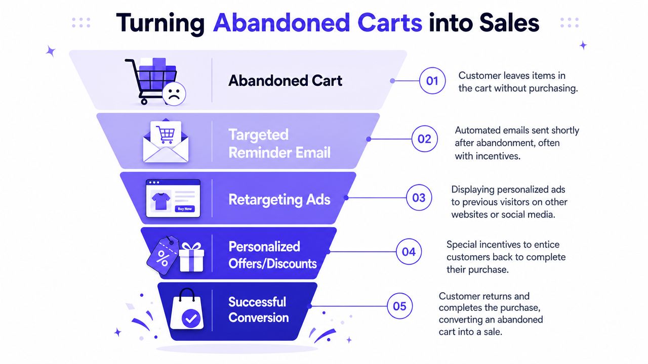
Recovery usually starts after the shopper leaves. Stores send reminder emails, run retargeting ads, or bring the product back into view on another device.
That works, but the reminder is often too generic. “You left something behind” isn't very persuasive when the actual problem was uncertainty.
What a better recovery moment looks like
A stronger recovery message would remind the shopper what they liked, while also helping them finish the decision.
For fashion, that could mean:
- Showing the exact item again instead of a broad category ad
- Bringing back saved visual comparisons so the shopper remembers why the piece was in the cart
- Using personal style previews to reconnect the product to the shopper's own appearance
- Reducing the next step so returning feels easy, not like restarting from scratch
Recovery gets stronger when it answers the doubt that caused the abandonment.
That's why saved visual previews can matter so much. If a shopper leaves because they're unsure about the style, the smartest follow-up isn't just a discount. It's a better view of the decision.
If you want a simpler shopping flow, start by making your cart decisions more visual. TryThisFit lets you preview the appearance of outfits in seconds, explore saved looks in your history, and use the free Chrome extension on sites like Zara, H&M, Amazon, Shein, Vinted, and Depop with a quick right-click.
Try Virtual Try-On Now
See how clothes look on you before you buy - works with any online store
Get Started Free