Customer Experience Improvement: E-Commerce Guide 2026
You can feel a CX problem before you can name it.
A shopper lands on a product page, likes the item, hesitates, opens three more tabs, scrolls through reviews, abandons the cart, then comes back a week later only to buy from someone else. Another customer completes the order, but the experience still goes sideways because delivery updates are unclear, returns are clunky, or the product looked different in their head than it did in real life.
That's what customer experience improvement looks like in e-commerce. Not as a branding slogan, but as a series of tiny moments that either build confidence or drain it.
Most stores don't need a dramatic overhaul first. They need a sharper view of where friction lives, a clearer way to measure it, and a handful of focused changes that make shopping feel easier, faster, and more personal.
Why Customer Experience Is Your Biggest Growth Lever
Returns, abandoned carts, repeat questions, low repeat purchase behavior. These usually get treated as separate operational issues. In practice, they often point to the same thing: the customer journey isn't helping people make confident decisions.
That's why customer experience improvement belongs in growth strategy, not just support. The business case is already visible in the market. The global customer experience management market reached about $12.04 billion in 2023 and was projected to grow at a 15.8% CAGR from 2024 to 2030, while the same source notes that improving retention by 5% can increase profitability by 25%, and 93% of consumers are more likely to buy again from brands with excellent service (Invesp).
What e-commerce operators often miss
A lot of teams still try to solve symptoms in isolation.
They tweak checkout when the underlying issue starts on the product page. They add more discounting when shoppers need more certainty. They invest in acquisition while ignoring the experience that determines whether a first purchase becomes a second one.
Practical rule: If customers need too much effort to understand what they're buying, your conversion problem and your retention problem are usually the same problem.
In online retail, confidence is the hidden lever. Shoppers can't touch fabric, compare drape in real life, or quickly test whether a style suits them. When confidence drops, hesitation rises. That shows up as longer decision cycles, more support questions, and more post-purchase disappointment.
A strong CX system reduces that uncertainty. It gives people clarity before checkout, reassurance after purchase, and fewer surprises throughout the journey.
Why this matters more than another surface-level optimization
The shift in CX has been from broad service quality to measurable business impact. That's the part many operators now understand. Experience isn't soft. It affects repeat buying, profitability, and whether customers remember the store as easy or annoying to buy from.
If you're working on retention, the tactics inside mastering customer experience are useful because they frame CX as a disciplined operating model rather than a vague promise. For e-commerce specifically, that same logic applies to product discovery, checkout, delivery communication, and returns.
I'd also pair that with a retention lens. The patterns in customer retention in ecommerce are a helpful reminder that customers rarely leave because of one dramatic failure. They leave after enough small moments feel harder than they should.
Diagnosing Your Current Customer Experience
Most brands already have the clues. They just live in different places.
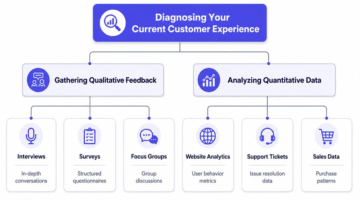
Analytics tells you what people did. Reviews, support conversations, and survey comments tell you why they did it. You need both, because a drop-off without context invites guesswork, and feedback without behavioral evidence can send teams chasing the loudest anecdote.
In 2022, customer experience quality declined for 19% of brands, the lowest rate in 17 years. The same source reports that 56% of consumers believe companies treat them like numbers, and 54% feel brands often neglect customer service (Scoop Market). That gap is exactly why diagnosis has to be more deliberate now.
Start with behavior, not opinions
Open your storefront data and look for friction patterns, not vanity patterns.
Useful places to start:
- Product page exits: High exits can mean weak imagery, unclear value, confusing sizing language, or missing delivery and return details.
- Cart abandonment moments: Look for the exact step where shoppers leave. Shipping surprise, coupon hunting, account creation, and payment friction all leave different traces.
- On-site search behavior: When shoppers repeatedly refine or restart searches, they may not trust navigation or filtering.
- Support-linked pages: If the same product or policy pages produce repeated support tickets, the page is doing an incomplete job.
What doesn't work is staring at top-line conversion and trying to “optimize the funnel” in the abstract. That usually leads to cosmetic changes with no real learning.
Then collect the language customers use
Once you know where the hesitation sits, pull the words customers attach to it.
Read reviews. Tag support tickets. Scan chat transcripts. Run short post-purchase and post-drop-off surveys. Ask simple questions like what almost stopped the purchase, what felt unclear, and what would've made the decision easier.
A practical diagnosis stack looks like this:
| Signal | What it reveals | What to watch for |
|---|---|---|
| Website analytics | Drop-off points and behavior patterns | Repeated exits at the same journey step |
| Reviews | Expectation gaps | “Looked different than I expected” or “hard to tell online” |
| Support tickets | Friction serious enough to trigger help-seeking | Same questions before purchase |
| Sales data | Product or category patterns | High interest with low completion |
A CX diagnosis is useful only when it connects a customer complaint to a specific touchpoint and a measurable behavior.
For Shopify operators, I like resources that stay close to real commerce data. This guide on customer experience for Shopify brands is useful because it keeps the focus on analytics you can act on.
Mapping the Customer Journey to Find Friction
Journey mapping gets overcomplicated fast. It doesn't need to be.
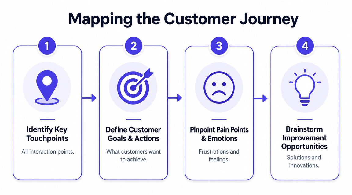
You don't need a giant workshop artifact with twenty swimlanes. You need a simple view of how one real shopper moves from curiosity to purchase, and where confidence weakens along the way.
The most neglected part of customer experience improvement is measuring friction in the actual journey instead of relying only on satisfaction surveys later. Stronger programs use analytics to identify where people disengage or drop off, and small touchpoint fixes can stack into meaningful gains in conversion and retention (CSG).
Follow one shopper from first click to delivery
Take a common path.
A shopper sees a blazer on social media. They click through to the product page. The photos are polished, but they still can't quite picture how the shape or style will look on them. They open reviews, leave, compare another site, return, add to cart, pause at shipping, finish the order, then wonder later whether returns will be difficult if the look isn't right.
That's a journey map. Not a document. A decision sequence.
Now mark the friction points:
-
Discovery friction
The ad got attention, but the landing experience didn't continue the same clarity. -
Visualization friction
The shopper likes the item but can't easily preview the appearance on themselves. -
Decision friction
Product details answer some questions, but not the one that matters most. “Can I see how this style looks on me?” -
Checkout friction
Extra fields, delayed cost transparency, or forced account creation break momentum. -
Post-purchase friction
Tracking, delivery messaging, and return guidance shape whether the purchase feels safe.
What to map and what to ignore
The goal isn't to capture every touchpoint. The goal is to catch the few moments that materially change behavior.
Use this filter:
- High emotion moments: uncertainty, urgency, comparison, regret risk
- High volume moments: product pages, cart, payment, delivery updates
- High cost moments: returns, support escalations, repeat browsing without purchase
That's why I like the framing in frictionless shopping. It keeps attention on the customer's effort, not just the merchant's process.
If a shopper has to imagine too much, search too long, or recover from too many small confusions, friction is already costing the sale.
A better map asks one hard question
At each touchpoint, ask: what is the customer trying to feel confident about right now?
On a product page, it may be style. In checkout, total cost. After purchase, control. Those are different jobs. One generic CX fix won't solve all of them.
That's why journey maps are powerful when they stay concrete. “Improve the customer experience” is too broad to execute. “Reduce uncertainty on high-intent apparel product pages” is specific enough to change.
Prioritizing High-Impact Improvements
Once teams see all the friction, they often make the same mistake. They create a giant backlog and call it a roadmap.
That usually kills momentum. Customer experience improvement works better when you sequence changes by impact versus effort, not by how impressive the project sounds in a planning meeting.
Use four buckets and be ruthless
A simple prioritization model is enough:
| Category | What belongs there | Typical action |
|---|---|---|
| Quick wins | High impact, low effort | Ship fast |
| Major projects | High impact, high effort | Scope carefully |
| Fill-ins | Low impact, low effort | Batch later |
| Time sinks | Low impact, high effort | Cut or defer |
In e-commerce, quick wins often live in plain sight. Cleaner return messaging. Better product-page clarity. More useful visual context. Faster support for pre-purchase questions. These don't require a platform migration.
Major projects can still matter. Reworking fulfillment workflows or unifying cross-channel customer data may be worth it. But if you start there, the organization waits too long to feel improvement.
What deserves priority first
I'd move these issues up the list when they touch revenue and confidence directly:
- Pre-purchase uncertainty: If shoppers can't judge style, color, or overall appearance, hesitation spreads across the whole session.
- Checkout interruptions: Anything that breaks buying momentum deserves immediate attention.
- Returns-related confusion: If return expectations feel murky, customers buy more cautiously.
- Repeated support questions: If people ask the same thing over and over, the journey is failing upstream.
A useful comparison is how to reduce shopping cart abandonment, because it highlights how many “abandonment fixes” are really confidence fixes in disguise.
Don't reward complexity. Reward the fixes that remove uncertainty at the exact moment a customer is about to decide.
What doesn't work
Three patterns waste time:
- Boiling the ocean: Trying to redesign every touchpoint at once.
- Choosing projects by internal politics: The loudest stakeholder rarely owns the highest-friction moment.
- Confusing novelty with value: A flashy feature that doesn't remove customer effort is decoration, not CX.
Good prioritization feels almost unfairly practical. You're not trying to make the store look more elaborate. You're trying to make buying feel easier.
Implementing Modern Tactics That Delight Customers
A shopper opens six tabs to compare dresses for an event, zooms in on product photos, checks the return policy twice, then leaves without buying because she still cannot tell whether the style will suit her. That kind of hesitation is where modern CX tactics earn their keep.
A good CX stack reduces uncertainty at the moment of decision. In practice, that usually means clearer self-service, better handoffs between support channels, more relevant merchandising, and one or two focused tools that remove guesswork fast. For apparel e-commerce, visual preview stands out because it addresses a common buying block without forcing a full platform rebuild.

Start with tactics customers feel immediately
The best modern improvements are often small enough to ship quickly and specific enough to change behavior.
A few examples show up again and again:
- Self-service that removes basic doubt: Return windows, shipping timing, sizing notes, and care instructions should be visible before customers go looking for support.
- Support continuity across channels: A customer who starts in chat and follows up by email should not have to repeat the issue from scratch.
- Personalization with restraint: Recent views, relevant categories, and practical reminders help. Cluttered recommendation blocks do not.
- Visual decision support: Customers should have a way to judge style and appearance without relying only on static product images.
This is the trade-off many teams miss. Large CX programs can align systems and fix deep process problems, but they also take time, budget, and cross-functional patience. Micro-innovations can produce a faster win, especially when they target a moment tied directly to conversion or return risk.
If you want a broader framework for how confidence shapes buying behavior, this guide on how to improve your customer sales journey is a useful companion.
Use virtual try-on where uncertainty is highest
In fashion, shoppers often understand the product details and still hesitate. The sticking point is visual confidence. They can see the item, but not the look on themselves.
A lightweight virtual try-on addresses that problem directly. Instead of asking customers to mentally translate a model photo into their own context, it gives them a quick preview using their own image. That does not replace sizing guidance or fit information. It handles a different job. It helps the shopper decide whether the style, color, or silhouette feels right before they commit.
TryThisFit is one example of this kind of tool. It lets shoppers preview how clothing looks on their photo in seconds, including while browsing retailer and marketplace listings. That matters because uncertainty rarely appears in a controlled demo environment. It shows up mid-session, while customers compare options across tabs, devices, and stores.

I like this category of tactic because the cost and complexity stay relatively low compared with a full CX overhaul. The downside is narrower scope. Virtual try-on will not fix weak delivery communication, inconsistent support, or a confusing returns process. It will, however, improve one of the most expensive points of friction in apparel commerce: uncertainty right before purchase.
You can also see the workflow here:
<iframe width="100%" style="aspect-ratio: 16 / 9;" src="https://www.youtube.com/embed/gcZNzv09i9k" frameborder="0" allow="autoplay; encrypted-media" allowfullscreen></iframe>Where this tactic earns the fastest return
Virtual try-on tends to work best in shopping environments where customers are making subjective style decisions quickly:
- Multi-store comparison: Shoppers moving between major retailers and marketplaces want a consistent way to judge appearance.
- Secondhand listings: Image quality varies, product pages are inconsistent, and customers have less merchandising support.
- Event or seasonal purchases: Costumes, occasionwear, and one-time outfits create more hesitation because the style is less familiar.
- Expressive categories: Dresses, coats, and statement pieces usually benefit more from appearance preview than basics do.
The larger lesson goes beyond one tool. Customer experience improvement does not have to start with a major redesign program. Start with the moments where confidence breaks. Add one practical capability that removes friction there. Then build from the result.
Measuring and Iterating on Your CX Strategy
A shopper pauses on a product page, opens size guidance, zooms the images, then leaves without buying. If that pattern repeats across hundreds of sessions, the job is not to launch another broad CX initiative. The job is to isolate that moment of hesitation, measure it, test one fix, and decide whether it deserves a larger rollout.
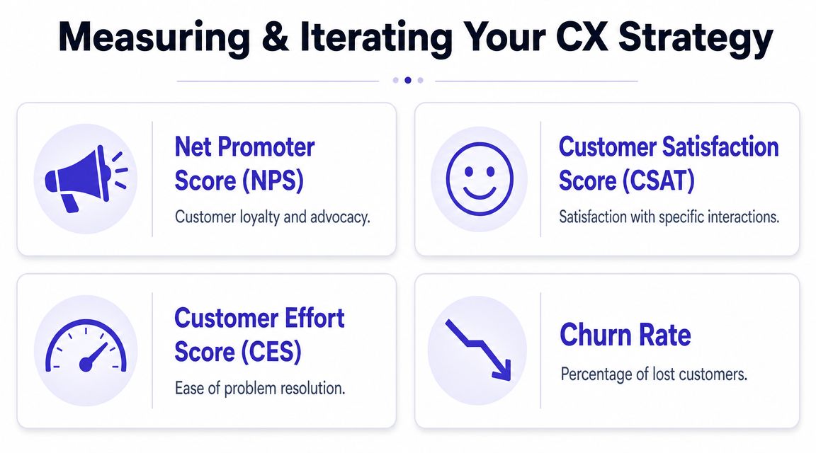
Teams that improve customer experience consistently run that loop well. Gainsight recommends starting with 3 to 5 core metrics such as NPS, CSAT, CES, and churn, then baselining them and reviewing them regularly while correlating them with business outcomes (Gainsight).
Choose metrics by problem, not by habit
A crowded dashboard does not improve decisions.
Match the metric to the friction point. For pre-purchase uncertainty, track signals close to that decision: product-page engagement, customer effort, support contacts before checkout, and conversion on affected categories. For post-purchase disappointment, satisfaction after delivery, repeat purchase rate, refund reasons, and churn usually matter more. The point is precision. If the problem sits in one stage of the journey, the scorecard should sit there too.
The common CX metrics still have a place. They just work best when each one has a job.
- NPS: Best for tracking broad loyalty and advocacy over time.
- CSAT: Useful after a specific interaction such as checkout, support, or delivery.
- CES: Strong for measuring friction because it captures how hard the experience felt in the moment.
- Churn: Useful when the goal is tying experience changes to retention.
Build a review cycle that forces clear decisions
Good measurement needs timing, ownership, and restraint.
A practical review loop looks like this:
-
Define the journey stage
Name the moment clearly: discovery, cart, support, returns, or post-purchase communication. -
Set the baseline
Record the current state before anything changes. -
Launch one controlled improvement
If you change five things at once, you will get noise instead of insight. -
Review monthly with cross-functional owners
Product, marketing, support, and operations should work from the same evidence. -
Decide whether to expand, revise, or remove
Some fixes improve sentiment but do little for behavior. Others reduce effort and lift conversion even if customers never mention them in surveys.
Measure the experience while it is happening. A survey sent days later can miss the friction that changed the outcome.
What good iteration looks like
The best iteration cycles are usually modest.
An apparel team sees repeat hesitation on product pages. Instead of redesigning the entire site, it adds a visual confidence tool to a narrow set of categories and watches what changes. Customer effort drops. Pre-purchase support questions shift from styling uncertainty to shipping and sizing. Conversion improves enough to justify expanding the test.
That is the larger lesson. Customer experience improvement often starts with a micro-innovation, not a major overhaul. A tactic like virtual try-on will not solve delivery delays or weak support coverage, but it can remove a costly point of doubt right before purchase. When a small fix changes customer behavior at a high-friction step, it earns the right to become part of the broader CX strategy.
As noted earlier, TryThisFit is one example of that kind of targeted tactic. The value is not novelty by itself. The value is whether it reduces hesitation, lowers effort, and gives your team a measurable place to learn from before investing in bigger CX changes.
Try Virtual Try-On Now
See how clothes look on you before you buy - works with any online store
Get Started Free