How to Reduce Shopping Cart Abandonment in 2026

It’s a feeling every e-commerce owner knows all too well. You've poured your heart into creating amazing products, your marketing is firing on all cylinders, and you're driving tons of traffic. Shoppers are loving what they see, filling their carts with goodies.
And then... nothing. They disappear right at the finish line, leaving a full cart behind without a second thought. It's beyond frustrating.
The Sobering Reality of the Abandoned Cart
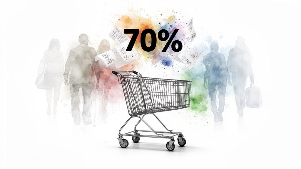
This isn't just a small leak in your sales funnel; it's a full-blown flood. The global average for shopping cart abandonment hovers around a jaw-dropping 70.19%. Think about that—for every 10 customers who add something to their cart, 7 of them walk away. On mobile, that number can climb past 80%!
Why does this happen? The reasons are all over the map, from getting hit with unexpected shipping costs at the last second to a checkout process that feels like doing your taxes.
But here’s the good news. That 70% isn't a mark of failure. I want you to see it for what it really is: your single biggest opportunity for growth.
These aren't lost causes. They are highly motivated shoppers who have already told you they want your product. They’re standing at the register, wallet in hand, saying, "I want this, but..."
My job is to help you figure out the "but."
My biggest piece of advice? Treat every abandoned cart as a treasure map. It's a clue pointing you directly to the friction in your sales process. Fixing these bumps in the road can unlock a massive, immediate boost in your revenue.
Top Reasons for Cart Abandonment and How to Fix Them
Before we dive deep, let's get a high-level view. I’ve seen these same issues pop up for countless online stores, and they almost always fall into a few key categories. This table breaks down the most common culprits and gives you a sneak peek at the actionable solutions I’ll be building out in this playbook.
| Reason for Abandonment | Actionable Solution |
|---|---|
| Unexpected Costs (shipping, taxes, fees) | Be transparent with all costs upfront on product and cart pages. |
| Forced Account Creation | Offer a streamlined guest checkout option. |
| Complicated Checkout Process | Simplify the checkout into fewer steps and fewer form fields. |
| Security Concerns | Display trust badges, SSL certificates, and customer reviews. |
| Website Errors or Slowness | Optimize site speed and A/B test your entire checkout flow for bugs. |
| Uncertainty About the Product (look, style, etc.) | Use high-quality images, detailed descriptions, and virtual try-on tools. |
| No Express Shipping Options | Provide multiple shipping methods with clear delivery estimates. |
| Unfavorable Return Policy | Make your return policy clear, fair, and easy to find. |
This isn't an exhaustive list, but it covers the big hitters that are likely costing you sales right now. By tackling these head-on, you're already on your way to recovering a huge chunk of that lost revenue.
Your Playbook for Winning Back Sales
Throughout this guide, I'm going to roll up my sleeves and get to work. This isn't about theory; it's a practical, step-by-step playbook for diagnosing and squashing the bugs that cause cart abandonment. You might also find it useful to explore these online vs. in-store shopping statistics to see how these different shopping behaviors stack up.
Here’s a glimpse of what I'm going to tackle with you:
- Become a Data Detective: I’ll dig into your analytics to find exactly where shoppers are dropping off.
- Create a Frictionless Checkout: I’ll show you how to streamline your checkout so it’s fast, intuitive, and almost effortless for your customers.
- Master Pricing & Shipping: Learn the art of being radically transparent about costs to build trust and eliminate last-second surprises.
- Build Unshakeable Confidence: I'll explore modern tools and tactics that erase a customer's doubt and get them excited to click "Complete Purchase."
Diagnosing Your Specific Abandonment Problem
Alright, let's get our hands dirty. Before you start randomly changing things on your site, you need to play detective. The real clues are hiding in your store's data, just waiting to show you exactly where your sales funnel is springing leaks.
Your first mission is to map out the journey your customers take from the moment they land on a product page to the final "thank you" screen. Most e-commerce platforms like Shopify or BigCommerce, and definitely analytics tools like Google Analytics 4, have built-in features to create a conversion funnel. This is your treasure map.
It can be a real eye-opener. You might be convinced your checkout process is silky smooth, but the data could show a massive 50% drop-off the second you ask shoppers to create an account. That's not a coincidence; it's a giant, flashing neon sign pointing directly at a point of friction you can fix.
Digging Deeper with Data Segmentation
Now, knowing where shoppers bail is just the first layer of the onion. The real "aha!" moments come when you start slicing up that data to figure out who is leaving and start to understand why.
Here are a few powerful ways I always start breaking down the data:
-
Device Type: What’s the abandonment rate on desktop versus mobile? I see this all the time: a sky-high mobile abandonment rate is a dead giveaway that the mobile checkout experience is clunky or frustrating to use.
-
Traffic Source: Where are these shoppers coming from? Compare the behavior of visitors from organic search, paid ads, and social media. You might find that traffic from your latest Instagram campaign is abandoning carts like crazy, which tells you there’s a mismatch between what your ad promised and what they found on your site.
-
Customer Type: This one is huge. Split your data between new visitors and returning customers. If new folks are jumping ship at a high rate, it's almost always a trust issue. They don't know you yet, so any little hiccup sends them running.
From Data to Educated Guesses
Once you've zeroed in on a problem area, you can start forming some smart hypotheses about what's going on. It's about connecting the cold, hard numbers to real human behavior.
Let me walk you through a scenario I see constantly. Let's say your data shows a ton of people are bouncing from your product pages, and it's happening mostly to mobile users coming from TikTok.
- The Data: You've got a high bounce rate and a dismal "add-to-cart" rate on product pages, specifically for mobile users clicking through from TikTok.
- The Hypothesis: These users are in "discovery mode." They saw something cool in a video, but now they're hit with a wave of purchase anxiety. They can't picture how that jacket or dress will actually look on them.
This is the exact problem I obsessed over and built a solution for. My tool, TryThisFit, was created to crush that "style uncertainty." It's a free Chrome extension that lets shoppers instantly see how an item looks on their own photo, and it installs in just a couple of seconds.
Think about stores like Zara, H&M, Shein, or even thrift sites like Vinted and Depop. With the Chrome extension, a shopper can just right-click a product image (flat-lay clothing photos work best for most accurate results!) and get an immediate preview of the style. It completely removes the guesswork and gives them the visual proof they need to feel confident.
I'm directly tackling that "how will it look on me?" question that stops so many sales. By helping users find their style and visualize the product on themselves, the app turns hesitation into a confident click on the "Add to Cart" button. Curious? Install the Chrome extension in 5 seconds and see the magic for yourself.
Make Your Checkout So Smooth, They Can't Help But Buy
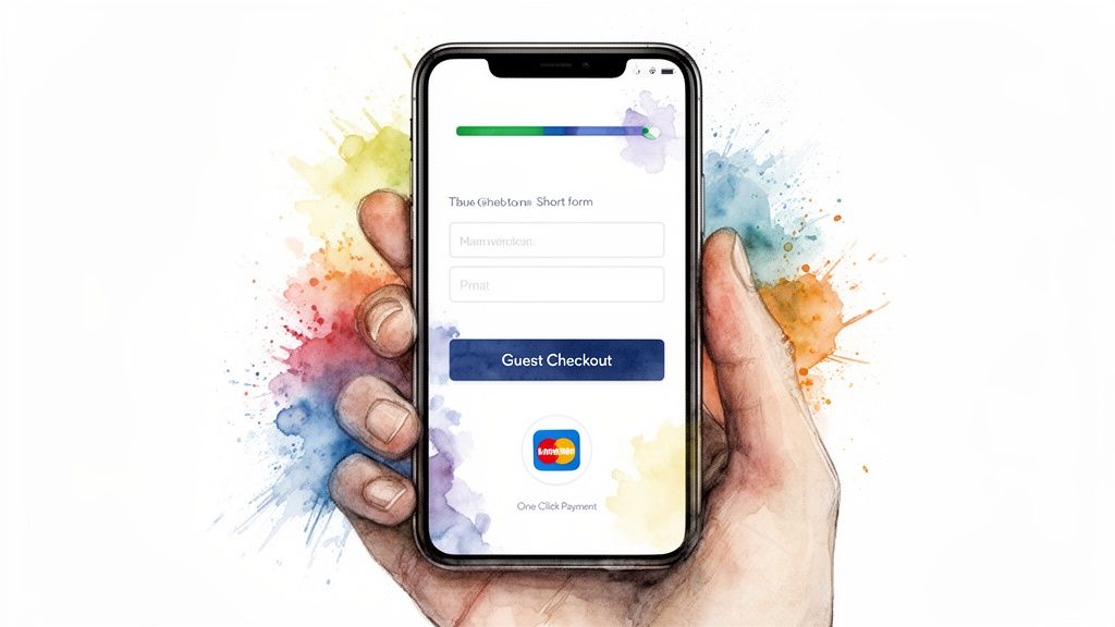
If your analytics show a steep drop-off right at the checkout, you’ve hit the jackpot. A clunky, slow, and confusing checkout is why 18% of shoppers bail on their carts. But here's the exciting part: fixing this is one of the highest-impact moves you can make.
The goal is brutally simple: make buying from you easier than abandoning the cart. Think of your checkout less like a final hurdle and more like a red carpet you’re rolling out for them.
Slash Those Form Fields. Ruthlessly.
Picture this: you’re at a real store, wallet in hand, and the cashier hands you a three-page form to fill out before they'll take your money. You’d walk out, right? That’s exactly how a shopper feels staring at a wall of online form fields.
It’s time to be ruthless. Do you really need their middle name? A separate "Company" field? Probably not. Combine "First Name" and "Last Name" into one "Full Name" field. Every field you eliminate is a win.
The Magic of Guest Checkout
I see this all the time—forcing a brand-new customer to create an account before they can buy. To them, it’s a huge commitment and a major red flag that screams "get ready for spam."
Offering a guest checkout is non-negotiable. It shows you respect their time and privacy. You can always give them the option to save their details and create an account after the purchase is confirmed.
A complicated checkout is a huge source of friction, but it's also one of the easiest problems to solve. By obsessing over simplicity and speed, you can slash your abandonment rate. A great checkout should feel almost invisible.
Social logins like "Continue with Google" or "Continue with Apple" are also a fantastic middle ground. They deliver the speed of a guest checkout with the benefit of creating a user profile in a single click. For even more smart ways to boost your checkout flow, these 10 Proven Ecommerce Conversion Rate Optimization Tips offer some fantastic, actionable advice.
Guide Shoppers With a Simple Progress Bar
Nobody enjoys feeling lost. A multi-page checkout with no end in sight feels like a never-ending chore, creating anxiety that leads directly to abandonment.
This is where a simple visual progress bar works wonders. Seeing clear steps like "Shipping > Payment > Review" instantly manages expectations. You're turning a task into a guided, satisfying process.
You MUST Optimize for Mobile First
Let's be real: mobile traffic dominates e-commerce now. A checkout process that wasn't built for thumbs and small screens is an absolute disaster waiting to happen. The average mobile cart abandonment rate is a breathtaking 81%.
Here’s how you make your mobile checkout a dream to use:
- Big, Tappable Buttons: No one wants to pinch-and-zoom just to hit the "Continue to Payment" button. Make your calls-to-action unmissable.
- Embrace Auto-Fill: Let the phone do the heavy lifting! Use browser and device features to automatically populate names, addresses, and even credit card details.
- Integrate Digital Wallets: This is the ultimate friction-killer. Adding options like Apple Pay, Google Pay, and PayPal can turn a two-minute ordeal into a five-second tap.
These tweaks don't just reduce friction; they transform your checkout from a frustrating barrier into a modern, secure, and downright effortless experience. It sends a clear message to your customers: I value your time.
Getting Real About Price Shock and Shipping Costs
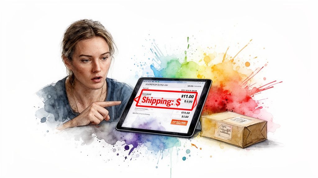
Let’s be honest: there is no faster way to absolutely murder a sale than to ambush a customer with surprise fees at the last second. In fact, a staggering 49% of shoppers will ditch a full cart simply because extra costs like shipping were sprung on them at checkout.
Think about the customer's journey. They've spent time falling in love with your products, and then, on the final page, the total jumps. That excitement instantly sours into frustration and a sense of betrayal.
Kill the Surprise with Radical Transparency
The fix is surprisingly simple: never, ever surprise your customer with the final price. Every single cost—from shipping and handling to taxes—needs to be out in the open long before they even think about entering their credit card details.
This isn't just about being honest; it's about managing expectations. You can easily add a shipping calculator to the cart page or even show estimated shipping right on the product page itself. When a shopper knows the full cost from the get-go, they're making a confident, informed decision.
Master Your Shipping Strategy
Shipping is almost always the main culprit behind price shock, so getting your strategy right is non-negotiable. There's no single perfect answer, but here are the models I’ve seen work wonders time and time again.
-
Offer Free Shipping: This is the undisputed champion for shoppers. Yes, it cuts into your margins, but the psychological pull of "free" is immense. It can boost your conversion rate so much that it more than pays for itself.
-
Free Shipping with a Threshold: This is my personal favorite and a fantastic middle ground. Offering free shipping for orders over a specific amount (like "$75+") not only smashes cart abandonment but also actively encourages shoppers to add another item to their cart.
-
Flat-Rate Shipping: This approach brings clarity and predictability. A single, flat shipping fee for all orders simplifies the entire decision process for your customers. It's an ideal fit if your products are generally similar in size and weight.
My two cents: People don't actually hate paying for shipping. They hate being surprised by it. Be upfront and give them clear, simple options. You'll turn a potential deal-breaker into just another seamless part of the transaction.
Test and Nail Your Shipping Threshold
If you go the route of "free shipping with a minimum spend," don't just pull a number out of a hat. The perfect threshold is hiding in your own data.
First, dig into your analytics and find your Average Order Value (AOV). Then, set your free shipping threshold just a bit higher—typically around 10-15% more.
So, if your AOV is currently $65, setting the free shipping bar at $75 creates a powerful incentive. A shopper who's close will almost always add one more small item to their cart to avoid the shipping fee. It’s a simple, data-backed move that not only slashes your abandonment rate but also drives up your revenue per customer.
Building Trust and Banishing Purchase Anxiety
Alright, let's talk about the real reason people bail on their carts. We’ve covered the logical stuff—surprise fees and frustrating forms—but the biggest conversion killer I’ve seen, especially in fashion, is way more emotional. It's that nagging voice in a shopper’s head asking, "But how will this actually look on me?"
That one moment of hesitation is a sales black hole. When a customer can't picture a product in their life, they hit the brakes and close the tab. This is the exact problem I became obsessed with solving, which led me to create a solution. My app, TryThisFit, is built to completely demolish that purchase anxiety in just a few seconds.
Turning Doubt into Confidence with Instant Visualization
The mental leap from seeing a gorgeous dress on a model to imagining it on your own body is huge. This is where virtual try-on technology becomes your secret weapon.
I designed a free Chrome extension that empowers you to visually try on clothes from any online store. This isn't about getting hung up on technical measurements. It’s all about instantly visualizing the style and the look of an outfit on your own photo.

Think about how people shop on major sites like Zara, H&M, or even Amazon Fashion. With the extension, they can simply right-click a product image and get an instant preview of how it looks on them. This works especially well with flat-lay clothing photos, giving a fantastic representation of the style.
In a flash, that abstract idea of a new coat becomes a concrete visual. It smashes through that critical "how will it look?" question, replacing doubt with the excitement they need to click "Add to Cart." Want to see for yourself? Try it now at trythisfit.com.
By giving shoppers a way to preview an item's appearance, you're knocking down the single biggest barrier in online fashion. You’re basically handing them a personal changing room that lives in their browser.
Want to see it in action? Install the Chrome extension in 5 seconds—it's totally free and takes just two clicks.
Empowering Shoppers Everywhere You Sell
This isn't just a tool for big-name retailers. Think about the boom in secondhand marketplaces like Vinted and Depop. Shoppers there face a double-whammy of anxiety: they can't try anything on, and returns are usually off the table.
This is where the right-click magic of the Chrome extension really shines. It works on any website, letting shoppers visualize those secondhand gems just as easily as a new top from Shein. It gives them the green light they need to snag that one-of-a-kind find.
Imagine the possibilities for your customers:
- Online Shopping: Instantly see how that new jacket from Zara or that dress from H&M fits their personal style.
- Secondhand Finds: Confidently hit "buy" on that amazing vintage piece on Vinted because they can already see how it will look.
- Halloween Costumes: Mix and match pieces from different stores to plan the perfect costume, seeing how it all comes together.
Every time a shopper uses a tool like this to visualize a style, you're forging a stronger bond. They're no longer just browsing; they're actively curating their look. If you want to dive deeper, you can learn more about how a virtual try-on can boost your e-commerce sales.
The Core Benefits of Visual Confidence
Providing a tool that helps customers see themselves in your products does so much more than lock in a single sale. You're building a rock-solid foundation of trust and convenience that keeps paying off.
Here’s the power you put in your customers' hands:
- Decide What to Wear: They can quickly compare multiple styles right on the product page, making decisions faster than ever.
- Save Time: No more endless scrolling or hunting for user photos. They get an instant, personal preview.
- Avoid Returns: When a customer is confident about how an item will look, the chance of that product coming back drops dramatically.
- Find Your Style: It encourages them to experiment with new looks they might have been too hesitant to try before.
Beyond these specific tactics, remember that a holistic effort to elevate your customer's journey is what truly builds loyalty. For more on this, check out this fantastic guide to improve your ecommerce customer experience.
Alright, let's roll up our sleeves and turn all this data into a real, actionable plan. You've done the hard work of diagnosing the problem; now it's time to build your cart-rescue roadmap.
Ready to see those numbers start moving in the right direction? Let's dive in.
First, Snag the High-Impact, Low-Effort Wins
These are the changes you can knock out in an afternoon that will have an outsized impact on your bottom line. They go right after the biggest, most common reasons shoppers bail.
- Be Radically Honest About Costs: If I've learned anything, it's that surprise fees at checkout are the absolute number one conversion killer. Get a shipping calculator on your cart page or show shipping estimates right on the product page.
- Offer a Guest Checkout Option: Seriously, don't force people to create an account just to give you their money. Add a "Checkout as Guest" button and let them fly through. You can always ask them to create an account after the purchase is complete.
- Flash Those Trust Badges: It only takes a few minutes to add security logos (like for your SSL certificate or payment partners like Visa, Mastercard, and PayPal) to your checkout footer. This is a small visual cue that instantly tells shoppers, "Your data is safe here."
Next, Tackle the Medium-Effort, High-Impact Fixes
Once you've plugged the biggest leaks, it's time for some foundational improvements. These take a bit more effort but are crucial for creating a smooth, confident experience that keeps customers coming back.
The goal is to move a customer from a place of doubt and uncertainty to feeling confident and excited about their purchase. It's a simple, but powerful, mental shift.
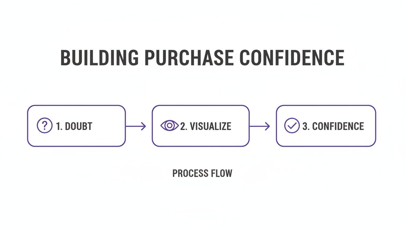
This is all about turning that "I'm not sure..." into an enthusiastic "I need this!"
By helping a shopper visualize the style, you're not just selling a product; you're selling them the feeling of owning it. It’s the final push they need to overcome hesitation and commit to the purchase.
With that in mind, here's what to focus on next:
- Simplify Your Checkout Form: Go on a mission to eliminate every single unnecessary field. Use a simple checkbox for "Billing is same as shipping." Every field you remove is a small victory against friction.
- Add a Progress Bar: Nobody likes a checkout process that feels like it goes on forever. Show shoppers exactly where they are with a simple visual indicator (e.g., Shipping > Payment > Review). It sets expectations and gives them a clear finish line to cross.
- Build Confidence with Visualization: Let's be honest, the question "But how will this actually look on me?" stops countless sales. I actually created a free tool to solve this exact problem. Install the Chrome extension in 5 seconds and your shoppers can instantly preview any item on your site—or on Zara, H&M, or Vinted—on their own photo with a simple right-click.
When you bring all these strategies together, you're building a system that doesn't just reduce friction—it actively builds the trust and excitement that seals the deal. For an even deeper look at building this kind of loyalty, check out our guide on improving customer retention in ecommerce.
Got Questions? I’ve Got Answers
Alright, we've covered a ton of ground. I’ve worked with countless e-commerce owners, and the same handful of concerns always pop up. Let’s tackle them head-on so you can move forward with total confidence.
What's a "Good" Cart Abandonment Rate, Anyway?
I know that 70% industry average can feel like a punch to the gut. But honestly, don't get hung up on it. I’ve seen some of the sharpest online stores work incredibly hard just to get their rates into the 50-60% range.
The real win isn't hitting some universal benchmark. It's about beating your own number, month after month. Focus on consistent, downward progress—that's the game.
How Can I Stop Losing So Many Mobile Shoppers?
This is the million-dollar question, especially when mobile abandonment rates can soar past 80%. The answer is to get ruthless about simplifying the experience. Think mobile-first, always.
This means big, thumb-friendly buttons and ditching as many form fields as you possibly can. Integrating digital wallets like Apple Pay or Google Pay isn't a "nice-to-have" anymore; it's essential for a frictionless mobile checkout.
And remember, that tiny screen breeds uncertainty. This is where visual confidence-builders become your superpower. A tool like the TryThisFit app can be a game-changer, letting a shopper instantly see how an item's style looks by uploading their own photo.
What's the One Thing I Can Do Right Now for a Quick Win?
Easy. Be brutally, unapologetically honest about your costs right from the start. Nothing sends a shopper running for the hills faster than a surprise shipping fee on the final checkout page. It’s the number one killer of conversions.
Add a shipping calculator to your cart page. Better yet, display shipping estimates directly on your product pages. If you can eliminate that last-second price shock, I promise you will see an immediate and satisfying lift in your sales.
Ready to give your customers the visual confidence they need to stop abandoning carts? Explore how TryThisFit can help by giving the app a try now at trythisfit.com and installing the free Chrome extension.
Try Virtual Try-On Now
See how clothes look on you before you buy - works with any online store
Get Started Free