Visual Merchandising 101: A Guide to Captivating Customers
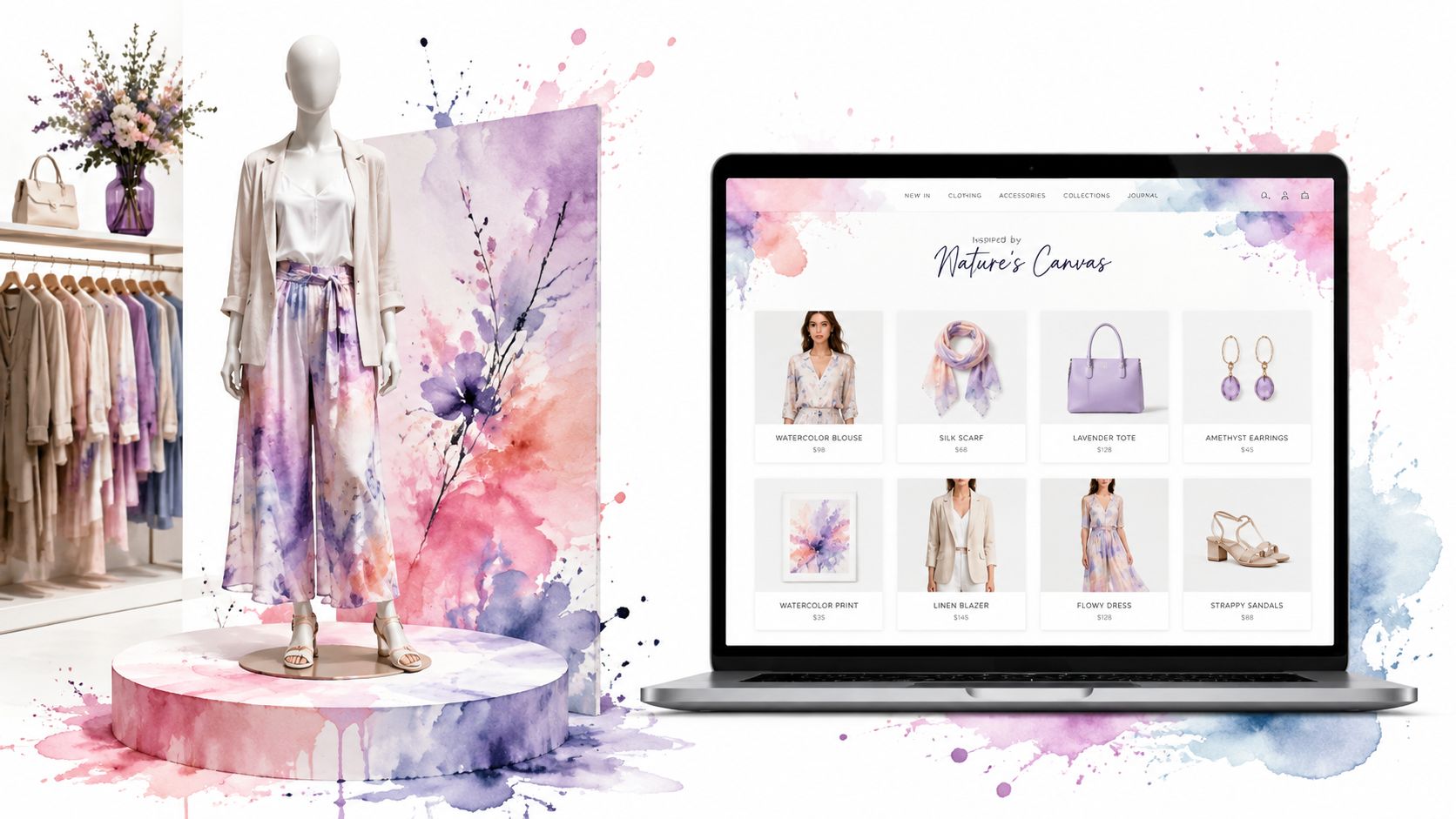
You're browsing online, opening tab after tab, and every store starts to blur together. One site feels polished and effortless. Another feels crowded, confusing, and strangely hard to shop, even if the products are good.
That difference is often visual merchandising.
In a physical store, it shapes what you notice first, where you walk, and what you remember. Online, it does the same job through homepage layout, category design, product imagery, styling, and the little visual cues that help a shopper decide, “Yes, this is for me.”
What Is Visual Merchandising and Why It Matters Now
Visual merchandising is the practice of presenting products so people can understand them quickly, want them more, and buy with less friction. It's not just “making things look nice.” It's a sales system built through placement, hierarchy, lighting, color, layout, and context.
A great store makes this feel effortless. You walk in, your eyes land on the right display, the path makes sense, and the products seem to belong together. A weak online store creates the opposite feeling. Too many banners, no clear focus, inconsistent photos, and product pages that leave the shopper doing all the interpretation.
It's presentation tied to buying behavior
Visual merchandising used to be treated more like decoration. Now retailers track it through business metrics such as sales per square foot, conversion rate, traffic flow, and average transaction value, and some industry guidance recommends reviewing display performance daily, weekly, and monthly to improve results, according to this retail analysis of visual merchandising measurement.
That shift matters because it changes the question from “Does this look good?” to “Does this help people move toward a decision?”
Several widely cited retail figures make the point clearly. One industry roundup says well-designed visual merchandising can make shoppers spend 20% more time in shops, complementary-color displays can lift sales by 35%, and window displays can increase foot traffic by 23%, according to Contravision's visual merchandising statistics roundup.
Good visual merchandising turns attention into action.
Why it matters more now
Modern shoppers don't move in a straight line anymore. They scroll, compare, save, revisit, and switch devices before they buy. That means your visual presentation has to work across physical and digital touchpoints, not just on a shelf or in a storefront.
That's one reason discussions about future retail development are increasingly focused on experience, consistency, and smart presentation rather than sheer product volume.

If you run an online store or brand, visual merchandising is how you guide the eye, reduce doubt, and help shoppers feel the style of your products before they commit.
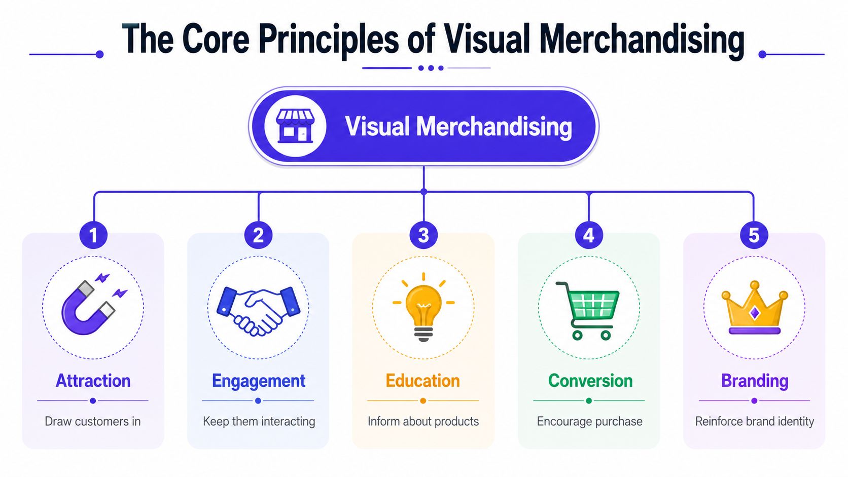
The Core Principles of Great Visual Merchandising
The best displays don't happen by accident. They follow a few repeatable principles that work in stores, on product pages, and even inside marketplaces.
Layout and flow
Think of layout as crowd choreography. In a store, that means aisle spacing, feature tables, and where people naturally pause. Online, it means navigation, collection structure, filters, and how smoothly someone moves from discovery to product page.
If a shopper has to stop and decode your store, you've already lost momentum.
A simple rule helps here:
- Lead with priority products so the shopper sees your most important category or story first.
- Group related items together so browsing feels natural, not random.
- Remove visual dead ends like cluttered sidebars, confusing menus, or pages with no obvious next step.
Color and contrast
Color doesn't just decorate. It organizes. It tells the eye where to land and what matters most.
A muted background can make a hero product pop. A strong accent color can draw attention to a launch, a callout, or a key button. But too many competing colors flatten the hierarchy and make everything feel equally important, which really means nothing stands out.
Lighting and emphasis
In stores, lighting creates mood and highlights merchandise. Online, the equivalent is image quality, background consistency, cropping, shadow, and contrast. Product photos with muddy lighting or inconsistent tones create uncertainty fast.
One strong merchandising principle is focal-point control. Retail guidance recommends putting priority merchandise at eye level and using contrast, lighting, balance, and restrained signage to direct attention and reduce cognitive overload, as explained in Lightspeed's guide to visual merchandising.
Practical rule: Make the right product the easiest product to notice.
Storytelling and props
Shoppers rarely buy an isolated object. They buy an imagined outcome.
A jacket styled with boots and a bag tells a fuller story than the jacket alone. A kitchen tool next to ingredients and servingware feels more useful than a product floating on a blank page. Context gives products meaning.
That's why strong merchandising often answers silent questions before they're asked:
| Shopper question | Visual answer |
|---|---|
| What goes with this? | Styled pairings and bundles |
| Where would I use it? | Lifestyle imagery |
| What kind of person is this for? | Clear brand aesthetic |
| Why this over the others? | Strong visual hierarchy |
Signage and clarity
In-store signage and online labels do the same job. They orient, reassure, and simplify.
Use fewer messages, not more. If every product is “must-have,” “new,” “bestseller,” and “editor's pick,” none of those labels carry weight. Clear copy and selective emphasis work better than visual shouting.
If you want a useful bridge from theory into product-page execution, this guide to product presentation shows how visual choices shape perception online.
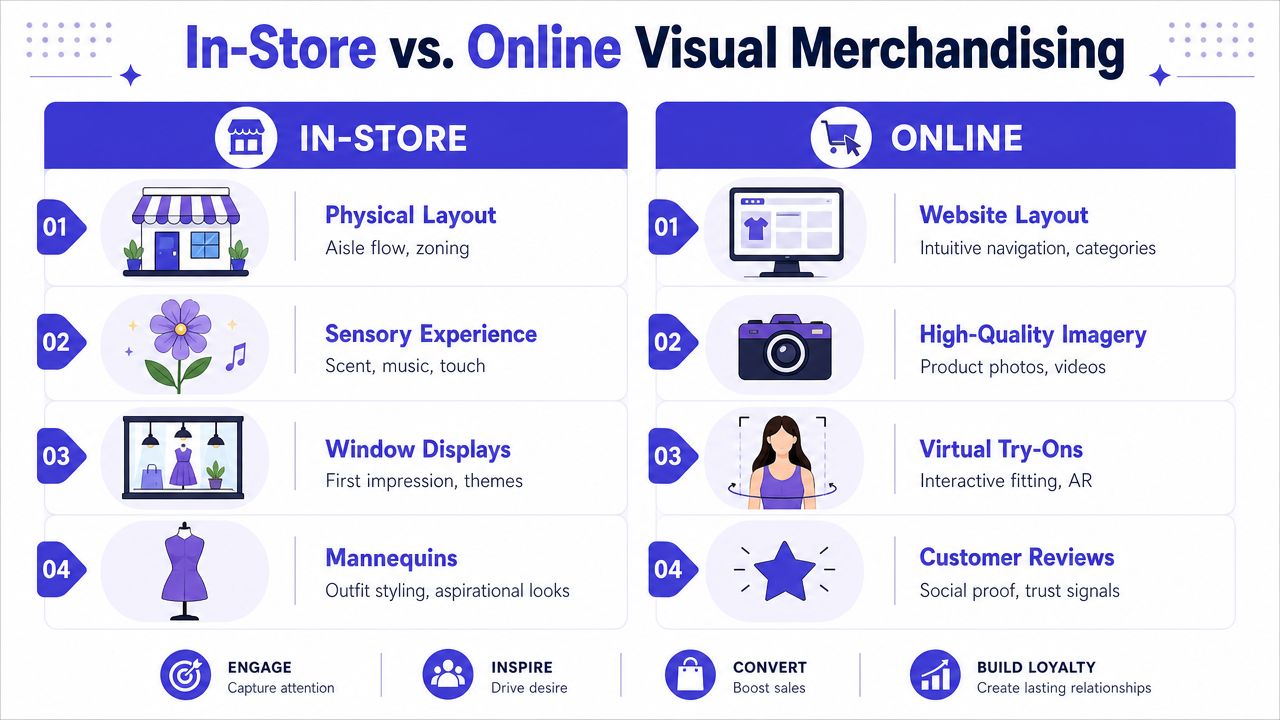
In-Store vs Online Visual Merchandising
The tools change. The shopper psychology doesn't.
A window display and a homepage hero banner do the same thing. They stop the scroll or the walk, frame the brand, and suggest what kind of shopping experience is about to happen.
The direct translation
Here's the easiest way to think about it:
| In-store element | Online equivalent |
|---|---|
| Window display | Homepage hero banner |
| Mannequin | Styled model image or Shop the Look |
| Store layout | Site navigation and category structure |
| Shelf placement | Search results order and collection ranking |
| Signage | Labels, badges, filters, and page copy |
| Sales associate guidance | Reviews, FAQs, and recommendation modules |
This is why a strong e-commerce site doesn't feel like a database. It feels curated.
Online has to replace missing senses
Physical retail has touch, scale, atmosphere, and movement. Online retail has to make up for those missing signals with visuals that do more work.
That means using:
- Clear primary images that establish the product fast
- Alternate angles that answer likely objections
- Styling context that helps the shopper visualize the look
- Clean navigation so exploration stays easy
A lot of merchandising advice now points in the same direction. Effective merchandising is shifting from “display everything” to “reduce cognitive load and make the right choice obvious,” especially because shoppers often research online first and expect a frictionless path to a decision, according to Scubefixtures on visual merchandising best practices.
For another perspective on retail execution, this article on boosting retail sales with merchandising is useful because it connects presentation choices with broader sales outcomes.
A short visual walkthrough helps make the comparison more concrete:
<iframe width="100%" style="aspect-ratio: 16 / 9;" src="https://www.youtube.com/embed/tUvUdDF8nB4" frameborder="0" allow="autoplay; encrypted-media" allowfullscreen></iframe>Where online retailers often get it wrong
Many online stores overload shoppers. They add more modules, more badges, more products per row, more popups, and more “helpful” recommendations until the page becomes mentally expensive to process.
That usually hurts the exact thing the brand wanted to improve.
A crowded page can hide a good product just as easily as a messy shelf.
If you want to understand how shopper behavior differs across channels, these online shopping vs in-store statistics help frame why merchandising has to adapt instead of just copying physical retail tactics.
Crafting Your Digital Visual Merchandising Strategy
A digital visual merchandising strategy starts with one question. What should a shopper understand within seconds of landing on your store?
If the answer isn't clear, your visuals won't feel coherent, even if each individual asset looks polished.
Start with visual identity
Your store needs a visual point of view before it needs more assets. That includes your image style, color logic, typography, crop style, model direction, backgrounds, and how you show collections together.
A minimalist brand can still feel warm. A colorful brand can still feel structured. The key is consistency. If your homepage feels editorial, your product page feels generic, and your checkout feels like a template, the shopping experience breaks apart.
Build around the customer journey
Merchandising isn't just a homepage task. It shows up at every visual decision point.
Map the journey like this:
- Discovery through social posts, ads, marketplace thumbnails, or search.
- Consideration on collection pages where shoppers compare options.
- Decision on product detail pages where hesitation usually appears.
- Confirmation at cart and checkout where clarity matters most.
At each step, ask what the shopper needs to see to keep moving.
Merchandise collections, not just products
Strong digital retailers do more than list inventory. They create visual groupings that make buying easier.
Examples work better than theory here:
- Seasonal edits like weekend getaway looks or cold-weather layers
- Use-case bundles like office basics, wedding guest styles, or travel sets
- Aesthetic groupings such as clean neutrals, bold prints, or soft tailoring
This approach reduces decision fatigue because the shopper no longer has to assemble meaning alone.
Treat product pages like selling environments
A product detail page is your shelf, mannequin, fitting room, and sales associate in one place. It should show the item plainly, style it in context, and remove uncertainty without visual overload.
One industry source reports that effective visual presentation can raise sales by up to 30%, while retailers increasingly use traffic analytics and display-performance measurement to improve layouts and placement, according to ThirdChannel on how technology is reshaping visual merchandising.
That's why testing matters. Try different image orders, collection thumbnails, and hero layouts. Measure what changes shopper behavior instead of assuming your prettiest version is your strongest one.
Feed the system with better creative
Many stores know they need more visual assets but get stuck at production. Short-form video, product explainers, and campaign variations can fill those gaps if they stay consistent with the merchandising strategy.
For brands building more visual content across ads and landing pages, the ShortGenius AI ad creative tool is one example of a resource that can speed up asset creation.
Bringing Products to Life with a Virtual Try-On
The hardest part of online fashion shopping isn't finding clothes. It's translating a flat product image into a personal style decision.
A shopper can like a dress on Zara, compare a jacket on H&M, save something from Shein, and then browse secondhand pieces on Vinted or Depop. But one question keeps showing up: how will this look on me?
Where classic merchandising stops
Traditional digital merchandising can do a lot. It can improve image order, show styling inspiration, and reduce clutter. But it still leaves a gap between seeing a product and visualizing it on yourself.
That gap matters most in categories driven by appearance and styling, especially fashion, costumes, and secondhand finds where there's less standardized presentation.
One practical tool in this area is virtual try-on apps. I built TryThisFit for this exact use case. The app lets shoppers upload their photo and preview the appearance of clothing on themselves, with no account needed. It's about helping people see how it looks, not determine technical fit or sizing.
Why this works for modern shopping behavior
Here, digital visual merchandising becomes personal. Instead of only showing a styled model, the shopper gets a way to visualize the style on their own image.
That changes the role of the product photo. It stops being the end of the presentation and becomes the starting point for personal evaluation.
A few details matter here:
- Flat-lay clothing photos work best for the most accurate style previews.
- The Chrome extension installs in a couple of seconds and works through a right-click action.
- It works on any site, so shoppers can browse Zara, H&M, Amazon, Shein, Vinted, Depop, and more without changing their normal flow.
- No accounts are needed, which keeps the process quick.
If you shop fashion on marketplaces, resale platforms, or brand sites, that convenience is the missing piece. You don't need to download images, juggle tabs, or guess from a hanger shot.
The strongest digital merchandising tools don't just show the product better. They help the shopper picture themselves in it.
If you want to try that workflow, you can install the free Chrome extension and right-click a clothing image to preview the style in seconds. It's also useful for secondhand shopping, comparing Amazon fashion options through Amazon, or previewing Halloween costume looks before buying.
If you'd rather start directly, you can try the app now and generate a quick preview without creating an account.
Measuring Success Key KPIs for Visual Merchandising
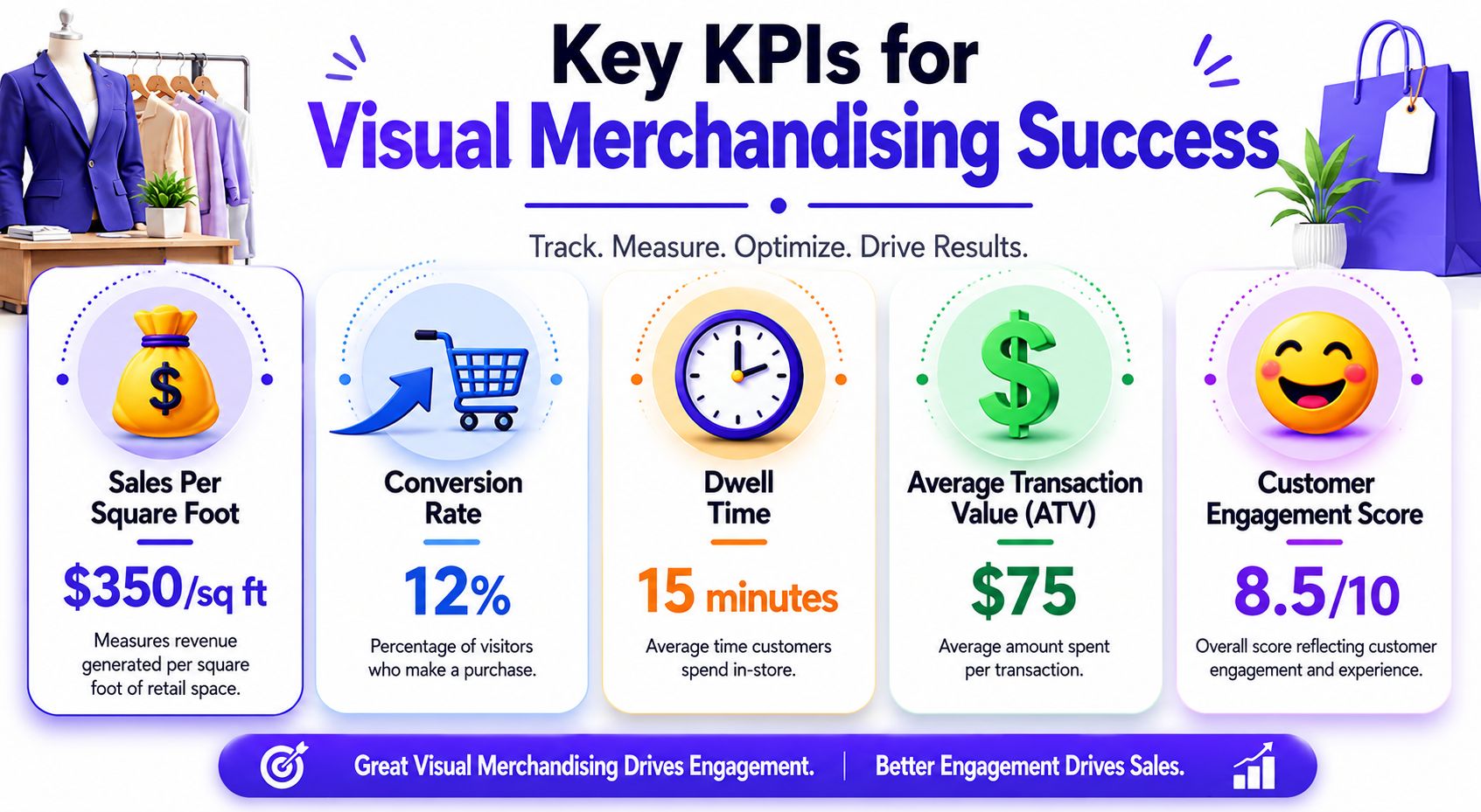
Visual merchandising becomes much more useful when you measure it like an operating system instead of admiring it like artwork. Attractive pages and displays matter. But the business question is simple: what changed after you improved the presentation?
The KPIs that matter most
Industry guidance says product placement, window displays, and layout should be tracked through metrics such as sales per square foot, conversion rate, and traffic flow, with performance reviewed weekly or even daily, according to GoPazo's visual merchandising analysis.
For e-commerce brands, the digital equivalents are just as practical:
- Conversion rate tells you whether your visual presentation helps people move from browsing to buying.
- Average order value shows whether your styling, bundling, and related-product logic encourage fuller baskets.
- Bounce rate and page engagement reveal whether the first visual impression invites exploration or pushes people away.
- Return rate can signal whether product imagery, styling context, and expectation-setting are doing their job.
- Click-through on collection pages helps you evaluate whether visual hierarchy is guiding attention where you intended.
How to connect KPIs to creative decisions
If conversion rises after simplifying a category page, that's a merchandising result. If average order value improves after styling complementary products together, that's a merchandising result too.
The same logic applies to tools that help shoppers preview appearance before purchase. If people can better visualize a style choice, you can watch whether that affects hesitation, checkout completion, or returns over time.
A practical review rhythm helps:
- Weekly checks for product page engagement, click patterns, and top-entry pages
- Monthly checks for conversion, returns, and category-level performance
- After each visual change compare the new version against the old one, not against your intuition
Don't confuse activity with impact
A store can refresh imagery constantly and still miss the mark. More assets don't guarantee better merchandising.
What matters is whether the presentation reduces friction, clarifies choices, and helps the shopper decide faster and more confidently.
Start Curating Your Perfect Style Today
Visual merchandising starts with a shelf, a window, a display table, or a mannequin. But the core concept is bigger than retail fixtures. It's the practice of helping people understand what they're looking at, why it matters, and how it fits into their life or style.
That's why the same principles work online. Strong hierarchy, cleaner choices, better product context, and less cognitive overload all make shopping feel easier. The tools may be digital now, but the job is still the same. Guide attention, build desire, and remove doubt.
For online fashion, one missing piece has always been personal visualization. Product photos can inspire, but they don't always answer the shopper's real question. Seeing the style on your own image gets much closer to that answer, especially when you're comparing outfits across different sites, browsing secondhand listings, or deciding what to wear for a specific occasion.
If you want to make your shopping decisions more visual and less guesswork-driven, you can try TryThisFit and then review saved looks in your try-on history. That gives you a practical way to compare styles, revisit favorites, and keep your choices organized without turning shopping into a project.
The best merchandising doesn't push harder. It makes the next decision feel obvious.
If you want a faster way to see how clothes look on you before buying, try TryThisFit. You can start in seconds, preview the appearance of styles from almost any shopping site, and use the free Chrome extension for right-click try-ons while you browse.
Try Virtual Try-On Now
See how clothes look on you before you buy - works with any online store
Get Started Free