How to Make Fitness App: Your 2026 Blueprint
The fitness app category isn't small anymore. Grand View Research projects the market at $12.12 billion in 2025 and $33.58 billion by 2033, with a projected 13.40% CAGR from 2026 to 2033 in its fitness apps market outlook. That changes how you should think about making a fitness app.
You're not building a novelty product. You're entering a mature category where users already know what a fitness app is supposed to do, and they abandon weak ones fast.
The mistake I see most often isn't bad intent or weak engineering. It's starting with a bloated feature list, then getting blindsided by two issues that should have shaped the product from day one: post-MVP cost creep and privacy trade-offs that directly affect engagement.
Laying the Foundation From Idea to Strategy
A good fitness app starts with a narrow promise. Not “help people get healthier.” Not “combine workouts, diet, recovery, coaching, and community in one place.” Those are company ambitions, not usable product definitions.
If you want to make a fitness app that survives contact with real users, define one repeatable job first. Examples include logging strength sessions faster than a spreadsheet, guiding beginner runners through a simple progression, or giving cyclists cleaner post-ride analysis without social pressure.
Pick a wedge, not a category
Broad markets reward clarity. Users download broad apps, but they keep the ones that solve a specific problem better than the alternatives.
Three filters help here:
- Frequency: Does the user hit this problem several times a week?
- Pain: Is the current workaround annoying enough that they'll switch?
- Expansion path: If the first loop works, can you add adjacent value later without rewriting the product?
That last point matters. A narrow entry point isn't a small vision. It's a practical way to earn retention before you expand.
Practical rule: If the product pitch needs the word “and” three times, the MVP is still too wide.
Competitor analysis should focus less on feature parity and more on friction. Open the leading apps in your niche and inspect the parts users tolerate rather than love. Slow onboarding. Confusing subscription walls. Messy sync behavior. Vague progress views. Generic plans that feel canned. Those are openings.
Define the user in behavioral terms
Demographics alone won't carry product decisions. “Women 25 to 40” or “busy professionals” sounds specific, but it doesn't tell the team what to build.
Behavior does. A stronger profile looks like this:
| User type | Current behavior | Friction | Product implication |
|---|---|---|---|
| Beginner lifter | Screenshots routines from social posts | Can't track progression cleanly | Fast logging matters more than content volume |
| Casual runner | Uses smartwatch data but ignores analysis | Too much data, not enough guidance | Simple summaries beat advanced dashboards |
| Home workout user | Starts plans but drops off quickly | Too much setup before first session | Onboarding must produce value almost immediately |
Product strategy becomes execution. The user profile should shape your onboarding, your retention mechanics, and your tech choices. It should also shape what you refuse to build.
A useful framing for founders is to think in terms of designing products from concept to production. The strong products don't just start with ideas. They start with constraints that force focus.
Write the UVP in plain language
A solid UVP is short enough that support, marketing, and engineering all interpret it the same way. If the statement can't guide backlog decisions, it's too vague.
Use this format:
- For [specific user]
- Who need [specific outcome]
- The app provides [clear mechanism]
- Unlike [common alternative]
- It avoids [main frustration]
Example:
For beginner lifters who want consistent progression, the app provides fast workout logging and simple weekly feedback. Unlike spreadsheet tracking or generic workout apps, it avoids heavy setup and cluttered analytics.
That's the kind of statement that keeps a roadmap honest.
Designing the Core User Experience and Features
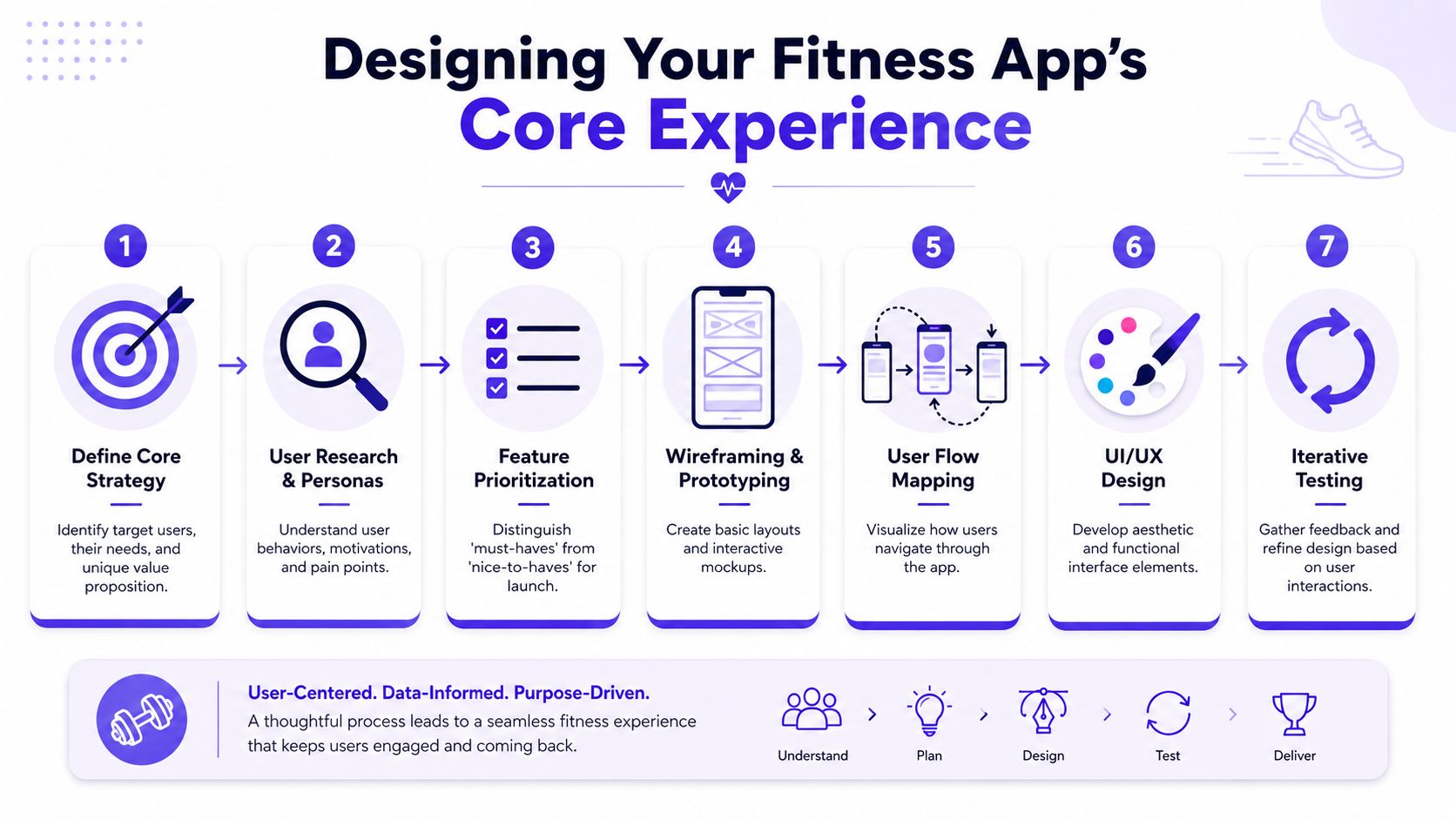
Most fitness apps fail in the first few minutes, not because the idea is wrong, but because the user has to do too much before seeing value. The MVP should revolve around one clean loop. Saigon Technology's guide to fitness app development recommends starting with a narrow problem statement and shipping the core loop first: onboarding, goal-setting, activity logging, and one or two retention mechanisms such as reminders or progress tracking.
That advice holds up in practice. If the core loop isn't satisfying, adding AI, wearables, or social features just gives users more ways to leave.
Build around the first successful session
The first session should prove the app's promise with as little effort as possible. That means reducing account friction, asking only for information you'll use immediately, and showing a meaningful result fast.
A clean first-session flow often looks like this:
- Intent capture. Ask what the user wants to do, not for a full profile dump.
- Quick setup. Collect only the minimum needed to personalize the first experience.
- Immediate action. Let them start a workout, log an activity, or see a plan right away.
- Visible progress. Show a completed state, streak, summary, or next step before they leave.
The trap is turning onboarding into a survey. Product teams often ask for age, weight, experience level, device permissions, notification preferences, content interests, and payment intent before the user has done anything. That's backwards.
A fitness app earns access. It doesn't demand trust up front and promise value later.
Prioritize features by what keeps the loop alive
Founders usually overestimate the importance of breadth and underestimate the importance of pace. A smaller feature set that supports a smooth loop beats a crowded launch every time.
Use three buckets:
Must ship
These are the pieces that make the app functional.
- Account and identity basics: Keep this lightweight.
- Goal setting: One goal is enough at launch if it drives the rest of the experience.
- Logging or tracking: This is the heartbeat of the product.
- Progress view: Users need evidence that using the app matters.
Good early additions
These features help retention without changing the app's core identity.
- Reminders: Useful when tied to user behavior, annoying when generic.
- Saved routines or templates: Great for reducing repeated effort.
- Basic insights: Summaries, trends, or simple recommendations.
Delay until behavior proves demand
These usually consume more time than founders expect.
- Social feeds
- Challenges and leaderboards
- Complex coaching systems
- Deep AI personalization
- Multi-device ecosystem support
A good benchmark is whether a feature shortens time to value, reduces repeat effort, or increases user confidence. If it does none of those, it probably belongs later.
For teams shaping the feature set, this breakdown of shopping app features is from another category, but the product lesson still applies. Start with the interaction that drives the decision, then layer convenience and retention around it.
Design the UI for movement, not browsing
Fitness apps are used in messy conditions. People are walking, lifting, sweating, switching music, locking screens, or glancing between sets. That changes interface priorities.
Use larger tap targets. Keep key actions at thumb level. Reduce hidden states. Avoid making people remember what screen they need next.
If I'm reviewing a prototype and the primary action isn't obvious in one glance, the design isn't ready. This category punishes hesitation.
Choosing Your Technology and Architecture Blueprint
Architecture decisions in fitness products aren't academic. They shape battery drain, sync reliability, release speed, and whether the team can keep up once device integrations pile on. NIX's fitness app development guide gets the core point right: technical execution is most reliable when the architecture prioritizes clean data flows, stable third-party integrations, and cross-platform frameworks such as Flutter or React Native, with testing focused on functional correctness, performance, and battery usage.
That sounds straightforward until you start connecting background sync, wearable events, notifications, analytics, and flaky mobile networks.
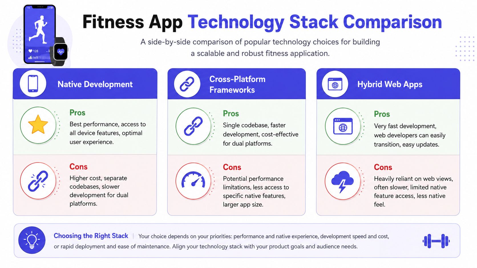
Native versus cross-platform
This decision should come from product requirements, not ideology.
| Approach | Best for | Main advantage | Main drawback |
|---|---|---|---|
| Native with Swift and Kotlin | Sensor-heavy, performance-sensitive apps | Tight platform control | Two codebases and slower parallel delivery |
| Cross-platform with Flutter or React Native | Most MVPs and many scaling products | Faster delivery across iOS and Android | More care needed around platform-specific edges |
| Hybrid web app | Content-first or lightweight utilities | Fastest to ship | Usually weak for complex device interactions |
For most new teams, Flutter or React Native is the practical default. You get faster iteration, shared UI logic, and lower coordination overhead. That matters when the product is still changing weekly.
Native makes more sense when the app depends heavily on platform-specific health data behavior, advanced sensor access, or performance-sensitive experiences that feel compromised through abstraction layers.
Design your data flow before writing screens
A lot of mobile pain comes from weak state design. Fitness apps aren't simple forms. They often juggle local session data, queued events, health imports, background updates, and server-side aggregation.
I prefer a structure with these rules:
- One source of truth per domain: Workout logs, user settings, and imported health data shouldn't compete.
- Offline-first assumptions: Users lose connectivity at the gym, outside, and while traveling.
- Explicit sync states: Pending, synced, failed, conflict. Don't hide this logic.
- Event-driven writes where possible: It's easier to debug than tangled side effects.
If the team can't explain what happens when a workout is logged offline and a wearable sync lands later, the architecture is still under-specified.
Architecture check: Every important user action should have a predictable path from device event to stored record to visible UI state.
Pick backend tools for boring reliability
Early-stage fitness apps don't need exotic backend stacks. They need services that are easy to reason about when data discrepancies appear.
A practical starting point:
- API layer: Node.js or Python, depending on team strength
- Primary database: PostgreSQL for structured user, session, and subscription data
- Async jobs: Queue-based processing for imports, summaries, reminders, and report generation
- Object storage: For media, exports, or cached artifacts
- Observability: Error tracking, API tracing, and mobile crash reporting from day one
SQL is usually the safer default here because activity, user, and billing data often need strong relationships and auditability. NoSQL can still fit for selective workloads, but many teams reach for it too early and pay for that later in reporting and consistency.
For founders thinking about product systems beyond mobile, this overview of retail technology is from a different vertical but hits a relevant principle. Clean architecture matters most when software has to coordinate user actions, external systems, and real-time expectations.
Test the ugly cases first
Basic happy-path QA won't save a fitness app. The hard bugs live in edge conditions.
Test these early:
- Interrupted sync: App closed mid-upload, device disconnected, partial import
- Permission changes: User revokes health access after onboarding
- Battery-sensitive background behavior: Sessions continue without draining the phone
- Duplicate event handling: Same activity arrives twice from different sources
- Timezone and date boundaries: Especially for streaks and daily goals
These are the issues users describe as “the app feels unreliable.” And once they think that, retention usually gets worse.
Integrating Sensors Health APIs and AI
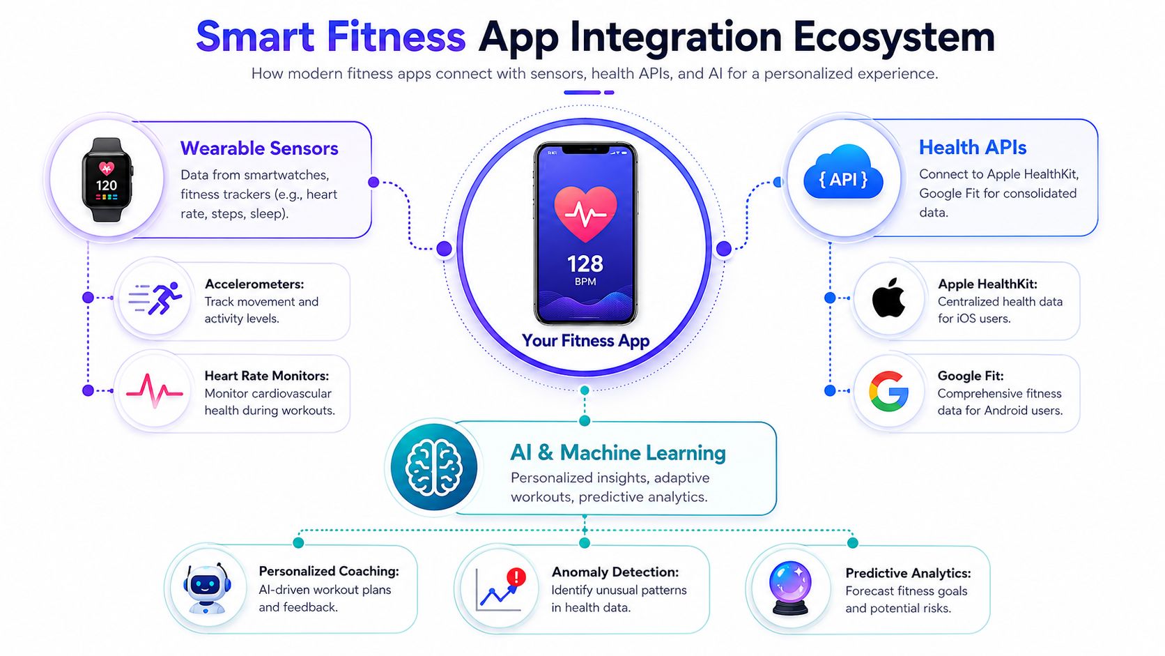
Integrations make a fitness app feel smart, but they also make the product fragile if the team adds them too early or too broadly. The right way to think about sensors, health APIs, and AI is simple: each one should remove manual effort or improve relevance. If it doesn't, it's just complexity wearing a premium label.
This ecosystem view helps keep the pieces grounded in user value.
Health APIs versus direct device integrations
Apple HealthKit and Google Fit are often the first integrations teams consider, and for good reason. They provide a normalized route into existing health data and reduce the need to connect every wearable individually on day one.
The trade-off is control.
Health API approach
- Faster path to broad user coverage
- Simpler data access model for common metrics
- Less direct dependency on multiple device vendors
Direct wearable integrations
- Better access to vendor-specific features
- More control over sync timing and user experience
- More maintenance burden and more failure modes
For an MVP, I'd usually start with one health platform integration per operating system before going deep on individual wearables. That gives the team a chance to learn what users connect and which imported data changes behavior.
A common mistake is assuming every available metric deserves a UI surface. Most of it doesn't. Pull in the data that strengthens the core loop. Ignore the rest until a real use case appears.
Here's a good example of the broader product conversation around AI-assisted app creation and workflow shaping:
<iframe width="100%" style="aspect-ratio: 16 / 9;" src="https://www.youtube.com/embed/hVIBpYLYGxU" frameborder="0" allow="autoplay; encrypted-media" allowfullscreen></iframe>Add AI where judgment is repetitive
AI is useful in fitness products when it compresses repetitive interpretation. It's far less useful when it tries to replace trust.
Good uses include:
- Turning activity history into concise weekly summaries
- Suggesting the next workout based on recent completion
- Adjusting plan difficulty from observed behavior
- Spotting anomalies that deserve a user check-in
Weak uses include overconfident coaching, fake precision, and explanations the team can't verify. If the model output affects recommendations, users need graceful ways to inspect, ignore, or correct it.
Don't connect AI directly to the user's sense of progress unless the team can explain the output clearly and recover cleanly when it's wrong.
Sequence integrations by operational cost
The order matters. A sensible progression looks like this:
- Manual input first
- Health platform imports next
- Selective wearable support after that
- AI on top of stable behavioral data
That order protects the product. Manual flows reveal whether users value the feature. Health imports reduce effort once the loop works. Wearables deepen convenience. AI becomes useful only after the app has enough clean behavior data to personalize anything responsibly.
If you reverse that order, you'll spend months fine-tuning intelligence on top of a weak foundation.
Building and Testing Your Minimum Viable Product
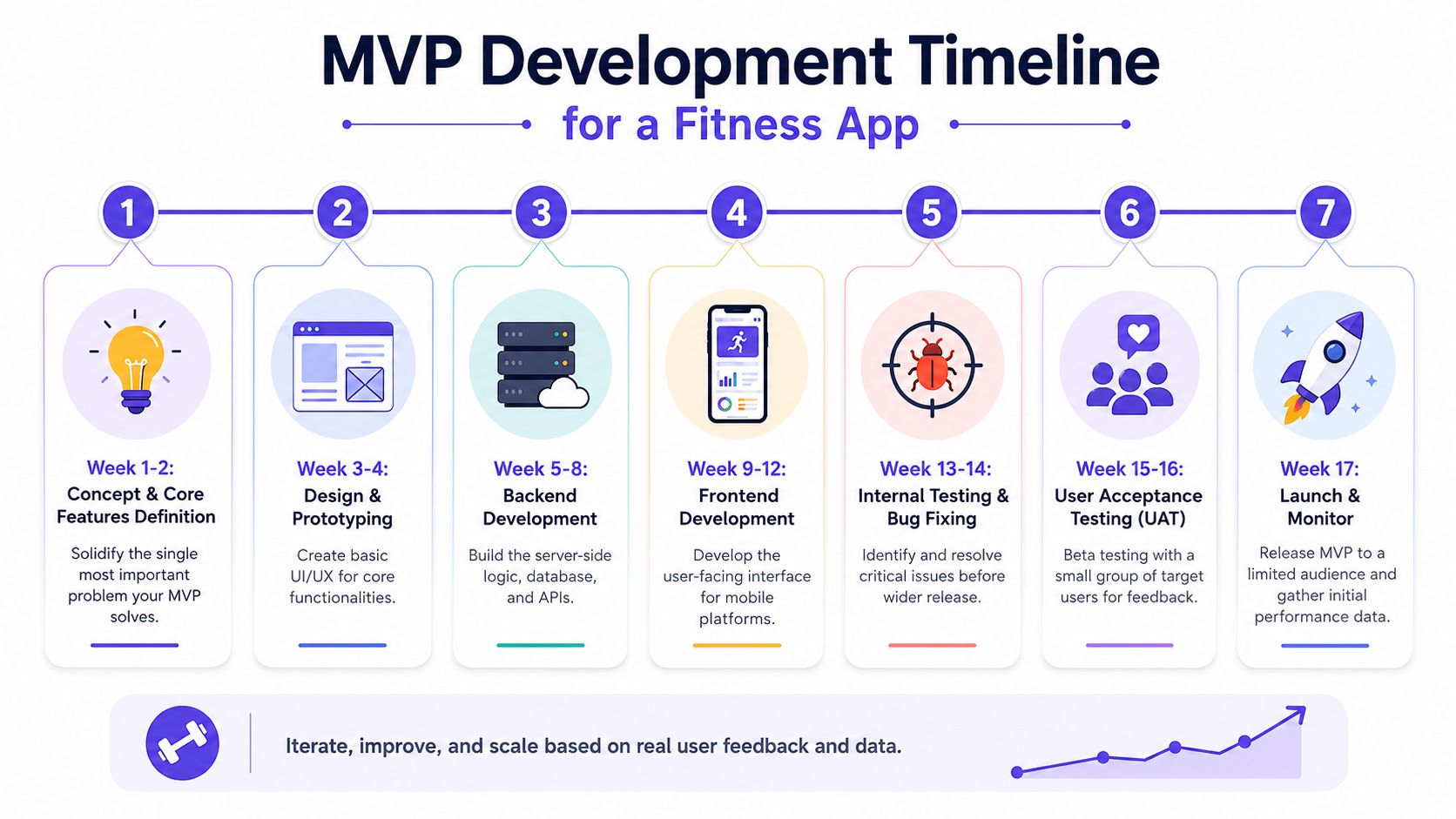
The MVP isn't the cheap version of the product. It's the smallest version that can prove repeated use. That distinction matters because teams often build too much, launch too late, and still miss key retention bottlenecks.
The hidden problem isn't just initial build cost. It's what happens after launch when the product starts needing smarter personalization, more durable sync, better monitoring, and support for edge cases you didn't budget for.
Scope the MVP around one measurable habit
A strong MVP should answer one hard question: will users come back without being pushed?
That means your first release should make one habit easy to repeat. If the app is for strength training, maybe that's logging sessions and seeing simple progression. If it's for recovery, maybe that's completing a daily check-in and seeing trend context.
Keep the release line strict:
- Include the core action, the result, and one retention mechanic.
- Exclude complex community features, broad content libraries, and “future-proof” admin systems you don't need yet.
If the team says a feature is needed because “we'll want it later,” it usually doesn't belong in the MVP.
Budget for post-launch realities, not just development
Founders often get blindsided, as Adjust's 2025 fitness app marketing report reveals that 68% of fitness apps fail to retain users post-MVP due to under-budgeted personalization infrastructure, and 42% of solo founders abandon projects after discovering post-launch costs for real-time sync exceed initial estimates by 300%.
That should change how you budget.
You're not only funding the first release. You're funding:
- Error monitoring and crash triage
- Data reconciliation when sync breaks
- Push logic that becomes more targeted over time
- Infrastructure for personalization rules or model-backed recommendations
- Support overhead from users who notice discrepancies before your team does
Shipping the MVP without reserving budget for the first months after launch is like opening a gym and forgetting maintenance.
Test in layers, not in one big QA pass
A disciplined testing sequence catches the failures that matter.
Internal product testing
Use this phase to verify the core loop repeatedly. Create real usage scenarios. Log sessions, interrupt them, change permissions, switch timezones, reinstall the app, and test old devices if possible.
Small beta with target users
This stage shouldn't focus on opinions about visual polish. It should reveal confusion, drop-off points, and trust breaks. Watch where users hesitate. Read the support messages carefully. They often describe the true product problem in plain language.
Controlled launch with instrumentation
Release to a limited audience and monitor behavior before broad promotion. You need to know where onboarding stalls, what gets ignored, and which events fail in production.
MVP discipline is less about saying no forever. It's about protecting the team from expensive guesses.
Monetization Models and Launch Strategy
Teams often ask how to monetize too late. They treat revenue as something to layer on after retention improves. That's risky because the monetization model changes the product itself. It affects onboarding, feature access, upgrade timing, and user expectations about what stays free.
If you want to make a fitness app that becomes a business, the business model has to fit the user habit from the start.
Pick the model that matches the product cadence
Different fitness products earn revenue in different ways because usage patterns differ.
| Model | Works best when | Risk |
|---|---|---|
| Subscription | Users return often for guidance, tracking, or evolving plans | Churn rises fast if value feels static |
| Freemium with paid upgrades | The free loop is useful and premium depth is clear | Teams often give away too much or gate too early |
| One-time purchase | Product is narrowly scoped and stable | Harder to sustain support and iteration |
| Ad-supported | Large casual audience and low expectation of premium guidance | Ads can disrupt focus and trust |
I'd argue most serious fitness apps should avoid leading with ads. The category depends on attention, trust, and repeated use. Interrupting that with low-quality ad experiences usually weakens the product.
Subscriptions work best when the product evolves with the user. Freemium works when the free version proves the habit and the premium version deepens it. One-time purchase can work for focused tools, but it puts pressure on acquisition because there's less revenue continuity.
Launch with proof, not with promises
App store copy tends to overreach. Teams describe the vision instead of the first useful action. That hurts conversion because users can't tell what the app does.
A stronger launch setup includes:
- Screenshots that show the core loop: Not marketing slogans over gradients.
- Description copy tied to user outcomes: Faster logging, simpler plans, clearer progress.
- A limited claim set: Promise what the current app really delivers.
- Support readiness: Replies matter early because confused users become public reviewers.
You also need a feedback path that the team monitors. App reviews matter, but direct support channels often surface the better product signals.
Growth should reinforce retention
The best launch channels depend on the product, but the same principle applies across them. Acquisition should bring in users who are likely to complete the core loop.
That often means:
- Publishing content that solves the same problem as the app
- Partnering with communities that already have the target behavior
- Creating onboarding flows specific to the channel or user intent
- Measuring whether acquired users return, not just whether they install
A lot of teams celebrate downloads that never become habits. That's noise.
There's also a broader founder lesson in how digital products find position in crowded categories. This write-up on fashion technology startups comes from another market, but the pattern is familiar. Products win when they express one clear value proposition and make it obvious fast.
If your monetization model forces you to obscure value until after signup, or your launch message needs a long explanation, the product probably isn't sharp enough yet.
Navigating Data Privacy and Compliance
Privacy is often treated as a legal review item near launch. That's a mistake in any app that handles health or activity data. In fitness products, privacy shapes trust, and trust shapes retention.
The common assumption is that deeper engagement requires more visible sharing, more social comparison, and more aggressive defaults. That's exactly where many products create avoidable risk.
A useful warning comes from the analysis cited in this discussion of Strava-style privacy risks: 37.5% of average users' home locations can be reverse-engineered via public leaderboards. Even if your app never intends to expose that kind of detail, the architecture choices that allow it often start small. Public routes. Fine-grained timestamps. Default-on sharing. Granular map views.
Treat privacy as a product feature
Privacy-first design doesn't mean stripping the app down. It means giving users confidence that the product won't surprise them.
That usually requires choices like these:
- On-device processing where possible: Especially for sensitive transformations or summaries
- Anonymized leaderboards: Rank participation without exposing precise location traces
- Opt-in sharing tiers: Public, friends-only, private. Never bury this.
- Purpose-limited permissions: Ask for access in the moment it becomes useful
- Clear retention rules: Users should understand what's stored and why
This approach helps product teams too. Privacy boundaries force cleaner system design. They reduce “just in case” data hoarding and make permission requests easier to justify.
Users will forgive a missing feature sooner than they'll forgive a creepy one.
Build compliance into workflow decisions
GDPR and CCPA implications show up in practical product choices long before legal docs are finalized. Consent flows, export behavior, deletion handling, auditability, and third-party processor selection all affect engineering work.
A few patterns save pain later:
Separate operational and analytical data
Don't mix user-facing records with event logs in ways that make deletion or access requests messy. Keep the boundaries clear.
Minimize sensitive defaults
If a feature can be private by default and still useful, start there. You can always let users open it up later.
Review third-party SDKs aggressively
A polished SDK can still create unnecessary exposure. If it collects more than you need, it's not free. You'll pay in trust and review overhead.
Privacy work rarely creates launch-day excitement, but it absolutely changes whether users feel safe building a habit inside the app. In this category, that isn't a compliance footnote. It's part of the product.
If you like products that make decisions easier before you commit, try TryThisFit. It lets you see how clothing looks, visualize the style, and preview outfits in seconds with no account needed. For shopping on Zara, H&M, Amazon, Shein, Vinted, Depop, and almost any other site, install the free Chrome extension. It adds a right-click try-on feature that works in a couple of seconds. Flat-lay clothing photos work best for the most accurate style previews. You can try items on the main app, review saved looks in your try-on history, or browse fashion picks on Amazon.
Try Virtual Try-On Now
See how clothes look on you before you buy - works with any online store
Get Started Free